|
| |
 |
Released by :
Veto
Release Date :
25 October 2008
Type :
C64 Graphics
(MultiColor)
|
AKA :
Viking Pic
Released At :
X'2008
Achievements :
C64 Graphics Competition at X'2008 : #8
Credits :
Download :
Look for downloads on external sites:
Pokefinder.org
User Comment
Submitted by Jammer on 1 November 2016
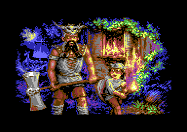
| Thx for reminding of this gem ;) Right side has also strong feeling of Henk Nieborg's awesome art for Lion Heart (together with my earlier associations) :) Aaaamiiigaaa! :D |
User Comment
Submitted by Jok on 1 November 2016
really good illustration and multi at the same time:)
+ work of light and leafs in background |
User Comment
Submitted by DKT on 28 December 2013
| It's like a movie. I fill it :-) |
User Comment
Submitted by apprentix on 21 July 2013
User Comment
Submitted by Wile Coyote on 3 March 2012
| My favourite picture from the compo. |
User Comment
Submitted by Jammer on 13 April 2009
| veto's main strength is that he avoids dithering but at the same time he gives every object strong sense of texture thus colour areas are not plain :) look at the right bottom for example :) |
User Comment
Submitted by CreaMD on 13 April 2009
User Comment
Submitted by Jucke on 13 April 2009
| Wow. Very nice excecuted. |
User Comment
Submitted by plagueis on 1 April 2009
| You are right, Jammer, the colors used on the right are my favorite part! |
User Comment
Submitted by Jammer on 12 January 2009
| btw., the right side gives me almost amiga'ish feel. reminds me the technique from 'lemmings 2: the tribes' intro or 'lure of the temptress' ;) |
User Comment
Submitted by v3to on 29 November 2008
@Jammer:
It is just a matter of personal tradition. Initially the biggest influence on this style were the works of Michael Kosaka (e.g. Skate or Die, Budokan or Sentinel Worlds). I was totally impressed how good his gfx look even with very limited dithering. I tried the same way and decided to abandon dithering at all. That was before my first public release - about 1988/89. Right from the start the reactions were controversial but IMHO it was a good decision. |
User Comment
Submitted by Jak T Rip on 29 November 2008
No way to hide your roots :)
This absolutely has the spirit of a game.
I also like the look the boy throws at his father.
Nice and looks alive! |
User Comment
Submitted by Motion on 27 November 2008
| @Jammer: Read this Portrait for more info. I think Veto has always been unique. There's a great deal of warmth, both visually and emotionally in this piece. Excellent work! |
User Comment
Submitted by Jammer on 27 November 2008
| lack of dithering really disturbs me and gives me a felling of watching a convert. similar impression when i saw your portrait for the first time. |
User Comment
Submitted by v3to on 25 November 2008
Thanks for all comments. I am really pleased and also surprised. In fact the picture was not intended to be some kind of game-intro-picture. Cannot hide my roots I suppose...
|
User Comment
Submitted by leonofsgr on 3 November 2008
| good pix veto! like the green and blue combination! |
User Comment
Submitted by oys on 30 October 2008
| jesus... it's multicolour! even if i dont like the motive so much either, this still kicks serious asses. |
User Comment
Submitted by Archmage on 27 October 2008
| Not my favourite type of motive, but this is still very good use of the multicolour mode. |
User Comment
Submitted by enthusi on 27 October 2008
in fact it looked fli or even ifli to me at the compo (yet voted it higher than 8th :o)
format was (sadly) unknown at compo |
User Comment
Submitted by Style on 27 October 2008
| given the format, this is awesome - shouldve placed much higher! |
User Comment
Submitted by Medicus on 26 October 2008
| Looks to me like an intro-picture to a full-price game many years back... and this is meant in the most positive way possible. |
User Comment
Submitted by DeeKay on 26 October 2008
| Me likey. Oldskoolish fantasy theme, but really great coloring and awesome details nonetheless! |
User Comment
Submitted by RaveGuru on 25 October 2008
| Very nice oldskool piccy. Looks like it was made for a sequel back in the 80's. (If the game hade this kind of graphics I'm sure I'd played it thru) =D |
User Comment
Submitted by Lubber on 25 October 2008
| Very nice to see such a good multicolor picture these days. |
User Comment
Submitted by Scout on 25 October 2008
| Corrected releasedate; releasedate = date when gfx-competition was held. |
User Comment
Submitted by d0c on 25 October 2008
| where is the game?.... :) |
|
|
|
 | Search CSDb |
|
|
| Navigate | |
|
| Detailed Info | |
|
| Fun Stuff | |
· Goofs
· Hidden Parts
· Trivia
|
|
| Forum | |
|
| Support CSDb | |
|
 |  |
|
