|
| |
|
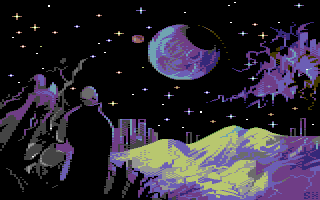
Far Away Trains Passing By [2009] |
AKA :
Junkyard Samurai Wannabe
Website :
http://pixeljoint.com/pixelart/47296.htm
Credits :
Download :
Look for downloads on external sites:
Pokefinder.org
User Comment
Submitted by iLKke on 2 August 2012
User Comment
Submitted by Burglar on 18 March 2010
User Comment
Submitted by Cobra/Samar on 18 March 2010
User Comment
Submitted by The Shadow on 17 October 2009
User Comment
Submitted by Linus on 16 October 2009
| What Sander said ... and the title <3 Great! |
User Comment
Submitted by skurwy on 16 October 2009
thank you! really glad to hear that! :)
@JackAsser, this must be a coincidence; however another nice one is that the picture was loosely based on the old (50s-60s) sf book covers, especially this one (a book by the other Hamilton, Edmond). ive never even seen The Commonwealth before, but this is the one i would undoubtedly choose to serve as my inspiration. |
User Comment
Submitted by Sander on 16 October 2009
| Great work again :) And i'm drewling over the details, every pixel seems so well put! Quite rare.. |
User Comment
Submitted by JackAsser on 16 October 2009
| "Far Away", "Trains", space etc. Inspired by The Commonwealth saga by Peter F. Hamilton? Or just a coincidence? |
User Comment
Submitted by daison on 16 October 2009
| Nice atmosphere in this one. I like it a lot. |
User Comment
Submitted by skurwy on 16 October 2009
thank you very much!
@luca: yes! youre right. i like clear day way more though. i just thought the title will create some interesting impression -- you read it and you expect something totally different, then there comes the surprise.
@moloch: thank you! the hires piece is already done! :)
@conrad: thanks! sure, they rock! always had this little perversion. :)
@deev: i was trying to get rid of the clashes where possible and leave them only where they create a specific artistic device. still, there are places where i could have done it better, but the end is the end and im not touching it up any more. :)
@motion: youre right too! pixel-wise, helm is one of the artists i admire most, and the black star was my inspiration here as well. it has started as a doodle, at the beginning i had no idea of how to cope with the composition, which stylistic choices to apply. . . no strict sense whatsoever. . . im really glad you like it, btw: when we can expect something new from you mate? :)
@wile: carry on, it doesnt have to be amazing! theres something very rewarding in putting your mental images down to a sheet of paper, or a computer screen if thats the case. they evolve throughout the process, too. give it a try!
@jammer: haha |
User Comment
Submitted by Luca on 15 October 2009
| ...citing Ulrich Schnauss? |
User Comment
Submitted by Moloch on 15 October 2009
Followed this a bit over at Pixelation. Nicely done.
Can't wait to see the hires portrait finished. |
User Comment
Submitted by Conrad on 15 October 2009
| Nice cold-looking picture. Oldskool stars ftw! |
User Comment
Submitted by Deev on 15 October 2009
| pretty nice, but whilst you get away with clear boundries between the chars in hires mode (plus it looks good!), I'm not sure I like it as much in multicolour. |
User Comment
Submitted by Motion on 15 October 2009
| Reminds me of The Black Star. Both are pondering their existence... or just trains? :) Nice work as always, Johnny! Love the colour choice. |
User Comment
Submitted by Jammer on 15 October 2009
| i bet you could do it in hires :D |
|
|
|
 | Search CSDb |
 |
|
 | Navigate |  |
|
 | Detailed Info |  |
|
 | Fun Stuff |  |
· Goofs
· Hidden Parts
· Trivia
|
|
 | Forum |  |
|
 | Support CSDb |  |
|
 |  |
|


