|
| |
AKA :
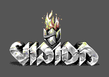
Logo for Vision / The Lost Bet
Website :
https://sanderfocus.nl/demoscene-logos/
Released At :
X'2010
Achievements :
C64 Graphics Competition at X'2010 : #12
Credits :
SIDs used in this release :
Download :
Look for downloads on external sites:
Pokefinder.org
User Comment
Submitted by katon on 13 March 2023
User Comment
Submitted by Motion on 25 November 2020
| That logo is literally on fire ...and still smokin' 10 years on! |
User Comment
Submitted by Peacemaker on 28 December 2014
User Comment
Submitted by Devistator on 12 September 2012
| Fuuuuck, can't believe I missed this.. epic styles, colours, ideas! |
User Comment
Submitted by Jok on 17 February 2012
User Comment
Submitted by FATFrost on 2 July 2011
| these are nice work stages that look real compared to the other fake work stages people provide. |
User Comment
Submitted by Archmage on 21 October 2010
| Thanks for the workstages. Very interesting approach. |
User Comment
Submitted by Jazzcat on 21 October 2010
| Clarence: expect this to be in something coded by Hein sometime. :D |
User Comment
Submitted by Medicus on 21 October 2010
| Thanks to Sander for the brilliant documentation of his work-stages! Very interesting :). |
User Comment
Submitted by Jucke on 20 October 2010
| killer logo. the kind of logo you pay money for. reminds me of that fairlight logo on the amiga, which i heard strider paid some graphician 3000sek for back in 1989 or so. |
User Comment
Submitted by booker on 10 October 2010
User Comment
Submitted by Tim on 7 October 2010
| Man.. when you told me the story about this entry I was wondering.. YES! comes very close to my all time logo ever! (your empire logo) great stuff.. wish you would do more even though it's "just a logo" ;) |
User Comment
Submitted by Clarence on 4 October 2010
| Excellent logo, too bad it didn't get used in a prod. |
User Comment
Submitted by Perplex on 4 October 2010
| Great stuff, I love it! Shame there's no demo surrounding it though. |
User Comment
Submitted by Danzig on 4 October 2010
| Sandra, this is awesome :) |
User Comment
Submitted by Archmage on 4 October 2010
| This one is right up there with the best C64 logos ever made. Good job, Sandaaah!!! |
User Comment
Submitted by TPM on 4 October 2010
| fucking awesome, Sander!! |
User Comment
Submitted by Moloch on 4 October 2010
| Always awesome to see more pixel work from one of my favorite graphicians. This logo is magnificent and certainly one of the best I've seen on c64 ever! |
User Comment
Submitted by Deev on 3 October 2010
| superbly made! and it's interesting to see your work processes. |
User Comment
Submitted by daison on 3 October 2010
Incredible...
Amiga-ish indeed, which I consider to be a good thing. |
User Comment
Submitted by Frantic on 3 October 2010
| Yes, Amiga comes to mind. The desire to be newschool and oldschool at the same time. :) |
User Comment
Submitted by Joe on 3 October 2010
User Comment
Submitted by Mindcooler on 3 October 2010
User Comment
Submitted by Shokray on 3 October 2010
| Awesome! one of the best c64 Logos ever imho. ..somekind of paralaxing graphic stuff behind the logo would fit perfect ;) |
User Comment
Submitted by JCB on 3 October 2010
| Pretty good, reminds me of The Bitmap Brothers style (Dan Malone in particular I think) |
User Comment
Submitted by Mr. SID on 3 October 2010
| Flawless pixels. I really like the heavy feel, and the slight reflections of the flame! |
User Comment
Submitted by Wile Coyote on 3 October 2010
Thats one big logo! - cool too..
Theres no room remaining on screen for anything else.
Maybe the fire could be replaced with a fire demo effect |
User Comment
Submitted by Malmix on 3 October 2010
|
|
|
 | Search CSDb |
|
| Navigate | |
|
| Detailed Info | |
|
| Fun Stuff | |
· Goofs
· Hidden Parts
· Trivia (1)
|
|
| Forum | |
|
| Support CSDb | |
|
 |  |
|