|
| |
 |
Released by :
Mirage
Release Date :
7 October 2010
Type :
C64 Graphics
(MultiColor + Sprites)
|
AKA :
Zilveren Surfer
Credits :
SIDs used in this release :
Download :
Look for downloads on external sites:
Pokefinder.org
User Comment
Submitted by Jammer on 6 July 2012
User Comment
Submitted by DeeKay on 10 October 2010
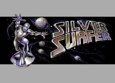
nice, i like the composition and how the logo gets a bluish tint towards the right, the top half of the silver surfer is mirage-class quality, but the bottom half just screams for hires - also, his left leg does seem to have a double knee. Edit: Okay, so that's in the original already - should've still been fixed/improved, just like the whole image and logo itself! ;-)
Bonus points for sideborder - so when will we get to test this pwned editor of yours, Lars? ;-D |
User Comment
Submitted by Wile Coyote on 9 October 2010
@irwin
The Angry Video Game Nerd can be funny.
Check out The Terminator review on the Snes.
The Arnold jumping action has to be seen to be believed. |
User Comment
Submitted by irwin on 9 October 2010
Dithering, colors, antialias somehow reminds me Sierra adventures on VGA PC. Awesome work!
Any chances to release your outstanding gfx-editor?
ps. very good review of Silver Surfer:
http://www.youtube.com/watch?v=gvnRBywkUZ0
:D |
User Comment
Submitted by Iapetus/Algarbi/Wood on 8 October 2010
User Comment
Submitted by Oswald on 8 October 2010
| Nice one! looks being below Mirage standards for me, but the 80% should explain that :) |
User Comment
Submitted by daison on 8 October 2010
User Comment
Submitted by Flex on 8 October 2010
User Comment
Submitted by Cresh on 8 October 2010
| Mace, check production notes. ;) |
User Comment
Submitted by Mace on 8 October 2010
Reminds me of the NES: (and a picture)
I talk too much and read too little...
|
User Comment
Submitted by Wile Coyote on 8 October 2010
First impressions are good.
The leg looks as half-assed as the original, so good conversion.
The thing that bothers me most is the logo. It starts off great at the lower left of the S. By the time it reaches the top right, Im questioning the R or could it be the E throwing the R out.
Either way, great use of colour as per usual. |
User Comment
Submitted by PAL on 7 October 2010
WOW DUDES... why this were not at X I can not understand? It is just perfect... WOW... take my hat off and eat it! PERFECT even while the anatomy looks stranger and stranger the more I look at it... but as a first glance it is a perfect 10! After 5 minutes it is a solid 8+ That upper part of his left leg destroys it more and more... freezes over here... want not to see that anymore... because I want to keep in mind the first impression of this... WOW!
The logo and the space is just jaw dropping! sideborder(like one of my images in Another Beginning were) and all.. Love it!
Do a fix of that leg before it takes over the whole screen and then the whole universe.... get a knee in there too... the whole image will shine forever as one of the best ever is my guess...
Love the music... it is very good this! |
User Comment
Submitted by TPM on 7 October 2010
User Comment
Submitted by grass on 7 October 2010
User Comment
Submitted by iAN CooG on 7 October 2010
<silver surfer> Im in ur sidebordarz stealing ur pixelz.
great one =) |
|
|
|
 | Search CSDb |
 |
|
 | Navigate |  |
|
 | Detailed Info |  |
|
 | Fun Stuff |  |
· Goofs
· Hidden Parts
· Trivia
|
|
 | Forum |  |
|
 | Support CSDb |  |
|
 |  |
|


