|
| |
Credits :
SIDs used in this release :
Download :
Look for downloads on external sites:
Pokefinder.org
User Comment
Submitted by Heavy Stylus on 19 December 2010
User Comment
Submitted by Morpheus on 17 October 2010
User Comment
Submitted by SIDWAVE on 17 October 2010
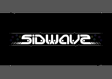
| Motion: if you can fix the ending E to look more like an E.. then i could in fact like to use this for a CD cover soon!! ??? whaaat ??? send!!!!!! :) |
User Comment
Submitted by DeeKay on 16 October 2010
| Just had an idea: If you rearrange this logo a bit, you could give it to the guy that makes SID2WAV for use on his HP/in the program! ;-D |
User Comment
Submitted by Sander on 16 October 2010
User Comment
Submitted by Motion on 16 October 2010
| Thanks for taking the time to comment on this release. Cheers! :) |
User Comment
Submitted by Mace on 13 October 2010
Cool stuff!
I like this modernish style. |
User Comment
Submitted by Deev on 13 October 2010
User Comment
Submitted by Linus on 13 October 2010
| Looks really stylish, although I have to agree with KeeDay about the "e". Thanks for sharing! |
User Comment
Submitted by Moloch on 13 October 2010
Wow, very cool screen - love the logo, including the E and the broken rasters and gray coloring is great effect!
|
User Comment
Submitted by psych on 13 October 2010
User Comment
Submitted by Archmage on 13 October 2010
User Comment
Submitted by Yazoo on 13 October 2010
User Comment
Submitted by DeeKay on 13 October 2010
I really like this, nice style!... If it wasn't for the "e", which is definately either a "z" or a "2"! ;-)
The little dot-globes look really nice, too! Nice idea with the broken rasterbars, really adds a finishing touch to it! ;-D |
User Comment
Submitted by booker on 13 October 2010
User Comment
Submitted by Slator on 13 October 2010
| looks fine, indeed. Good work |
User Comment
Submitted by daison on 13 October 2010
| Nice design! I can only hope it will still be used... |
User Comment
Submitted by Motion on 13 October 2010
This was a player screen I was working on for SIDwave, but seeing as Jan already had his own player screen, I ceased working on it.
Anyway, I just found out that SIDwave has been dissolved. OMG! :(
|
|
|
|
 | Search CSDb |
|
 | Navigate |  |
|
 | Detailed Info |  |
|
 | Fun Stuff |  |
· Goofs
· Hidden Parts
· Trivia
|
|
 | Forum |  |
|
 | Support CSDb |  |
|
 |  |
|


