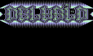
|
| |
AKA :
MFC (My First Compo)
Released At :
3-Color-Logo Competition 2013
Credits :
Download :
Look for downloads on external sites:
Pokefinder.org
User Comment
Submitted by Raffox|HF on 4 March 2013
| Back in the days it would have looked quite cool. Not my cup of tea though. |
User Comment
Submitted by Radiant on 16 February 2013
| For me it's the colors that make the picture. |
User Comment
Submitted by TheRyk on 16 February 2013
| Quite a good logo, the terrible colors could easily be fixed, if I wanted to use it, I'd decide either for green or blue palette. Dark green and light blue just don't work here imho. |
User Comment
Submitted by CONS on 16 February 2013
User Comment
Submitted by Radiant on 16 February 2013
User Comment
Submitted by spider-j on 15 February 2013
| The letters alone are very nice. I'm not a big fan of that background gfx and the color choice. |
User Comment
Submitted by hedning on 15 February 2013
User Comment
Submitted by Dr.j on 15 February 2013
| Nice logo Andy ! . hope to see more logos from you in the competition. Go Andy Go ! LOL |
User Comment
Submitted by camper on 15 February 2013
| nice 2 see that delysid is still in action.. |
User Comment
Submitted by Malmix on 15 February 2013
|
|
|
 | Search CSDb |
|
 | Navigate |  |
|
 | Detailed Info |  |
|
 | Fun Stuff |  |
· Goofs
· Hidden Parts
· Trivia
|
|
 | Forum |  |
|
 | Support CSDb |  |
|
 |  |
|


