|
| |
AKA :
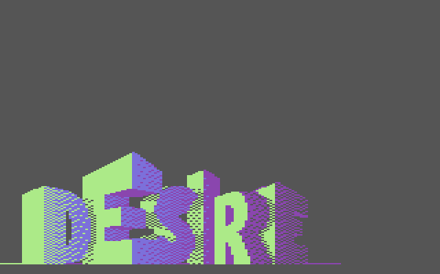
An experiment in shading
Released At :
3-Color-Logo Competition 2013
Achievements :
C64 Graphics Competition at 3-Color-Logo Competition 2013 : #91
Credits :
Download :
Look for downloads on external sites:
Pokefinder.org
User Comment
Submitted by Hammerfist on 6 February 2020
| For anyone that cares or happens to find this again, I did get around to that re-do of the logo that I promised. Check out "Desire's X-mas 2019": Desire's Xmas 2019 |
User Comment
Submitted by v3to on 23 March 2013
| like the logo design, but dithering is rough... |
User Comment
Submitted by Deev on 23 March 2013
| Quite a nice idea, it just needs better execution. |
User Comment
Submitted by spider-j on 18 March 2013
| very nice idea. could probably work better with another color combination. |
User Comment
Submitted by Hammerfist on 17 March 2013
| @Elko: I will definitely do a remake of this one, especially after all the positive feedback. I knew this wasn't good or even properly finished (no anti-aliasing for one) but I had run out of time for a final version.. |
User Comment
Submitted by Zierliches Püppchen on 17 March 2013
Hey Mr. Hammerfist, u really thrown a good chance away. I thought u would push a nice 3d logo into the competition and this would be the teaser ;-) the Char-Arrangement was cool ...
Spend time in finish it, as cons said ... |
User Comment
Submitted by Magic on 16 March 2013
| Realtime 3d shaded Desire logo's zijn kei goaf! Goed gedaan Hammerfist! |
User Comment
Submitted by TheRyk on 15 March 2013
| idea and some shapes are really promising. Don't find that the colors suck that hard. Room for improvement, though. |
User Comment
Submitted by CONS on 15 March 2013
| I would like to see this logo get a makeover with love. It has potential, for sure. As it is, it feels very unfinished. |
User Comment
Submitted by Reject on 15 March 2013
User Comment
Submitted by Zierliches Püppchen on 15 March 2013
| Whats this? an unfinished sketch? I am not sure, whats your intention. Colors O.M.G. ... form could be working, but not jet ... |
User Comment
Submitted by Raffox|HF on 15 March 2013
| It surely shows a lot of potential. Looks quite original and appealing even if raw. |
User Comment
Submitted by Hammerfist on 14 March 2013
My apologies for this quick-n-dirty logo. I had made the 3D framework a while back and this evening wanted to fill it up with shaded colors. I guess I did that, but it's not nearly as pretty as I hoped... Anyway, comments please because I believe it's worth a proper 2nd version!
Btw: Coder colors! And completely by accident! What has become of me... :/ |
|
|
|
 | Search CSDb |
|
 | Navigate |  |
|
 | Detailed Info |  |
|
 | Fun Stuff |  |
· Goofs
· Hidden Parts
· Trivia (1)
|
|
 | Forum |  |
|
 | Support CSDb |  |
|
 |  |
|


