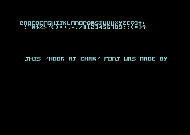
|
| |
Released At :
Font Creation Competition 2013
Achievements :
C64 Graphics Competition at Font Creation Competition 2013 : #52
Credits :
Download :
Look for downloads on external sites:
Pokefinder.org
User Comment
Submitted by G-Fellow on 3 August 2013
| Ofcourse use it Dr.j and everyone else..this is why the compo is made or? |
User Comment
Submitted by Dr.j on 12 July 2013
| Very nice Charset in my opinion. i would like to use it one day |
User Comment
Submitted by Didi on 11 July 2013
There's really a hook on this thingy. ;)
Such a simple scroller is OK or a simple screen message like greetings. But no music, no color effects, no additional graphics/animations, splits, etc. (Nitpickers will come up that a $d016 split is needed to make a scroller.) |
User Comment
Submitted by user on 11 July 2013
| I like the idea with the translation of the letter '&' |
User Comment
Submitted by G-Fellow on 11 July 2013
| I did upload now a bold version of this charset. Thank you Oswald and THE USER for your helpful comments! :) |
User Comment
Submitted by G-Fellow on 11 July 2013
It did make sense what Oswald says, but argh, thanks THE USER for the info, what do I know? lol
Release a thin and bold font? mmmm |
User Comment
Submitted by chatGPZ on 11 July 2013
| cool, it took only two entries until retroactive unreleasing \o/ |
User Comment
Submitted by user on 11 July 2013
| Nice font G-Fellow. I can say, that i can read it on the real thing. But nowaday i have my C64 connected via S-Video. I wanted to create a 1 pixel thick lined font for this compo too. |
User Comment
Submitted by G-Fellow on 11 July 2013
You absolut right Oswald, I did not think about it and did not test it on my CRT TV.
I fix thix charset...new file and new picture soon available... |
User Comment
Submitted by Oswald on 11 July 2013
| but putting that aside, its a nice font :) |
User Comment
Submitted by Oswald on 11 July 2013
| thing is 1 hires pixel vertical lines were hardly visible back in the day, now it looks cool in the emu era, but I still have the feeling from the heydays that its just wrong. on a crt telly this would be a hardly readable font. |
User Comment
Submitted by G-Fellow on 11 July 2013
Like Didi/Laxity sayd, it is really hard to do a new charset after all this years.
I did every char on my own, but I saw hundreds of charsets since 1984, It can be that something influence me.
I hope a scrolltext is not against the rules, because it is a charset, it makes sense to me to use a scrolltext. |
|
|
|
 | Search CSDb |
|
 | Navigate |  |
|
 | Detailed Info |  |
|
 | Fun Stuff |  |
· Goofs
· Hidden Parts
· Trivia
|
|
 | Forum |  |
|
 | Support CSDb |  |
|
 |  |
|


