|
| |
|
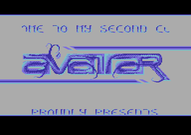
ATA-Intro "Blue Grass" [2013] |
Released At :
Intro Creation Competition 2013
Achievements :
C64 Demo Competition at Intro Creation Competition 2013 : #29
Credits :
SIDs used in this release :
Download :
Look for downloads on external sites:
Pokefinder.org
User Comment
Submitted by daison on 5 December 2013
Solid intro, I like te details such as the logo d020 lines in the border and the diagonal fade sprites.
The logo is typical grass-roughness, love it or hate it, it at least has a strong appearance imo.
Cool tune too btw! |
User Comment
Submitted by bepp on 3 December 2013
| ? Wrong background error. Music great, but a bit hard to give proper vote with these colors. |
User Comment
Submitted by Hammerfist on 3 December 2013
| @Didi: then to be honest, I just don't like it so much. I thought it was the color selection, but the original gives me the same feeling. |
User Comment
Submitted by Didi on 3 December 2013
@Hammerfist: Logo palette was different in the original logo, but made for grey background:
Avatar 3 color |
User Comment
Submitted by Hammerfist on 2 December 2013
| Nice, slick design, but the logo palette looks like it was made for a black background. That kinda spoilt it for me. Music is awesome though, so still 6/10. |
User Comment
Submitted by Didi on 27 November 2013
| @spider: Tried it with a darker grey but it looked worse. |
User Comment
Submitted by spider-j on 25 November 2013
| Music is awesome, intro looks nice. I only wish it had a darker grey as bg. |
User Comment
Submitted by Richard on 12 November 2013
| This intro is totally awesome. I also love the music as well. :) |
User Comment
Submitted by Yogibear on 3 November 2013
User Comment
Submitted by grass on 31 October 2013
| Hey, hey, hey. THX! Nice work! |
User Comment
Submitted by Dr.j on 31 October 2013
User Comment
Submitted by Dr.Science on 30 October 2013
| nice style - like this one! |
User Comment
Submitted by STF on 30 October 2013
User Comment
Submitted by Didi on 30 October 2013
Made for the guys in Avatar.
Maybe someone knows whom to credit for the charset? |
|
|
|
 | Search CSDb |
|
 | Navigate |  |
|
 | Detailed Info |  |
|
 | Fun Stuff |  |
· Goofs
· Hidden Parts
· Trivia
|
|
 | Forum |  |
|
 | Support CSDb |  |
|
 |  |
|


