|
| |
Released At :
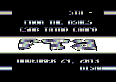
Intro Creation Competition 2013
Achievements :
C64 Demo Competition at Intro Creation Competition 2013 : #32
Credits :
| Code | .... | Six of Cincinnati Commodore Computer Club, Dark Lords of Chaos, HVSC Crew, Scene World Magazine, Style |
| Graphics | .... | Six of Cincinnati Commodore Computer Club, Dark Lords of Chaos, HVSC Crew, Scene World Magazine, Style |
| Text | .... | jcompton of From the Ashes |
| | | Six of Cincinnati Commodore Computer Club, Dark Lords of Chaos, HVSC Crew, Scene World Magazine, Style |
| Concept | .... | jcompton of From the Ashes |
SIDs used in this release :
Download :
Look for downloads on external sites:
Pokefinder.org
User Comment
Submitted by Hammerfist on 5 December 2013
| @Daison: Apparently they do so in stereo, cause you said it twice :) |
User Comment
Submitted by daison on 5 December 2013
Nice idea, but needs more polishing imo.
And the high notes make my ears bleed :s |
User Comment
Submitted by daison on 5 December 2013
Nice idea, but needs more polishing imo.
And the high notes make my ears bleed :s |
User Comment
Submitted by Hammerfist on 2 December 2013
| I like the color scheme and the text. But what's wrong with Baby Got Back?? Although I get a great nostalgic vibe from this intro, I'm not that impressed. 4/10 |
User Comment
Submitted by Dr.j on 29 November 2013
| Nice effect in the logo (which i don't see for a lot of time) but the music just killing me ear. think for a better logo design and a different choice of music could make nicer here. anyway very nice intro |
User Comment
Submitted by Six on 28 November 2013
| There was *something* further that could have been done with it, either through patterning better or changing the color motion itself to a more organic pattern - I ended up pressed for time and never refined it further. I'm open to suggestions on how that technique can be better leveraged. |
User Comment
Submitted by TheRyk on 28 November 2013
| Good mix of well-known but never-out-of-fashion-raster-fx and sth different in the logo coloring. Think that effect might have even looked better in a rather linear-shaped logo. Definetely a very nice one. |
|
|
|
 | Search CSDb |
|
 | Navigate |  |
|
 | Detailed Info |  |
|
 | Fun Stuff |  |
· Goofs
· Hidden Parts
· Trivia
|
|
 | Forum |  |
|
 | Support CSDb |  |
|
 |  |
|


