|
| |
Website :
https://github.com/Compyx/uglyuglyugly
Released At :
Intro Creation Competition 2018
Achievements :
C64 Demo Competition at Intro Creation Competition 2018 : #50
Credits :
SIDs used in this release :
Download :
Look for downloads on external sites:
Pokefinder.org
User Comment
Submitted by B3L4 on 13 January 2019
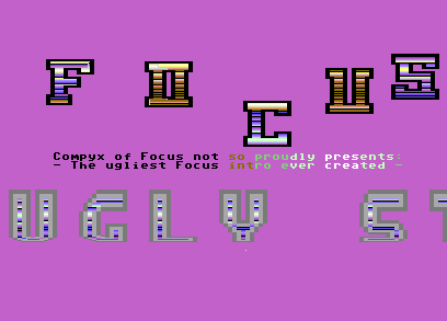
I swear I can smell rainbow unicorn fart....
Still cool in a way. |
User Comment
Submitted by ChristopherJam on 13 January 2019
| So refreshing to see a stretcher anchored at the bottom rather than the top for a change. Lovely rasters inside the letters, too. |
User Comment
Submitted by Jammer on 11 January 2019
| It is quite ugly but I cannot underrate the code ;) |
User Comment
Submitted by 0xDB on 10 January 2019
| Sprite stretching/warping is still cool. |
User Comment
Submitted by Compyx on 7 January 2019
| I just managed to vote for myself, I wish I voted higher. Why did I vote an 8? |
User Comment
Submitted by Compyx on 20 December 2018
| That was the original idea. Also makes the color cycling of the "presents" text a lot more ugly, too much background color :) |
User Comment
Submitted by DKT on 20 December 2018
User Comment
Submitted by The Phantom on 17 December 2018
My stretcher isn't that freakin' smooth, and it drives me crazy as to why. I keep thinking I'm reading the sinus table wrong, that I have to get a bit more mathy with it :)
(then again, I have 2 splits with mine)
But still...
Nice... Er... Ugly intro.. Totally ugg.. |
User Comment
Submitted by Compyx on 16 December 2018
Well, I tried to make it real ugly, ie not-focus style. And I got bored with it :)
On to the next intro, which might be less ugly.
Edit: to see the real ugliness, change $d025/$d026 writes in the DYSP to $d021 writes :) |
User Comment
Submitted by TheRyk on 16 December 2018
I've seen (and done) uglier :)
Code: solid sideborder action, Design: maybe another scroll font and less coder-colors would add cowbell enough |
|
|
|
 | Search CSDb |
|
 | Navigate |  |
|
 | Detailed Info |  |
|
 | Fun Stuff |  |
· Goofs
· Hidden Parts
· Trivia
|
|
 | Forum |  |
|
 | Support CSDb |  |
|
 |  |
|


