|
| |
Credits :
SIDs used in this release :
Download :
Look for downloads on external sites:
Pokefinder.org
User Comment
Submitted by plagueis on 15 November 2014
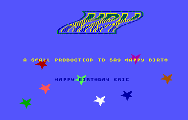
| It's amazing how much I 'pooched the screw' on the design here. Even forgot to set priority on at least one or both stars over/under scroller. And yes, the logo was terrible because "I DREW IT!" :) |
User Comment
Submitted by Tim on 17 July 2009
| ah darn.. no rotating stars? except for the logo this is uber-cute :) |
User Comment
Submitted by plagueis on 12 July 2009
User Comment
Submitted by The Shadow on 12 July 2009
| The rotating characters is a cool and fresh effect! |
User Comment
Submitted by daison on 12 July 2009
Taking it from the screenshot I was kind of hoping the start would be moving an rotating too, but nevertheless this is a sweet product and a very nice way to wish TP a happy birtday.
The tech looks smooth (but the colors... ;)
Anyway, you just keep on making progress and it already makes me excited about your next product. Keep it up m8!
p.s. better late than never; happy birthday Eric! :) |
User Comment
Submitted by plagueis on 11 July 2009
| hahaha, Glad you liked the demo...I had a lot of fun making it! |
User Comment
Submitted by The Phantom on 11 July 2009
Nice B. Thank you very much :D
My wife took me camping for my birthday. She also gave me a kick ass purple sunburst electric guitar (purple is my favorite color). I've only played with it for 20 minutes (tuning it) and then she took me camping :O
I'm about to have some leftover cake, a cup of coffee and then play guitar.
I really enjoyed this production. Nice flow to it and I can finally see what you meant with the rotating characters. The tech-tech came out very nice too.
I'm glad you've taken to ml so quickly. I think you've already surpassed my coding skills, if not, you soon will. Keep up the good work and let's not make any future project a nightmare ;) |
User Comment
Submitted by tbolt on 11 July 2009
| @Darth Plagueis: yep, the video mode was the problem. Maybe more planning in the future for parts and layout, colors, effects, that sorta thing. Good you're moving along in the learning process. |
User Comment
Submitted by JackAsser on 10 July 2009
:D
@Kickback: Did I just spot you use the 'part' word instead of the 'page' word. Man, have I converted an NTSC-scener? :D |
User Comment
Submitted by Kickback on 10 July 2009
My head is rollin LOL!!! Nice little part and I guess TP is getting older and older GEEZER!
|
User Comment
Submitted by plagueis on 10 July 2009
| @Thunderbolt: If you see flickering then you are either running in PAL mode, or you are multitasking too much with the emu in Windows. It runs great on my NTSC c64 and on my Vice in NTSC mode. I now test all my demos on the real c64...now that I have a MMC Replay it's fast and easy. |
User Comment
Submitted by tbolt on 10 July 2009
Good old tech-tech, but seems like lots of flickering in there. Maybe the emu is to blame?
|
User Comment
Submitted by Conrad on 10 July 2009
Quote:OK, who is TP?
The Phantom |
User Comment
Submitted by NecroPolo on 10 July 2009
I just can't read the rolling text in places :) It feels a bit like picking wine from a bottle with chopsticks.
That is, part of the fun, I guess :D |
User Comment
Submitted by Stainless Steel on 10 July 2009
User Comment
Submitted by Moloch on 10 July 2009
Looks like the old phrase "Hobbit'ed Colors" is coming back in style! ;)
|
User Comment
Submitted by plagueis on 10 July 2009
| @Groepaz: heheh, yeah, the damage came when I drew and colorized the logo assuming a black background. Then I decided to retrofit the logo with colors which fit the new scheme for the demo page...but not necessarily the style and usage of the logo. Nevertheless, I coded my first tech-tech effect...which taught me how to properly count cycles...and then the 2nd goal of this project (aside from the birthday cheer!) ...porting the character rotation effect from a demo viewed on my Amiga 500. My greatest satisfaction in developing this production was getting the characters rotating. But as a logo graphician...my journey has obviously just begun. |
User Comment
Submitted by grennouille on 9 July 2009
| Refreshing! Sounds and look like one of those cutie japanese games! Bravo! |
User Comment
Submitted by chatGPZ on 9 July 2009
| yay, only ntsc people can come up with such color combinations for a logo :o) |
User Comment
Submitted by Jon on 9 July 2009
User Comment
Submitted by grennouille on 9 July 2009
| As soon as I'm home I'll check this freshly looking demo. Now if only this workday would end... |
|
|
|
 | Search CSDb |
|
 | Navigate |  |
|
 | Detailed Info |  |
|
 | Fun Stuff |  |
· Goofs (1)
· Hidden Parts
· Trivia
|
|
 | Forum |  |
|
 | Support CSDb |  |
|
 |  |
|


