|
| |
Credits :
| Code | .... | Buzz |
| | | Digit of Abnormal, Bonzai, Exult |
| | | Fist of Illusion |
| | | Power |
| | | Rocky of Illusion |
| | | ZTH of Abnormal, Panoramic Designs |
| Music | .... | Drax of Crest, NATO, Unitech Designs, Vibrants |
| | | Geoff Follin |
| | | Markus Schneider of Lords of Sonics, X-Ample Architectures |
| | | Metal of Abnormal, Contex, Unitech Designs |
| | | Tornado of The Golden Triangle, The Shadows |
| | | Ziphoid of Active, Razor 1911, SceneSat |
| Graphics | .... | Buzz |
| | | Davinci |
| | | Merlin of Vision |
| | | Power |
| | | SIT |
| Design | .... | Power |
| | | ZTH of Abnormal, Panoramic Designs |
| Charset | .... | Buzz |
| | | Moonray of The Shadows |
| | | Power |
| | | Thomas |
| | | Thomas Heinrich of X-Ample Architectures |
| Linking | .... | ZTH of Abnormal, Panoramic Designs |
SIDs used in this release :
Download :
Look for downloads on external sites:
Pokefinder.org
User Comment
Submitted by iAN CooG on 5 April 2015
User Comment
Submitted by Rough on 5 September 2007
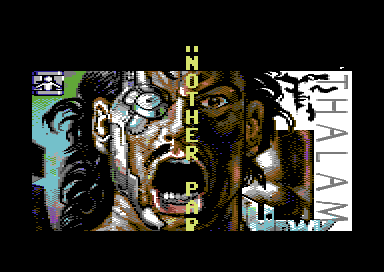
Fine with me, but take a screenshot from the Hawkeye picture part, not the intro.
Having it here to see at a click raises chances to find its source. |
User Comment
Submitted by Hein on 5 September 2007
| ai, Rough, you removed my version of the screenshot. :) Why not compremise; add a screenshot with Pepto palet and without PAL emulation? These bright colours are quite horrible. (Light red is definately brighter than orange, and not like the screenshot you uploaded) |
User Comment
Submitted by Stainless Steel on 5 September 2007
| Its a copy of this : this |
User Comment
Submitted by Deev on 5 September 2007
| I like this version of the Hawkeye pic much better than Robin Levy's picture that was used in the game. Agreed the palette in the screenshot does it no favours. |
User Comment
Submitted by HCL on 5 September 2007
| @RouGh: I thought we all agreed on Pepto's palette being the most c64-like. Vice's default palette is also not that bad, but this looks like from another planet! That's all i wanted to say :). |
User Comment
Submitted by Sander on 5 September 2007
| Damn - i think the sign actually says 'SIT'! :) |
User Comment
Submitted by Rough on 5 September 2007
@HCL: I do. I dont like screenshots which look like from an 80s television set with too pale colours, I used to have a sharp monitor.
@others: that sign in the left upper corner could be a symbol for some painter
@Twoflower: the original loading pic is that: http://www.gb64.com/Screenshots/H/Hawkeye_1.png |
User Comment
Submitted by Twoflower on 5 September 2007
| Might have been a ditched loaderscreen from some Hawkeye-preview? Or is this the one used in the game - can't remember? The case of ditched and leaked loaderscreens are quite common, I have one from Bangkok Knights, atleast one from Rubicon, one from Druid, etc. This one is more than possibly made by Robin Levy. |
User Comment
Submitted by Sander on 5 September 2007
| Looks like it's based on the Hawkeye screen, and i think it's signed with Hawk... (does it help?) |
User Comment
Submitted by Hein on 5 September 2007
| What silly programmer decided to add an 0gly upscroller on top of that great picture? |
User Comment
Submitted by HCL on 5 September 2007
| Who started to add screenshots with dutch colorscheme?!? looks like spectrum or smtg to me.. not c64 :(. |
User Comment
Submitted by Rough on 5 September 2007
| For years I wondered who did this marvellous picture (last part), there are no credits inside the demo. Maybe someone knows?!?!??! |
|
|
|
 | Search CSDb |
|
 | Navigate |  |
|
 | Detailed Info |  |
|
 | Fun Stuff |  |
· Goofs
· Hidden Parts
· Trivia
|
|
 | Forum |  |
|
 | Support CSDb |  |
|
 |  |
|


