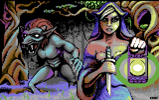
|
| |
 |
Released by :
Ooz
Release Date :
3 October 2010
Type :
C64 Graphics
(MultiColor)
|
Released At :
X'2010
Achievements :
C64 Graphics Competition at X'2010 : #23
Credits :
Download :
Look for downloads on external sites:
Pokefinder.org
User Comment
Submitted by katon on 13 March 2023
User Comment
Submitted by redback on 16 September 2011
| Love it! I could only dream to pixel multicolour this good |
User Comment
Submitted by Mermaid on 16 May 2011
User Comment
Submitted by The Shadow on 29 January 2011
| This is very well made :) |
User Comment
Submitted by Iapetus/Algarbi/Wood on 12 October 2010
| Congrats it is a very good picture! Me wants more of these :) |
User Comment
Submitted by booker on 10 October 2010
User Comment
Submitted by wacek on 9 October 2010
Being completely repetitive: welcome to the c64 scene, a splendid debut picture, should be ranked much higher, I want more of this!!! :)
And by the way, it brings back the argument that gfx & msx compos should in fact remain anonymous and with paper votes. I keep wondering how much better for example this pic would do in the compo, if it was organised in that way. Just a thought. |
User Comment
Submitted by Tim on 7 October 2010
| weird.. I should copy/past every word Moloch said below! |
User Comment
Submitted by irwin on 5 October 2010
23th place? hmm, of course deserves higher, i agree with Veto and others, but in other side - 23 is good number to start - Michael Jordan
;) |
User Comment
Submitted by Morpheus on 4 October 2010
| Well done! Great pixel-pushing. This is why I love multi colour the best. Definitely deserved a higher position. |
User Comment
Submitted by Moloch on 4 October 2010
| This brings back memories of quite a few title screens for commercial releases. Really like the "pixel feel" you get with the view. Would like to see more in the near future. |
User Comment
Submitted by assiduous on 4 October 2010
| ranked way too low indeed. a sweet mc picture,only the lamp glow could use afew more touches i think. go go Agenda,bring us some more :) |
User Comment
Submitted by Oswald on 4 October 2010
| love the unconventional use of colors, the feel that every pixel is in its perfect place, and the style of the whole. perfect! and what yazoo said :) |
User Comment
Submitted by Yazoo on 4 October 2010
| yes - it looks not converted unlike alot of others. thats what i like. and it also doesnt follow the actual nufli hype which is another plus for me :) i really like this and also think it should be placed alot higher. if i could i would swap my #7 with this atleast. |
User Comment
Submitted by Wile Coyote on 4 October 2010
If I voted at X2010, it might have gone something like:
#1 Dont Turn/Ooz
I really like this picture. I think its my favourite from X2010. I love all the obvious manual labour.
#2 25 Years of Yie Ar Kung-Fu /Veto
Great NUFLI image, and manages not to look like a ZX Spectrum image. The foliage to the lower left works really well. Im not to sure about the female to the left.
#3 Must Ache the Moustache /Duce
Great use of hires. Upper and lower border always gets a thumbs up. I dont know what it is, but some hires seem a bit more ZX Spectrum than others.
Good to see a lot of entries to this years X, just too bad many of them look like they have at some point be passed through a converter. |
User Comment
Submitted by saehn on 4 October 2010
| Wow, great for a first release. Hope to see more from you. You've already got a style, now we'll see how well you continue to adapt it to the C64! Should have placed higher, agreed. And yeah, that face does remind me of Archmage's work a bit, cool. Please keep pixelling on the C64, OoZ... |
User Comment
Submitted by Hoild on 4 October 2010
| Nice storybook illustration graphics. We seems to be having a good time thanks to all the graphicians from other platforms discovering the C64. |
User Comment
Submitted by Steppe on 4 October 2010
| The motive is boring to me. And I don't like the beasts penis. Bah! ;-) |
User Comment
Submitted by v3to on 4 October 2010
| great to see ooz art on c64. agree that this one should have been placed way higher. my only issue with this pic is the opaque light of the latern. simply love the fearytale atmosphere... lovely. |
User Comment
Submitted by DeeKay on 4 October 2010
| This is definately some soild pixelw0k here, like the face best! This guy can also do black outlines that don't look like shit, which few people manage to do! ;-) Should rank way higher! |
User Comment
Submitted by Frantic on 4 October 2010
Maybe the motive of the girl staring towards the viewer has some slight resemblance to some Archmage picture, but when it comes to the technique I don't see much resemblance to Archmage's work here..
Anyway.. Nice "pixelled" feeling in this one. |
User Comment
Submitted by Malmix on 4 October 2010
| This one is really great! Reminds me a bit of archmage style... Ranked #23??? tough compo :) |
|
|
|
 | Search CSDb |
|
 | Navigate |  |
|
 | Detailed Info |  |
|
 | Fun Stuff |  |
· Goofs
· Hidden Parts
· Trivia
|
|
 | Forum |  |
|
 | Support CSDb |  |
|
 |  |
|


