|
| |
Website :
http://c64pixels.com/diggr/monroe6569
Released At :
C64pixels.com Double Screen Compo
Achievements :
C64 Graphics Competition at C64pixels.com Double Screen Compo : #3
Credits :
Download :
Look for downloads on external sites:
Pokefinder.org
User Comment
Submitted by Golara on 27 March 2018
User Comment
Submitted by Tao on 12 July 2011
| For some reason I like the 64-version better than the original. Guess I might be too much of a pixelhead :P |
User Comment
Submitted by Medicus on 12 May 2011
| oh wow.... the signature is not wired... |
User Comment
Submitted by saehn on 12 May 2011
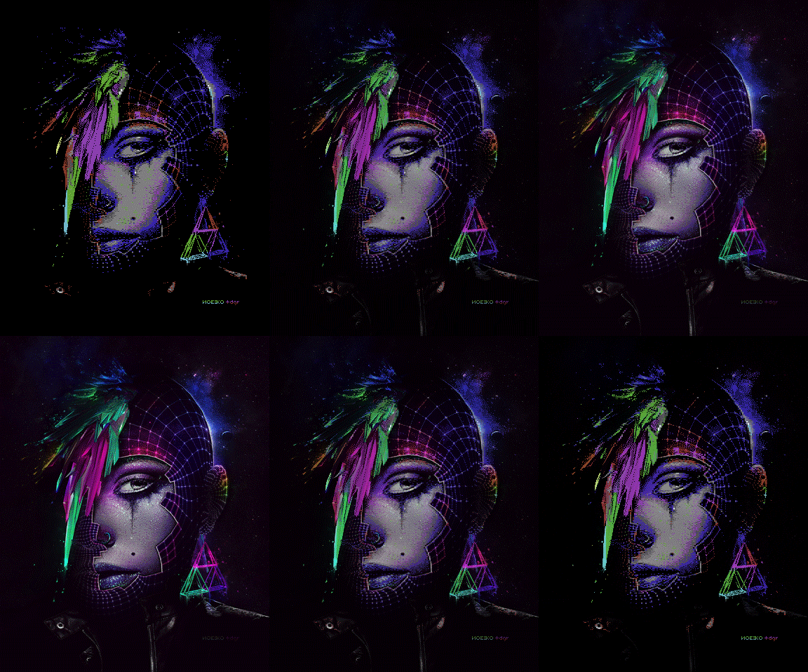
Thanks for posting your tool online, very cool! Here is the image compared to the original:
 |
User Comment
Submitted by hedning on 9 May 2011
| It would be nice with more original graphics in this competition. It's one thing to be inspired, another thing to copy. It looks nice, though... |
User Comment
Submitted by Hoild on 8 May 2011
| Many refreshingly "un-C64-ish" graphics in this compo. This is my personal number one. |
User Comment
Submitted by Jak T Rip on 8 May 2011
| WOW! The pic and the TRONish style are amazing. But even more cool is that charset mode / editor you wrote for it. Keep it up! |
User Comment
Submitted by Oswald on 8 May 2011
| ammazing, looks like a non c64 pic, still love it :) |
User Comment
Submitted by Nitro on 8 May 2011
| Awesome effort with the picture and own editor! |
User Comment
Submitted by Celtic on 8 May 2011
| My personal favourite, even with the new entries by Yazoo and Twoflower (which are completely awesome aswell). This one just kicks ass. It is great to have Digger back, and even better his gfx are awesome! Well done sir! |
User Comment
Submitted by Digger on 8 May 2011
Thanks for all the comments - it was quite challenging to do it using chars (and limited palette). I've ended up coding my own editor actually, it's available online (and soon as open source with the .asm for the viewer)
http://c64.blog2t.net/slixed/ (Adobe Flash plugin required)
Let me know what you think. |
User Comment
Submitted by Mermaid on 8 May 2011
| Wile Coyote: We'll just have to agree to disagree on that one, it looks great to me as it is. |
User Comment
Submitted by Wile Coyote on 8 May 2011
@Mermaid
The large purple chunk looks fine.
The vertical cyan meets green in an abrupt fashion at tip of hair is the area I refer to.
A couple of well place sprites would have worked wonders.
UPDATE: Having seen the source image behind Monroe 6569 has altered my original views. While Diggers take on the original is proportionally accurate, he has failed somewhat in recreating the sparkle present on Monroe 3000 / Noeeko. The sparkle really makes the original what it is. |
User Comment
Submitted by Mermaid on 8 May 2011
Great use of char mode.
Wile Coyote: Large chunk of cyan? I don't see much cyan except a tiny bit at the tip of the hair? Did you mean the chunk of purple? |
User Comment
Submitted by Yazoo on 8 May 2011
User Comment
Submitted by Ed on 8 May 2011
User Comment
Submitted by Motion on 8 May 2011
User Comment
Submitted by Wile Coyote on 8 May 2011
The face looks great, as does the ear ring. There's something about the hair that bothers me, it might the large chuck of cyan.
Also, I see a parrot wedged in the front of someone's face :)
If I was asked to pick a winner from this 2 screen compo, Monroe 6569 would be 2nd to Cargo. |
User Comment
Submitted by Cresh on 8 May 2011
User Comment
Submitted by Cruzer on 8 May 2011
| I think we have a winner! |
User Comment
Submitted by Ksubi on 8 May 2011
| Wow! Amazing pic, love the colour combinations. |
User Comment
Submitted by v3to on 8 May 2011
| the graphic is done in charset |
User Comment
Submitted by Skate on 7 May 2011
| is this hires or what? :) amazing picture. |
|
|
|
 | Search CSDb |
|
 | Navigate |  |
|
 | Detailed Info |  |
|
 | Fun Stuff |  |
· Goofs
· Hidden Parts
· Trivia
|
|
 | Forum |  |
|
 | Support CSDb |  |
|
 |  |
|


