|
| |
Website :
http://c64pixels.com/twoflower/cargo
Released At :
C64pixels.com Double Screen Compo
Achievements :
C64 Graphics Competition at C64pixels.com Double Screen Compo : #2
Credits :
SIDs used in this release :
Download :
Look for downloads on external sites:
Pokefinder.org
User Comment
Submitted by Jok on 20 April 2013
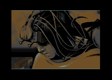
great picture, really good palette, composition and well choosen motif
not often i write opinion like this about 1x1 copies but this one have extraordinary execution |
User Comment
Submitted by hedning on 18 May 2011
| You took a nice pic, enhanced it, put yourself in it and added a perfect atmosphere. It's a good example of how you can be inspired by a pic, copy some bits, maybe, but still add enough of your own work to make it quite unique. |
User Comment
Submitted by Yogibear on 11 May 2011
| It is better if you invent everything yourself but now and then "an inspiration" is ok! |
User Comment
Submitted by The Shadow on 10 May 2011
User Comment
Submitted by Sledge on 9 May 2011
| Very good, Blomman. This picture is really nice and enhance the feeling of the original subject indeed! Top vote from me! :D |
User Comment
Submitted by JCB on 9 May 2011
| Any supplied info on sources should really have been posted in prod notes or something when the images were uploaded here (whoever uploaded them) or by the artists themselves. |
User Comment
Submitted by Twoflower on 9 May 2011
User Comment
Submitted by Mermaid on 9 May 2011
User Comment
Submitted by JCB on 9 May 2011
User Comment
Submitted by Isildur on 9 May 2011
User Comment
Submitted by Hoild on 8 May 2011
| Many refreshingly "un-C64-ish" graphics in this compo. This is my personal number two. |
User Comment
Submitted by Stone on 8 May 2011
| Awesome picture and my personal favorite. So stylish and moody. I don't think the format does it justice though. |
User Comment
Submitted by Linus on 8 May 2011
| Wow! My fav from the compo for sure. |
User Comment
Submitted by Jak T Rip on 8 May 2011
| Wow, stunning work! Let's have more unusual gfx compos like this. |
User Comment
Submitted by Yazoo on 8 May 2011
| good, that there was the overtime, so this could compete. |
User Comment
Submitted by Celtic on 8 May 2011
| This is fantastic sir! The colour are beautifully chosen, and especially the cyan pixels are placed particularly exciting. I am in awe! |
User Comment
Submitted by Cruzer on 8 May 2011
| Great sci-fi pic with cool alternative palette. And nice to see my routine found some usage. |
User Comment
Submitted by Slator on 8 May 2011
| wow, nicly done, me really likes |
User Comment
Submitted by FATFrost on 8 May 2011
| 2flower this is awesome. Great details hidden within. Palette is one of my faves too. More koala werkz please. :) |
User Comment
Submitted by Wile Coyote on 8 May 2011
Atmospheric - moody.
Great theme. There's definitely more stuff of interest going on on the right side.
The music - Green Beret Loader inspired ?
UPDATE: Cargo has become my favourite pic from the compo.
UPDATE 2: Interesting to see the reference image posted by Mermaid. Originally I thought Twoflower had based the face on reference material, possibly added in the hair / wires, and invented a backdrop. All those thoughts have gone out the window. But still, its a good image based on a good image. |
User Comment
Submitted by Ksubi on 8 May 2011
| Really stylish presentation. I actually like the limited palette used here, the orange/grey/cyan suits the scene perfectly. Great work! |
User Comment
Submitted by Skate on 8 May 2011
| gray with orange combination is really interesting but i liked the result. i like pictures like this one which have completely "pixelled" feeling. :) |
|
|
|
 | Search CSDb |
|
 | Navigate |  |
|
 | Detailed Info |  |
|
 | Fun Stuff |  |
· Goofs
· Hidden Parts
· Trivia
|
|
 | Forum |  |
|
 | Support CSDb |  |
|
 |  |
|


