|
| |
|
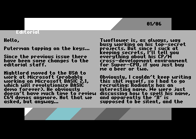
Nordic Scene Review #8 [2014] |
Credits :
SIDs used in this release :
Download :
Look for downloads on external sites:
Pokefinder.org
User Comment
Submitted by Oswald on 3 February 2014
| double redraw doesnt matter, since you can start reading right away, instead of staring at a blank screen. |
User Comment
Submitted by Skate on 3 February 2014
I thought NSR was over. It's a real nice surprise. :) I read more than half of the reviews and i'll keep reading the rest.
@Oswald: Since sideborders are open, it would probably double the page flipping time. It's much better as it is. |
User Comment
Submitted by STF on 28 January 2014
| Nice design, very pleasant to read :) |
User Comment
Submitted by psych on 28 January 2014
User Comment
Submitted by Yogibear on 28 January 2014
User Comment
Submitted by Oswald on 28 January 2014
| really excellent indeed, very nice clean design, following these days' trends. it doesnt bother me that its not showing article titles, but I'd rather opt for seeing the screen being redrawn, that would reduce the wait when flipping pages. |
User Comment
Submitted by TheRyk on 27 January 2014
| visual presentation with fullborder and also music(!) are really nice. Personally, I don't neeed dozens of tunes in each mag, some track otions are always nice, though), few other points I'd criticize were already mentioned. All in all, preeetty good. |
User Comment
Submitted by Perplex on 27 January 2014
Great stuff, please keep them coming!
Puterman: "Shift lock, anyone?" At least one of the effects in the demo does indeed loop while shift lock key is down, I guess we ran out of time or simply forgot to add that feature to other parts, and yet again quite a few effects aren't really suitable for looping. |
User Comment
Submitted by The Shadow on 27 January 2014
Written in English. What more can one ask? Overall this is a great presentation.
More please :) |
User Comment
Submitted by Scarzix on 27 January 2014
I would like to see a few improvements in the fresh new Diskmag design:
1) explanation when I hover an icon, or perhaps an inventory, in modern GUI design, you dont lure the user, you tell them what to expect, so a little "introduction" on each section.. or
2) A general disposition/list of all articles to expect.
3) Headlines in different color, or inversed chars
4) thumbnails from the demos you are writing about
5) more music to choose from, the tune is fine, but to me gets very stressful after 2 loops. Cant read to that type of tune. Nice tune, but its not a diskmag tune for me. Guess I am getting too old.
But all in all, nice and refreshing design.
Shame you missed the music in "Gammal Man", its was supposed to be a singalong tune so everyone could learn how to sing the intro text + the scroller actually explains the story about Gammal Man. But hey, you cant win everyone's taste, can you? ;-) |
User Comment
Submitted by bepp on 27 January 2014
| Yes! Highly enjoyable reading! Puterman/Radiant(silent X) combo works very well. Good engine too (Mager!) and suiting soundtrack which which keeps on going. Thanks guys! |
User Comment
Submitted by chatGPZ on 27 January 2014
User Comment
Submitted by cg on 27 January 2014
| Nice one, focus on the content! Here's to the "revival" of NSR. <3 |
User Comment
Submitted by Doc Strange on 27 January 2014
| Nice read and love Twoflower's minimal design. |
User Comment
Submitted by Conjuror on 27 January 2014
Great read, I like the style of the reviews, a conversion between puterman and radiantx. Gives it a late night movie review show feel to it with good pace.
Nice feel to the outfit and of course good that it goes into the borders. One thing, could we have the demo titles in another colour? And maybe some icons of puterman and radiantx sitting in big leather chairs facing a round coffee table? :D
Really enjoyed this as demos are my focus and thanks for the fair review of SUD. |
User Comment
Submitted by Rough on 27 January 2014
User Comment
Submitted by Ninja on 26 January 2014
| Yaaaay, welcome back! Technically good presentation - and even more important: Awesome read, had some good laughs. Very pleasant surprise! |
User Comment
Submitted by Twoflower on 26 January 2014
User Comment
Submitted by Marq on 26 January 2014
| The First Ball is not pure C, but C+asm :) |
User Comment
Submitted by Archmage on 26 January 2014
| I made a huge shrimp sandwich and had a really good read! Thanks guys! |
User Comment
Submitted by ϵʟʞ on 26 January 2014
Very nice reader! I like it is fullscreen over border and not 8x8 chars dependent also with IRQ loader!
Perfect work! |
User Comment
Submitted by Response on 26 January 2014
| Excellent! Reading my ass off atm :) |
User Comment
Submitted by Frantic on 26 January 2014
| I didn't expect a new issue to come out so early! |
User Comment
Submitted by Cruzer on 26 January 2014
User Comment
Submitted by MagerValp on 26 January 2014
| Hooray for my magsys finally being used! |
User Comment
Submitted by hedning on 26 January 2014
User Comment
Submitted by Frantic on 26 January 2014
|
|
|
 | Search CSDb |
|
 | Navigate |  |
|
 | Detailed Info |  |
|
 | Fun Stuff |  |
· Goofs
· Hidden Parts
· Trivia
|
|
 | Forum |  |
|
 | Support CSDb |  |
|
 |  |
|


