|
| |
Website :
https://github.com/magic-roundabout/refix-2017-c64
Released At :
Intro Creation Competition 2016
Achievements :
C64 Demo Competition at Intro Creation Competition 2016 : #15
Credits :
Download :
Look for downloads on external sites:
Pokefinder.org
User Comment
Submitted by Joe on 29 December 2019
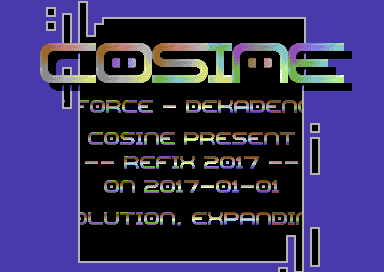
Lovely! Small things such as the slightly distorted rasterbars in the chars does much.
I would wished for more "holes" masking the screen. But that one "window" works! |
User Comment
Submitted by Jak T Rip on 1 February 2017
| Stunning music! And style. |
User Comment
Submitted by Frantic on 8 January 2017
| I have mixed feelings. I like some of that Amiga stuff that this could be said to be influenced by, but at the same time I think it looks worse on the C64 (lacking all those wonderful shiny copperlists and stuff) and therefore loses some of its original virtue. Some stuff just looked sooo good on the Amiga. :) |
User Comment
Submitted by Shadow on 8 January 2017
User Comment
Submitted by Hammerfist on 8 January 2017
| The first time I saw it, I admit I didnt like it much, but after giving it a chance, I must say it has a lot of interesting little details that made me change my mind. The music is very good, befitting a grander production, and I love the uncommon color scheme, odd design elements around the frame and in the border and that the scroller is also visible in that separate cut-out on the left. |
User Comment
Submitted by jailbird on 7 January 2017
| A similar approach to design was very popular on Amiga in the early to mid-90s (before they started to mimic the PC scene). Plenty of examples in Spaceballs, Melon Dezign, Anarchy, Lemon., The Silents, Virtual Dreams, Sanity, Kefrens (etc) stuff from their prime years. And a quite inspirational period for us, since the style could be easily translated to C64 (and it still isn't overused here). |
User Comment
Submitted by Oswald on 7 January 2017
| its all slight variations on the same (albeit cool) idea imho. |
User Comment
Submitted by jailbird on 7 January 2017
| The design of Domination has a focus on white outlines combined with black pseudo-shadows, whilst EoD's design is based on thick black outlines, not light ones. Domination has a prevalent blue background so I kind of understand Krill's association, but other than that, I don't really see too much resemblance. Also, toying with the outlines is a quite straightforward conclusion, there are probably dozens of releases with somewhat comparable design. |
User Comment
Submitted by Oswald on 7 January 2017
| edge of disgr. has the same outlines... |
User Comment
Submitted by jailbird on 7 January 2017
| I missed this one till now, beautiful! <3 |
User Comment
Submitted by T.M.R on 7 January 2017
@Krill: The design is a reworking of a mid 1990s intro i did; i got the idea for the uneven edges from somewhere but not consciously from Domination's outfit. =-)
The colours are just the ones i always use really... |
User Comment
Submitted by Krill on 7 January 2017
Colours make me think of some early Apex games, co-incidence? :)
Design reminds of Domination #12 and later, co-incidence? :)
Anyhow, great stuff! |
User Comment
Submitted by Yogibear on 4 January 2017
User Comment
Submitted by Pad on 2 January 2017
| Great design, and splendid music! |
User Comment
Submitted by celticdesign on 1 January 2017
User Comment
Submitted by Cruzer on 1 January 2017
User Comment
Submitted by ws on 1 January 2017
| @T.M.R: no joke - it actually happened to me before :-D thats honestly why i asked. |
User Comment
Submitted by Oswald on 1 January 2017
| very nice, amongst the most beautiful ones so far :) |
User Comment
Submitted by T.M.R on 1 January 2017
| @wertstahl: Yes, the timing of the rasters is deliberate and the odds of it all lining up correctly by accident are pretty low... |
User Comment
Submitted by ws on 1 January 2017
| Beautiful design and sound! But... whats wrong with the rasterbars? Total desync - is that intended? |
User Comment
Submitted by chatGPZ on 1 January 2017
User Comment
Submitted by Dr.j on 1 January 2017
| great one! really one of the coolest around ! |
User Comment
Submitted by Motion on 1 January 2017
| Good looking intro! I'm loving the cover of the Amiga module, Macrocosm. <3 |
User Comment
Submitted by Xenox on 1 January 2017
User Comment
Submitted by DKT on 1 January 2017
|
|
|
 | Search CSDb |
|
 | Navigate |  |
|
 | Detailed Info |  |
|
 | Fun Stuff |  |
· Goofs
· Hidden Parts
· Trivia
|
|
 | Forum |  |
|
 | Info on other sites |  |
|
 | Support CSDb |  |
|
 |  |
|


