|
| |
Credits :
Download :
Look for downloads on external sites:
Pokefinder.org
User Comment
Submitted by Electric on 18 December 2023
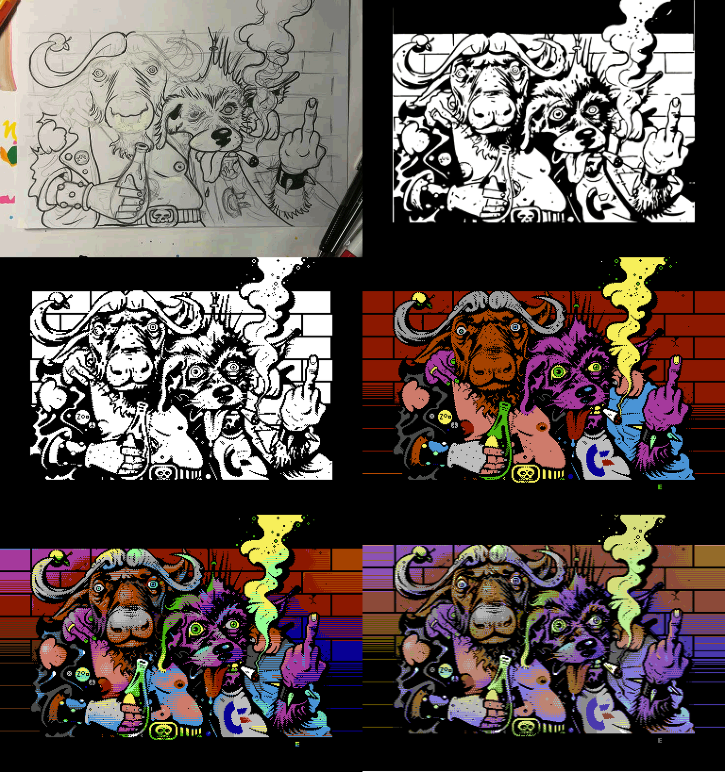
Based on inked pencil sketch done on paper in ca. size of A4. Pixeled in PhotoShop with a touchpad.
Workstages:

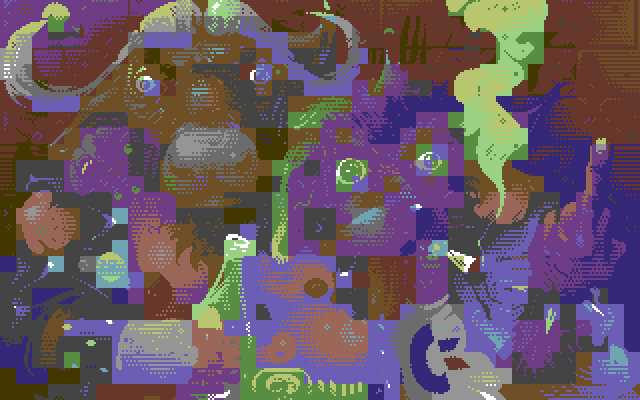
The image uses an overlayed interlaced sprite field on top of hires image. The interlace causes ‘bleeding’ from under the sprite pixels (that are 2x1 pixel in real) which forced me to check ‘what’s under’ and manually fix it. The actual hires image looks like this (minus black):
 |
User Comment
Submitted by Morpheus on 18 February 2021
| I only saw this one a few days ago... Damn Electric! Superb work. |
User Comment
Submitted by Norvax on 15 January 2021
| Electric's gorgeous graphics with CopyFault's unique viewing engine made my day today. |
User Comment
Submitted by Electric on 16 October 2020
@Viscid – thanks! I did have something else planned for X'20 though ;)
Anyway, now when there's a year to wait still I'll prolly work on something extra again – 2-3 pics to choose the actual compo one from… OR most likely be lazy until fall '21 and then finish the pic I had planned in a hurry. |
User Comment
Submitted by Viscid on 16 October 2020
| Wonderful picture as always... thanks for the stages. Would have won X2020 ;) |
User Comment
Submitted by Yogibear on 11 October 2020
User Comment
Submitted by LMan on 5 October 2020
| This is insane! Massive kudos. |
User Comment
Submitted by Electric on 4 October 2020
| Hey! There were some questions if I could work out a digital print out of this. Would someone here be interested in buying such? Size A1 (840 x 594 mm), quality print, signed & numbered. That'd be like 30€ + shipping (+-10€ inside Europe). PM me if interested. |
User Comment
Submitted by Dr.j on 2 October 2020
| oh my fuckin' god ! this is beautiful work!!! 11/10 |
User Comment
Submitted by hedning on 2 October 2020
| Only real hw counts, and there the flicker is not bad at all. <3 And, also, who needs Amiga? |
User Comment
Submitted by ptoing on 2 October 2020
| Yeah, if I turn down the brightness on my 1084S enough I can get it to not flicker at all, with still being bright enough. Really nice pic either way. Might try something along these lines at some point. |
User Comment
Submitted by DKT on 2 October 2020
| On my C64C + TV (AV) it doesn't flicker or trembles too much, and mostly on lighter regions only. Great work! |
User Comment
Submitted by Cupid on 2 October 2020
| You cheated, you know how to paint! |
User Comment
Submitted by Digger on 2 October 2020
| Amazing code CF and great piccy Electric! I wonder if someone tried Mufflon on this yet? |
User Comment
Submitted by rail slave on 2 October 2020
| This transcends the machine, breaks the pixel wall and becomes a diskcover |
User Comment
Submitted by BokanoiD on 2 October 2020
| It doesn't get more awesome than this. Why can't I vote 11. |
User Comment
Submitted by Electric on 2 October 2020
| @Copyfault I was indeed about to ask if the sprite colours could be tabled as well. So, maybe I'll work on that with the next image on the mode. Would it as well be possible to lace the sprite colours? |
User Comment
Submitted by Copyfault on 2 October 2020
It makes me really happy to read some comments on the code:) Thank you all for mentioning!
But ofcourse, code is always/most of the time "in the background", especially when combined with such pure graphical awesomeness!
@Algo: the mode is similar to you MUCSU Hires, but here rather MUCSO (overlay sprites are used). The displayer code does not change sprite colours, but it'd be an easy feature to implement (check out the tons of "waste cycles"-spots in the cycle sheet;)) |
User Comment
Submitted by Shastar on 2 October 2020
User Comment
Submitted by Oswald on 2 October 2020
| love how creatively the side rasters were done, apart from the overal superb pic ofcourse, just nobody noted that :) |
User Comment
Submitted by Toggle on 2 October 2020
| Brilliant! I'll just leave another 10 here hoping you'll keep your pics coming, Electric. |
User Comment
Submitted by Electric on 2 October 2020
| Btw, I think it'd be possible to make a converter for the mode (un modé). The hires image should have always the darker option of the two cols for the parts that are under the black. This concerns the screen area of course only, and images such as this which uses black as global colour. In case the global one is different the case will change completely. |
User Comment
Submitted by Electric on 2 October 2020
| @algorithm I'm honestly a dropout when it comes to more advanced C64 graphic modes. I really did not think this would be something totally new, but maybe the approach of having the outlines 'separated' is bit non-C64. The idea came from the fact that once you work with hires (with just 2 cols per char) you're always in trouble if you use outlines – black (or dark) already 'consumes' the other colour and then you're left with just one… which usually leads to major colourclashing. |
User Comment
Submitted by HCL on 1 October 2020
| Outstanding, definitely! Some strange coloring here and there, like the body of the bull in light blue makes him look kinda sick.. Then, an entirely purple daog is of course just normal :D. Love it! |
User Comment
Submitted by Bitbreaker on 1 October 2020
| I very much love the workstages and the process of creating this. The nipples of the left character have a better outcome in one of the worksteps with a pink/red colouring though :-P |
User Comment
Submitted by KAL_123 on 1 October 2020
| Outstanding picture. Definately a highlight. Take my 10 points. |
User Comment
Submitted by algorithm on 1 October 2020
| Nice both in grapical quality as well as gfx mode (I believe this implementation was not done before) - 3 hires colors per 8x8 with third color being universal throughout the image - sprite x interlaced) 10/10 |
User Comment
Submitted by Flex on 1 October 2020
| Outstanding! Finally it is released. |
User Comment
Submitted by Dymo on 1 October 2020
User Comment
Submitted by ilesj on 1 October 2020
User Comment
Submitted by Electric on 1 October 2020
| Carrion, I considered mostly nothing :). Would've been wiser I suppose, but I still think you can't reach the same result with other modes. I might be wrong though, not a specialist on more advanced stuff. Anyway, after years with pure hires I've again started to try out something else as well. Why I wanted the colours to be stable is the fact I wanted to mix them without flickering. |
User Comment
Submitted by Carrion on 1 October 2020
Really Cool!
@Electric
It looks like it could be NUFLI. Did you considered this mode or not at all? |
User Comment
Submitted by Electric on 1 October 2020
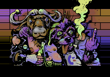
Thanks for the comments! This was very much a test on this 'mode' that’s prolly nothing that new – just the idea to use the sprites to make the outlines and hires to do the colouring might be something that has not been done before.
Anyway, the code here is kinda special and having all the extra toppings along the screen area is purely thanks to Copyfault. This flickers too much of course, but I think I'll give the mode another try with something else than black as the 'global' colour. |
User Comment
Submitted by Steppe on 1 October 2020
User Comment
Submitted by Ghost on 1 October 2020
User Comment
Submitted by booker on 1 October 2020
User Comment
Submitted by Snabel on 1 October 2020
| Hehe, spot on <3 These two guys looks exactly like (insert name of any C64 sceners here). I love it! |
User Comment
Submitted by Dr. TerrorZ on 1 October 2020
| I just had to view the image on the 1084S, trying different adjustments to reduce the flicker. Great picture and a very clever use of the border! |
User Comment
Submitted by ptoing on 1 October 2020
| This came out really neat. :) |
User Comment
Submitted by psych on 1 October 2020
| As a big fan I can only say that I'm speechless. Your art is so unique. Love it to the bone. |
User Comment
Submitted by Motion on 1 October 2020
User Comment
Submitted by Mibri on 1 October 2020
User Comment
Submitted by Mixer on 1 October 2020
| Good work with the viewer! Neat trick using the sax when changing sprite pointers. |
User Comment
Submitted by hedning on 1 October 2020
User Comment
Submitted by FABS on 1 October 2020
User Comment
Submitted by Jammer on 1 October 2020
User Comment
Submitted by Shogoon on 1 October 2020
| Amazing! Cool comics vibes. |
User Comment
Submitted by Smasher on 1 October 2020
User Comment
Submitted by Joe on 1 October 2020
User Comment
Submitted by Mr. Spock on 1 October 2020
User Comment
Submitted by fieserWolF on 1 October 2020
User Comment
Submitted by Electric on 1 October 2020
After a year we finally get this out, this with the help of Copyfault – enormous thanks for the code.
This pic was actually meant to be out at Zoo'19 and it was shown there at the graphics compo receiving 3rd place. However, at the party it did not run properly (lacked the x-shift of the sprite layer) and only the screen area was shown. The release version here is very close to the actual ready 1st version I made, having border splits and sprites in upper and lower border (yes, they’re non-flicker on purpose).
From the package you may find Copyfault's documentation including the code, cycle sheets ++. The ZIP also includes the image workstages.
Also thanks to Ptoing all the help. |
|
|
|
 | Search CSDb |
|
 | Navigate |  |
|
 | Detailed Info |  |
|
 | Fun Stuff |  |
· Goofs
· Hidden Parts
· Trivia
|
|
 | Forum |  |
|
 | Support CSDb |  |
|
 |  |
|


