|
| |
AKA :
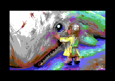
Beached Whale Pic
Released At :
Syntax 2009
Achievements :
C64 Graphics Competition at Syntax 2009 : #4
Credits :
Download :
Look for downloads on external sites:
Pokefinder.org
User Comment
Submitted by Jak T Rip on 3 January 2010
| ARRG! He did it again...! |
User Comment
Submitted by wozza on 10 November 2009
| 10/10 from me, I remember at the time saying to myself, 'that's just gorgeous!' |
User Comment
Submitted by Oswald on 9 November 2009
User Comment
Submitted by Jazzcat on 7 November 2009
WOW! This is easily the number one ranked entry in the gfx compo for me and I voted it so, dunno what weird drug the party go'ers were on, but this one rocked. MC HIRES PAINT BRUSH STYLER!
|
User Comment
Submitted by DRAX on 4 November 2009
User Comment
Submitted by Stainless Steel on 4 November 2009
| Archmage : maybe its a midget baby whale :-D |
User Comment
Submitted by Prowler64 on 4 November 2009
This is simply amazing!
I am seriously going to print it on paper and put it on my wall!! |
User Comment
Submitted by oys on 3 November 2009
| AMAZING! and i just love how the kid is tall enough to be able to touch the whale :) anyway, maybe the best hi-res picture from veto so far, simply STUNNING! |
User Comment
Submitted by saehn on 3 November 2009
| Archmage you envious fucker! ;-) Just kidding, but I have to disagree with you a bit. For me, the purpose of the picture is to convey the emotional interaction between the child and the whale. You mention that you acknowledge the picture's cartoonish-ness, but that still you want perspective to be addressed more accurately. Well, for me: is it recognizably a whale? is it recognizably a child? is the artist more concerned with the sub-context or the literal depiction? I mean, if we're so concerned with photo-realism, then I must say that we've chosen the wrong medium. Sure we can suggest form & volume, but those elements don't have to define a work, do they? These are just my questions & perspectives, obviously not absolute answers. Good topic for discussion... |
User Comment
Submitted by booker on 3 November 2009
As to the perspective there's actually only one thing that has caught my eye - the rest of the whale (where it gets coloured) looks a bit having too much bend. Thuss making it a kinda having different size from the head. For instance I would see it without the sky, but having more body...but I can't draw! ^^
As to Archmage's comment about the kid I disagree :) |
User Comment
Submitted by PAL on 3 November 2009
| I forgot one very important note here... my daughter at 6.5 years just loved it and asked if I could take it out on paper so that she could give it to a friend(christina) in school... That is love for the motive... and overall feeling I guess! |
User Comment
Submitted by v3to on 3 November 2009
thanks for all your comments and the nice words.
the motive was followed a gut feeling. the only plan was to do a more "pleasant" gfx than my recent ones, but i had no special idea. so i chose the first image i had in mind. overall i am satisfied with the result. imo the atmosphere is doing well and it is nice to look at.
@archmage: i am thankful for every differentiated view and there were also others who had controversial opinions about the pic. i am not exactly strong in compositing, so i try not to take my pixels too serious. you are right, there are issues left. depending the perspective the child just stretches out the hand towards the whale but its posture looks like touching it (in that case the shadowing is also spoiled in this area). |
User Comment
Submitted by Archmage on 2 November 2009
I'll be honest here.
First of all, I think Veto is good with making texture spring out of colour use, like the sky in his first picture and the whale skin here. What he does is not really pixelling per se, but the canvas and tablet approach is well done to the extent that I really prefer this to a lot of the crosspixeltechniques that after all these years has grown to be rather generic. I also think that this is Veto's best picture when it comes to subject matter. It is cleverly chosen in the sense that it is immediate as well as stimulating to the imagination.
My problem with this picture comes from the interplay between anatomy and perspective, which, in short, is off. It does not seem right that the character can touch the whale where he does when he stands where he does. And that applies even if you grant some slack for the characters cartoonish anatomy. And to me this bugs the eye too much for me to fully enjoy the picture. Consequently, a weak 8 from me.
And before you guys go calling me an envious fucker, let me just mention that I would never have written this much, or anything for that matter, had I not had deep respects for Veto as one of the scene's best artists. :) |
User Comment
Submitted by ne7 on 2 November 2009
| absolutely amazing picture. just amazing |
User Comment
Submitted by irwin on 2 November 2009
Best in compo, best hires pic on C64.
My vote 11/10 ;) |
User Comment
Submitted by Ninja on 2 November 2009
It is not only the breath-taking hires-technique in Veto's pictures, I absolutely love his motives. The atmosphere, expressions...for me this is story-telling. Stunning awesome, this one being my favourite so far.
|
User Comment
Submitted by NecroPolo on 2 November 2009
| Spectacular... You truly have a jawdropping technique and style. You really expand the limits of imagination - that's what makes our fav little old battered 8-bitters so special :) |
User Comment
Submitted by clonK on 2 November 2009
| Really like ur distinctive style. |
User Comment
Submitted by Krill on 2 November 2009
User Comment
Submitted by Almighty God on 2 November 2009
| Wauuuuu! amaizing mate, love it. |
User Comment
Submitted by PAL on 1 November 2009
| Personally I do not like the actual image of scene, but I just drop my jaw down and grasp for air as the image quality of the hires is just amazing, I just do not think I can remember anything this good beeing created before when thinking it is a hires image... but it holds a lot of colors this one... very hard work you have done here... should have been at first place in my mind for texh and skills, but as an image I am not that sure. It looks splendid. |
User Comment
Submitted by saehn on 1 November 2009
| What?! Fourth place? Disheartening... nothing against the 1st, 2nd, and 3rd winners but this is the most artistic piece, IMO. Crazy how compo voting works out... Boobies 'n dragons :-D |
User Comment
Submitted by Raffox|HF on 1 November 2009
User Comment
Submitted by Clarence on 1 November 2009
| Stunning work! Incredible details in this mode. |
User Comment
Submitted by Joe on 1 November 2009
User Comment
Submitted by Sasq on 1 November 2009
This might be the best HIRES picture ever made...
|
User Comment
Submitted by Yazoo on 1 November 2009
User Comment
Submitted by TWW on 1 November 2009
| Nice pic. Makes me wanna eat a whale steak (Yeah I'm Norwegian) |
User Comment
Submitted by GT on 31 October 2009
User Comment
Submitted by Skate on 31 October 2009
| Great pixel work + touchy concept. |
User Comment
Submitted by Jammer on 31 October 2009
User Comment
Submitted by psych on 31 October 2009
| Veto,my friend - you totally rule!! |
User Comment
Submitted by The Shadow on 31 October 2009
User Comment
Submitted by HCL on 31 October 2009
User Comment
Submitted by leonofsgr on 31 October 2009
| good picture veto! 10/10 ;_) |
User Comment
Submitted by Joe on 31 October 2009
User Comment
Submitted by JackAsser on 31 October 2009
User Comment
Submitted by Stainless Steel on 31 October 2009
| Love it. One really must admire the way Veto handles HiRes. |
User Comment
Submitted by Cresh on 31 October 2009

BTW
The best one from Veto (by now). |
User Comment
Submitted by Metal Maniac on 31 October 2009
User Comment
Submitted by Soren on 31 October 2009
| Amazing! This is the winning pic, if you ask me! |
User Comment
Submitted by booker on 31 October 2009
|
|
|
 | Search CSDb |
|
 | Navigate |  |
|
 | Detailed Info |  |
|
 | Fun Stuff |  |
· Goofs
· Hidden Parts
· Trivia
|
|
 | Forum |  |
|
 | Support CSDb |  |
|
 |  |
|


