|
| |
Released At :
KozMOS 2012
Achievements :
C64 Demo Competition at KozMOS 2012 : #8
Credits :
Download :
Look for downloads on external sites:
Pokefinder.org
User Comment
Submitted by Copyfault on 11 September 2013
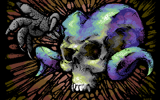
Great pic and a straight advice for how-to-do-hires-with-style even from a coder's view;)
@Groepaz: thanks for bringing this tool to mind, but unfortunatly we didn't care for basic (=non-fli-based) modes. Should be added to the 2DO-list for the still-in-the-making update of the ILM editor. Guess it'll take me ages to get done with it, if ever:/ |
User Comment
Submitted by Joe on 9 June 2012
Rethinking the text written for VN #59, which will surface this weekend. I come to think about the general multicolored bitmap mode, which afterall is my darling:
Upper/lower sprites, the hardware tricks of $3fff's or $d016 to make some really funky things for a rather simple screen, without whiping out the possibilities for fast loading, effects and other things ontop of it all.
Now... Why didn't I ever seriously learn how to code?! Or put differently, why didn't anyone do that one editor of freefloating splits and sprites :) |
User Comment
Submitted by Joe on 15 March 2012
I'd wish someone would code such an editor, with sprites, with multicolored bitmap + the possibility for rasters in the background. My god what a fantastic tool for creation within the economy of the mode, space and loading time in a demo...
Probably one of the most inventive acts since... |
User Comment
Submitted by Jak T Rip on 27 February 2012
| Awesome. And the idea to d016-shift the lines is simply ideal for hires! Great stuff and now that you think of it it's astonishing that it wasn't used before. |
User Comment
Submitted by DeeKay on 14 February 2012
| Really great picture, as always. also idea with the $d016 to hide the block-boundaries!... but how the hell do you pixel in this mode? Or convert it if you pixel it somewhere else? 8) Is there a c64 editor? |
User Comment
Submitted by booker on 7 February 2012
User Comment
Submitted by apprentix on 7 February 2012
User Comment
Submitted by Bago Zonde on 6 February 2012
First class art. Really interesting patterns.
|
User Comment
Submitted by Hoild on 6 February 2012
| Intricate and detailed pixel work, though the colour scheme on the horns is way too generic, and not particularly fitting for the theme and subject. |
User Comment
Submitted by Yogibear on 6 February 2012
User Comment
Submitted by MagerValp on 6 February 2012
User Comment
Submitted by Fresh on 6 February 2012
| Awesome picture! Thumb up! |
User Comment
Submitted by Skate on 6 February 2012
Beelzebub has a devil put aside for me... for meeee... for meeeeeee!!! :)
10/10 |
User Comment
Submitted by enthusi on 6 February 2012
Damn, had exacly that d016 concept in mind for some time now but was too lazy to consider an editor ;-) PLUS, I would not have been able to produce such a nice gfx no matter what ;-) Im not so sure about the motive though. I thought those diagonal blocks would help in particular when pixeling i.e. some skyscraper scene or things that are blocky in nature. Thus giving you 4 instead of 2 colors per 'cell'.
Extremely nice dither like this one was shown in other (of your) pictures as well and worked quite well, too.
Another downside of course is the relatively intense CPU usage in contrast to the basic HiRes mode.
It looks very good but Im sure it would have looked very good in traditional HiRes (+ your skills) in this case.
Cheers |
User Comment
Submitted by bepp on 6 February 2012
User Comment
Submitted by chatGPZ on 6 February 2012
you can probably edit it in the ILM editor?
edit: lol, f 0f00 1000 c8 ... and it still does look better than many other pictures released these days. =) |
User Comment
Submitted by Cruzer on 6 February 2012
| Cool, I like the mode too - d016 tweaked hires bitmap. Any of the common gfx editors that handles that, or did you have to make a homebrewn one? |
User Comment
Submitted by E$G on 6 February 2012
User Comment
Submitted by hedning on 6 February 2012
| Really, really cool! Great!!! |
User Comment
Submitted by Cresh on 6 February 2012
| Wow, once again you take it to another level! |
User Comment
Submitted by Soren on 6 February 2012
User Comment
Submitted by Cobra/Samar on 6 February 2012
|
|
|
 | Search CSDb |
|
 | Navigate |  |
|
 | Detailed Info |  |
|
 | Fun Stuff |  |
· Goofs
· Hidden Parts
· Trivia
|
|
 | Forum |  |
|
 | Support CSDb |  |
|
 |  |
|


