|
| |
Released At :
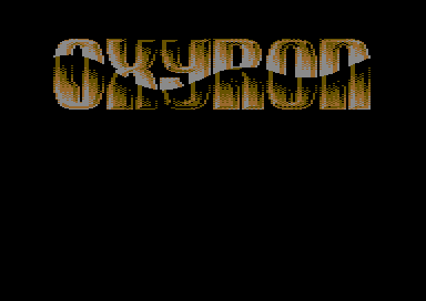
3-Color-Logo Competition 2013
Achievements :
C64 Graphics Competition at 3-Color-Logo Competition 2013 : #44
Credits :
Download :
Look for downloads on external sites:
Pokefinder.org
User Comment
Submitted by Raffox|HF on 1 March 2013
| Cool wavy chrome effect applied! |
User Comment
Submitted by BHF on 19 February 2013
| 89-91 style :D the best years, hehe. |
User Comment
Submitted by Fungus on 17 February 2013
| nice one, very old school. |
User Comment
Submitted by N3XU5 on 17 February 2013
| retro style ... awesome!! =) |
User Comment
Submitted by Bob on 17 February 2013
I didn't know that you where a closet artist ;)
wow now it turnsout ;) better late then never 8)=)
Awesome oldschool style logo, my taste of style ;)
Censor would have worked perfectly ;) hehe
|
User Comment
Submitted by Stainless Steel on 17 February 2013
User Comment
Submitted by Medicus on 16 February 2013
| I have never ever in my life seen this kind of pattern in a logo... mhh.. or have I? ;) |
User Comment
Submitted by Cobra/Samar on 16 February 2013
User Comment
Submitted by Cruzer on 16 February 2013
User Comment
Submitted by Testa on 16 February 2013
blinking my eyes... a top coder who is
pixeling a logo.. i wonder: is this made
from scratch?... it looks cool anyway |
User Comment
Submitted by PAL on 16 February 2013
| it is focus design style logo... I like that... great logo dude! |
User Comment
Submitted by Zyron on 16 February 2013
| I somehow get the feeling I've seen this before. |
|
|
|
 | Search CSDb |
|
 | Navigate |  |
|
 | Detailed Info |  |
|
 | Fun Stuff |  |
· Goofs
· Hidden Parts
· Trivia
|
|
 | Forum |  |
|
 | Support CSDb |  |
|
 |  |
|


