|
| |
Released At :
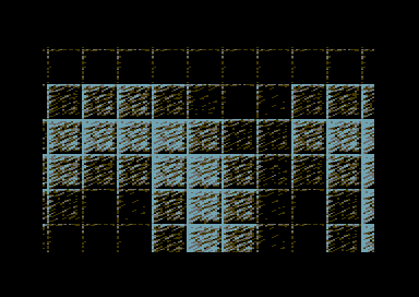
3-Color-Logo Competition 2013
Achievements :
C64 Graphics Competition at 3-Color-Logo Competition 2013 : #62
Credits :
Download :
Look for downloads on external sites:
Pokefinder.org
User Comment
Submitted by bepp on 6 February 2014
User Comment
Submitted by Shaun C on 2 March 2013
I've got to admit, I get a kick out of seeing bigass scrolling logos like this.
The shaded tiles are nicely done too.
|
User Comment
Submitted by chancer on 21 February 2013
| BIG UP yaself ;-) . I thought more would have twigged in the rules it did allow scrolling :) |
User Comment
Submitted by Skate on 19 February 2013
| i was expecting this from the moment i read compo rules. even mentioned it on facebook to some of my local scener friends 1-2 days ago. cruzer became the first one to do it. thumbs up pal! |
User Comment
Submitted by Perplex on 19 February 2013
| Fun idea, and deluxe execution as always! |
User Comment
Submitted by PAL on 19 February 2013
| God damn... Oswald... "the color pink WHICH IS NOT A MAN COLOR" not from me... bluish because I think that will fit better on top of here, not anything else... djezuz... I will now Edit my post bellow! And I know it is against the rulez... but make it as a small demo... you can do it... for the fun of it Cruzer... but maybe it is no fun... hmmm... great logo! |
User Comment
Submitted by bepp on 19 February 2013
| I like the way you're thinking! Out of the box :) |
User Comment
Submitted by Oswald on 19 February 2013
great joketro :)
btw from the "demos" topic:
"the color pink WHICH IS NOT A MAN COLOR"
and now here too:
"PSS: and no purple or pinkish sprites, make them blueish!" |
User Comment
Submitted by Didi on 19 February 2013
Thought about a little swinger as possible moving displayer but this is HUGE.
It's unexpected, but valid regarding the rules. I live and learn.
Most logos are judged by the screenshot without downloading it. Should be impossible with this one. ;) |
User Comment
Submitted by Cruzer on 19 February 2013
PAL: Sorry, sprites are against the rules :P
CONS: It uses $f2 chars, and warp mode is your friend.
Algorithm: Almost correct, except there are 18 shades.
The Dr.j: Just a little joke ;) |
User Comment
Submitted by Akira on 19 February 2013
User Comment
Submitted by Dr.j on 19 February 2013
Sorry for being rude but what is that?
|
User Comment
Submitted by enthusi on 19 February 2013
Took me only one swing to read it, unless it does not say what I think it does. Nice one.
Thumbs up for the quality scrolling :) |
User Comment
Submitted by iAN CooG on 19 February 2013
:O
theryk: why vague? " Logo is not limited to screen size. "
cons: fonts at $2000, there are $70 bytes unused at end, that is 14 unused chars. |
User Comment
Submitted by algorithm on 19 February 2013
| Have not run the program yet but I assume a chunky pixel is mapped to a 4x4 tile table which would allow 16 shades with each shade using 16 chars. |
User Comment
Submitted by TheRyk on 19 February 2013
Thumbs up, this happens if competition rules are too vague.
However, I also love it :) |
User Comment
Submitted by CONS on 19 February 2013
| The idea is good. Its really good actually. What i dont like is that withouth the knowledge that its a camelot release beforehand i guess you have to watch it at least 10 minutes to get what the logo says. And i don't have the endurance for that. How much of the 255 chars does this take? maybe one can improve the idea, by changing the tiles or the sinus it is moving in. |
User Comment
Submitted by PAL on 19 February 2013
I love this one and it actually shades itself so nice from peak in box and til lowest intensity one... loggs really nice.... come on Cruzer, make a mega insane multiplexer on top and a char logo mover that stay perfect in y but moves in x into the same so background logo and main logo and sprites move all different... .... would love that... with a JB tune ontop to make it perfect...
PS: and because you are the Cruzer, make the whole fucking background logo in border too...
PSS: and no purple or pinkish sprites, make them blueish!
PSSS: edit: because bluish color would make better image and nothing to do with anything else than that!
I like this one ! |
User Comment
Submitted by BHF on 19 February 2013
| What Yazoo said, its a bit hard to read. |
User Comment
Submitted by Bob on 19 February 2013
hahaha excellent... coders strikes back!
|
User Comment
Submitted by Yazoo on 19 February 2013
sorry. this is too small for my taste ;-)
nah, seriously. a bit hard to read because of the size, but i like it. its good to see something quite different in the compo. |
|
|
|
 | Search CSDb |
|
 | Navigate |  |
|
 | Detailed Info |  |
|
 | Fun Stuff |  |
· Goofs
· Hidden Parts
· Trivia
|
|
 | Forum |  |
|
 | Support CSDb |  |
|
 |  |
|


