|
| |
|
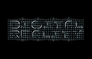
Digital Reality Logo [2013] |
Released At :
3-Color-Logo Competition 2013
Achievements :
C64 Graphics Competition at 3-Color-Logo Competition 2013 : #13
Credits :
Download :
Look for downloads on external sites:
Pokefinder.org
User Comment
Submitted by Raistlin on 7 February 2024
| Really awesome, this one - underrated in the competition I think, it should've come higher! |
User Comment
Submitted by sextone on 19 March 2013
User Comment
Submitted by redback on 14 March 2013
| Quite unique and very much in the spirit of the competition |
User Comment
Submitted by Sixx on 13 March 2013
User Comment
Submitted by NecroPolo on 12 March 2013
| That is awesome. Neo sends his greetings. |
User Comment
Submitted by celticdesign on 12 March 2013
| very fresh, very digital, very good work!!! |
User Comment
Submitted by Shine on 12 March 2013
| AWESOME! This rocks ... :) |
User Comment
Submitted by Bob on 12 March 2013
| like this one very much, Matrix styled ;) |
User Comment
Submitted by Tristan on 12 March 2013
| Fresh concept.. also one of my fav palattes. |
User Comment
Submitted by Wisdom on 12 March 2013
| The most original one in this compo so far. Very cool. |
User Comment
Submitted by Cresh on 12 March 2013
User Comment
Submitted by Motion on 12 March 2013
True art, as it makes the brain fill in the gaps. Thumbs up!
|
User Comment
Submitted by spider-j on 12 March 2013
| Looks very nice. One of those logos that scream for animation. Would work very well with moving background and animation of the letter outlines. |
User Comment
Submitted by HCL on 12 March 2013
User Comment
Submitted by Fungus on 12 March 2013
| I really like this, Bravo! |
User Comment
Submitted by Yogibear on 12 March 2013
User Comment
Submitted by Zierliches Püppchen on 12 March 2013
| Interesting Style ... if your intention lays on matrix ... u hit it ;-) lovely idea to use true, false bits with a light silhouette of the Digital Reality ... i like it |
User Comment
Submitted by Kristian on 12 March 2013
| There is a lot of neat stuff going on in this compo. Super nice work! |
User Comment
Submitted by PAL on 12 March 2013
| Even cooler! I must say... I could have that on my wall just beacause it is really cool... thanx for this one! It is such a cool demopart more, if that were animated and all... I like it much! |
User Comment
Submitted by Deaks on 12 March 2013
| The binary in the background isn't random. It's actually the title/signature/greets and an INC $D020 loop ;) |
User Comment
Submitted by PAL on 12 March 2013
| Very cool, like the concept, more a poster than a logo! We are in the matrix! |
|
|
|
 | Search CSDb |
|
 | Navigate |  |
|
 | Detailed Info |  |
|
 | Fun Stuff |  |
· Goofs
· Hidden Parts
· Trivia
|
|
 | Forum |  |
|
 | Support CSDb |  |
|
 |  |
|


