|
| |
 |
Released by :
JSL
Release Date :
11 April 2013
Type :
C64 Graphics
(MultiColor)
|
Credits :
Download :
Look for downloads on external sites:
Pokefinder.org
User Comment
Submitted by Jak T Rip on 9 May 2013
| Love it! Cool expression! |
User Comment
Submitted by St0rmfr0nt on 12 April 2013
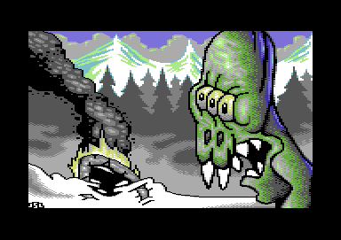
Whot? Not an Alien, it's Homer Simpson mutated after atomic explosion in the nuclear power station at Springfield ;o)
~ Like it ~ |
User Comment
Submitted by PAL on 12 April 2013
| the shadow on the ailien with the cold blue light from side is really making it shine. good work! |
User Comment
Submitted by Burglar on 11 April 2013
now this is nice pixeling. I like the blue shade on the back of the aliens head. and the background is cool too, maybe some more variation in the trees would've been nice.
and this is *a lot* better than Last Ninja. you can do it \o/ |
User Comment
Submitted by FATFrost on 11 April 2013
| Really good pic!!! great smoke and depth to the alien.... :) |
User Comment
Submitted by JSL on 11 April 2013
XIII: I use my sketches for c64 pics, and normally about 2-3 sheets of such sketches I come up with, all kind of strange puppets and figures, so when this is drawn by a 5 year old, you mean all my comicstyled sketches suck. Well, I can't do better. Then all my pictures I did for c64, suck. Nnoooo... I can't draw? check my deviantART for my drawings, real drawings, the link is here on my profile. And glad most of you do like the Alien picture. :)
|
User Comment
Submitted by dink on 11 April 2013
| Awesome pic, that alien looks like hes gonna eat the crashee's for lunch :) |
User Comment
Submitted by Shine on 11 April 2013
User Comment
Submitted by Oswald on 11 April 2013
| now this is one which I like a lot. cool smoke & alien & background ir all comes together. |
User Comment
Submitted by Cresh on 11 April 2013
User Comment
Submitted by Cruzer on 11 April 2013
User Comment
Submitted by TheRyk on 11 April 2013
| Especially in the background there IS some progress imho by not outlining EVERYTHING in black anymore. Not so sure about the crashed object and the alien. |
User Comment
Submitted by xIII on 11 April 2013
I like the background and the gradients. Also the use of colour is nice.
The alien looks like it was drawn by your 5 year old nephew on his first day in drawing school (it means I don't really like it). I've seen alot better pictures from you so I don't think this is progress. |
User Comment
Submitted by celticdesign on 11 April 2013
| nice one, i can see a cool animated demo part in here. paralax scrolling in the background. animated fire / smoke. the monster scrolls in... |
User Comment
Submitted by JSL on 10 April 2013
this one is one of my latest actually, from last weekend.. Not sure if there is progress to be seen.. Enjoy..
|
User Comment
Submitted by Yogibear on 10 April 2013
|
|
|
 | Search CSDb |
|
 | Navigate |  |
|
 | Detailed Info |  |
|
 | Fun Stuff |  |
· Goofs
· Hidden Parts
· Trivia
|
|
 | Forum |  |
|
 | Support CSDb |  |
|
 |  |
|


