|
| |
|
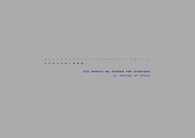
3x3 Should Be Enough For Everyone [2013] |
Released At :
Font Creation Competition 2013
Achievements :
C64 Graphics Competition at Font Creation Competition 2013 : #29
Credits :
Download :
Look for downloads on external sites:
Pokefinder.org
User Comment
Submitted by Jak T Rip on 26 August 2013
| btw, this is a 4x4 font. The spaces in between are required, too... |
User Comment
Submitted by N3XU5 on 21 August 2013
User Comment
Submitted by wacek on 21 August 2013
| This was never meant as a serious entry, so you can vote is as low as you please, I don't mind at all :) |
User Comment
Submitted by Jak T Rip on 20 August 2013
User Comment
Submitted by Deev on 19 August 2013
| Another one that serves its purpose very well, but I can't really give it a high vote as there's only one way you could really do this. |
User Comment
Submitted by WTE on 19 August 2013
The idea is NOT (!) new: Knoetie in Cave +3
[And I would expect much more other examples in other releases.] |
User Comment
Submitted by Viktor on 17 August 2013
User Comment
Submitted by wacek on 16 August 2013
| @Perplex: yes. I hate your eyes and I aim to destroy them. You shall all be nearsighted as I am! <evil_laughter> Bwahahahaha!! </evil_laughter> ;) |
User Comment
Submitted by Frantic on 16 August 2013
User Comment
Submitted by Wisdom on 16 August 2013
User Comment
Submitted by Axis/Oxyron on 16 August 2013
Very nice.
I guess this will be the new standard for DYPC-records. ;o) |
User Comment
Submitted by chatGPZ on 16 August 2013
User Comment
Submitted by Perplex on 16 August 2013
| Good effort! Liked how you presented it as green on light grey to make it even more readable. ;-) |
User Comment
Submitted by The Shadow on 16 August 2013
| Awesome font! V was the most practical way to make 5 for Roman numeral V. Just as 2 is II for Roman numeral II. |
User Comment
Submitted by hedning on 15 August 2013
| tokra: It can't, because V equals 5. ;) |
User Comment
Submitted by tokra on 15 August 2013
Neat! Now do lower-case :-)
Notes: M looks like A, could be a flipped W instead
5 looks like V, not sure how this could be improved |
User Comment
Submitted by WTE on 15 August 2013
| Hard to believe but it is readable. Thanks to the human brain! |
User Comment
Submitted by Skate on 15 August 2013
| naughty but smart solutions. :) |
User Comment
Submitted by Tao on 15 August 2013
User Comment
Submitted by wacek on 15 August 2013
Dedicated to Tao of Triad .
Hey man, I saw your 3x4 Pixel Font and decided to crank it up to a 'ridiculous' level.
Enjoy! ;) |
|
|
|
 | Search CSDb |
|
 | Navigate |  |
|
 | Detailed Info |  |
|
 | Fun Stuff |  |
· Goofs
· Hidden Parts
· Trivia
|
|
 | Forum |  |
|
 | Support CSDb |  |
|
 |  |
|


