|
| |
AKA :
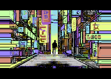
If you look well, you can find the cat!
Released At :
Flashparty 2021 Online Edition
Achievements :
C64 Graphics Competition at Flashparty 2021 Online Edition : #2
Credits :
Download :
Look for downloads on external sites:
Pokefinder.org
User Comment
Submitted by rodney/arise on 28 July 2022
User Comment
Submitted by LDX#40 on 16 September 2021
User Comment
Submitted by Frantic on 8 September 2021
User Comment
Submitted by Toggle on 8 September 2021
User Comment
Submitted by Deev on 8 September 2021
| This is great! Love the style, the colours and how you used the splits in the border. |
User Comment
Submitted by FABS on 7 September 2021
| Thanks so much for the comments and for the support mates! Really appreciated! :-) |
User Comment
Submitted by psych on 7 September 2021
User Comment
Submitted by Nordischsound on 7 September 2021
| HOOOOOLY F**K, this is your best work so for! Instand classic! |
User Comment
Submitted by MCM on 7 September 2021
| Super cool colorchoice, i like the borderwork. |
User Comment
Submitted by Flotsam on 6 September 2021
| Really cool use of d020. Well done! |
User Comment
Submitted by Monte Carlos on 6 September 2021
| Makes best use of Rasters in Sideborder. Cubism rule |
User Comment
Submitted by Yogibear on 5 September 2021
User Comment
Submitted by 4gentE on 5 September 2021
User Comment
Submitted by KAL_123 on 5 September 2021
| Very nice comic-like look and very colorful too. |
User Comment
Submitted by Joe on 5 September 2021
| @Fabs. Yeah exactly that! You really made it work! |
User Comment
Submitted by FABS on 5 September 2021
@Joe yeah you get it about the 'wrong' perspective lol, l put many "escape" points, the mind try to find a sense following them. Then the rasters add like a falling out effect (at least to me). With E$G we was chatting about the fake perspectives too.
I've started this pic in March 2020, then l put it on the side, then l continued it a bit in Feb and l put at the side again. Then l've finished it few days ago for this Flash party. :-)
Thanks to everyone for the support! |
User Comment
Submitted by ChristopherJam on 5 September 2021
User Comment
Submitted by jab on 5 September 2021
User Comment
Submitted by Shine on 5 September 2021
| Indeed, this is really fresh! :D |
User Comment
Submitted by Joe on 5 September 2021
The best thing about this image is that it doesn't follow perspective rules one bit :D
Atleast it has multiple vanishing points. And I don't care. Feels simply right! |
User Comment
Submitted by Jammer on 5 September 2021
User Comment
Submitted by katon on 5 September 2021
| I agree with Joe's comment |
User Comment
Submitted by Joe on 5 September 2021
| This feels really nice and fresh! |
User Comment
Submitted by Motion on 5 September 2021
| Excellent! Loving that border usage. |
|
|
|
 | Search CSDb |
|
 | Navigate |  |
|
 | Detailed Info |  |
|
 | Fun Stuff |  |
· Goofs
· Hidden Parts
· Trivia
|
|
 | Forum |  |
|
 | Support CSDb |  |
|
 |  |
|


