|
| |
|
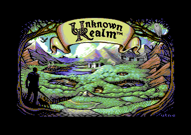
Unknown Realm Title Picture (unused) [2019] |
 |
Released by :
Pond [web]
Release Date :
14 December 2019
Type :
C64 Graphics
(MultiColor + Sprites)
|
Credits :
Download :
Look for downloads on external sites:
Pokefinder.org
User Comment
Submitted by hedning on 21 December 2019
| Groepaz: It feels that they have serious communication problems, if they 1. change their mind like that regarding rejection, and 2. think they have to give an artist permission to release her own work, even if it's based on their mockup. |
User Comment
Submitted by chatGPZ on 21 December 2019
"That artwork was *not* rejected by us, but it was released without our permission or any prior notice."
time to get popcorn |
User Comment
Submitted by Burning Horizon on 20 December 2019
| Great work, Vanja! It's a shame Stalling Dragon hasn't delivered it yet. |
User Comment
Submitted by ptoing on 20 December 2019
Good to see you posting something again. This is extra lovely.
Hope to see more again from you in the future and hope that all is well on your end :) |
User Comment
Submitted by Mermaid on 17 December 2019
Quoting TheRykThe picture is uber awesome, but all that sprite overlay stuff just for making the logo letters HiRes-ish?
I can't remember anymore if they asked specifically for it (pretty sure they did), I'd have to dig through old messages to find out, but I do know that when I was asked to do the picture they sent me their own early attempt at making a C64 version, and it had a single colour resolution logo:
 |
User Comment
Submitted by TheRyk on 17 December 2019
Bloody shame of not using this masterpiece, aside: The picture is uber awesome, but all that sprite overlay stuff just for making the logo letters HiRes-ish?
Toggle $d015 (sprites on/off) in VICE Mon via
>87d 00
>87d ff
On the other hand, amazing how great the picture itself looks in plain multicolor without hankypanky. |
User Comment
Submitted by HCL on 17 December 2019
| The world is full of assholes, sad to hear that story. The picture is truly awesome!! No doubt. |
User Comment
Submitted by Raistlin on 17 December 2019
| Oh wow, the colouring to me looks better than the version from the Kickstarter! Shocking how they treat you over this, that’s not a good way to do business... |
User Comment
Submitted by CreaMD on 17 December 2019
| After reading your story Mermaid, I think their problem is not life, but lack of experience. They are trying to deliver perfect product, (perfect image, in your case), but they don't know how perfect product should look, so they waste time tweking it ad absurdum, not seeing it's already good enough. It reminds me of my experience with t-shirt/apparel design versus final manufactured product. Many times I saw all the glitches and bugs in final production and I was disappointed, but my *experienced* customer always told me: don't worry everybody will see this as final product that was intended to be like that, and they will like it. |
User Comment
Submitted by Doc Strange on 16 December 2019
| This is great, amazing artwork. It's the actual Kickstarter being a total fail. Very disappointed with that project. |
User Comment
Submitted by MagerValp on 16 December 2019
| Terrific work, as always! You managed to squeeze an impressive number of details in the image — I think every single thing from the original? A little closer together, because, well, pixels. I still don't see how anyone could complain about it. |
User Comment
Submitted by Mermaid on 16 December 2019
Iirc, when they asked me to do the picture in the first place (because they liked the pictures I had done for Ultima IV Remastered), the deal was that if I was able to do the picture before their campaign ended they would write an update about it on their kickstarter page and mention Pond Software and Graham Axten's game The Bear Essentials which we were about to do a physical disk release of. I put everyhing else aside and delayed the release of Graham's game to finish the picture in time for them to post the update, thinking the extra publicity boost might help us flog a few extra copies. After several previews and fixes to the picture based on their feedback (plus some arguing about things where I stubbornly thought they were wrong, like the colour of the owl's eyes) I was sure I had a completed final picture with some days left to post the update, so I sent them this version with the sprite file and source code.
A few days went by without a reply, then I received a list of things they weren't happy with, including the character in the foreground, the scroll, my colour choices, specifically the use of dark blue. I asked for details on what needed to be fixed when it came to the scroll and character so I could try and finish it in time for them to post the update, the reply I got was that it would take too long to tell me in writing, it was too late. So that was the end of my involvement.
I still hope they finish the game one day, I did back the kickstarter campaign and I am convinced they plan to finish it. I do not think they took the money and ran, I think it's probably a case of life sometimes randomly punching you in the face, or biting over more than you can chew, or finding that things take longer than expected. Or all of the above. Best of luck to them, I hope they succeed in the end. |
User Comment
Submitted by Perplex on 16 December 2019
| Quite certain "unused" in this case means the game will never be released, sadly. |
User Comment
Submitted by Romppainen on 16 December 2019
| I could easily believe Vanja actually pulled it herself, it seems the devs just took money and ran so parting from whole project would't be bad idea at all. |
User Comment
Submitted by Frantic on 16 December 2019
| Perhaps they were allergic to quality. |
User Comment
Submitted by Mibri on 16 December 2019
| Amazing stuff, and it really does look just like the project's artwork on the Kickstarter page so God knows why they rejected it...?! |
User Comment
Submitted by Frantic on 16 December 2019
User Comment
Submitted by Steppe on 16 December 2019
User Comment
Submitted by FABS on 15 December 2019
User Comment
Submitted by Raistlin on 15 December 2019
| Amazing, really nice! I assume this was intended for a Rainbird adventure game - a crime if this was started but never finished ... |
User Comment
Submitted by GH on 14 December 2019
| Gorgeous and what a details! |
User Comment
Submitted by Mikael on 14 December 2019
| Kick Ass Image! Better than many title screens during the glory days of gaming! Very well done Vanja! |
User Comment
Submitted by Ksubi on 14 December 2019
| Multicolour magic by Mermaid! |
User Comment
Submitted by Yogibear on 14 December 2019
User Comment
Submitted by Digger on 14 December 2019
| Amazing that's just multicolour! Makes me want to pixel again :D |
User Comment
Submitted by aNdy on 14 December 2019
| Someone showed me this a long time ago and I couldn't believe those fools weren't going to use it. It's a beautiful picture, true C64 art. |
User Comment
Submitted by psych on 14 December 2019
User Comment
Submitted by iAN CooG on 14 December 2019
| Probably this was too good for the actual game :D |
User Comment
Submitted by Joe on 14 December 2019
User Comment
Submitted by Moloch on 14 December 2019
| Glad to see this image is now in the public eye. Fine craftsmanship here, superb image! |
User Comment
Submitted by Jammer on 14 December 2019
User Comment
Submitted by G-Force on 14 December 2019
User Comment
Submitted by hedning on 14 December 2019
| It is completely and utterly bizarre that they turned down this pic. Unbelievable. |
User Comment
Submitted by Carrion on 14 December 2019
User Comment
Submitted by Toggle on 14 December 2019
| Perfection! 10/10. Thanks for releasing this fantastic pic, Vanja! |
User Comment
Submitted by Smasher on 14 December 2019
User Comment
Submitted by bugjam on 14 December 2019
| If they really turned down that pic, I wonder what else they want to use... |
User Comment
Submitted by Dymo on 14 December 2019
|
|
|
 | Search CSDb |
|
 | Navigate |  |
|
 | Detailed Info |  |
|
 | Fun Stuff |  |
· Goofs
· Hidden Parts
· Trivia
|
|
 | Forum |  |
|
 | Support CSDb |  |
|
 |  |
|


