|
| |
Credits :
Download :
Look for downloads on external sites:
Pokefinder.org
User Comment
Submitted by Jak T Rip on 1 February 2017
User Comment
Submitted by HCL on 11 December 2016
| Lovely picture, and an even better discussion ;) |
User Comment
Submitted by rail slave on 9 December 2016
| Really like the space/starfield colors, creative |
User Comment
Submitted by Rock on 4 December 2016
| This looks amazing:) you did splendid job. |
User Comment
Submitted by Hoild on 4 December 2016
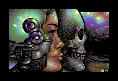
The face is flat and weird -- the lips seem to be pixelled in a different style than the rest of the face, and the jaw is huge and masculine.
Also, if that is supposed to be a helmet or some kind of cyborg skull replacement it looks out-of-plane with the face.
-But all that would be OK if only the shit was done in NUFLI. ;b |
User Comment
Submitted by ChristopherJam on 4 December 2016
| Love the glints on the helmet. |
User Comment
Submitted by Dr.j on 3 December 2016
| wow! great work Jailbird and Shine! this is absolutely great artwork! 10/10 |
User Comment
Submitted by The Phantom on 3 December 2016
| Awesome reply Jailbird, thanks. |
User Comment
Submitted by jailbird on 3 December 2016
| Oh Leon, nice to see that you still handle our arguments with a mature approach :) |
User Comment
Submitted by leonofsgr on 3 December 2016
| Dither perfect, but the ugly face and skull... pff... :_) |
User Comment
Submitted by Slartibartfast on 3 December 2016
User Comment
Submitted by Roysterini on 3 December 2016
Nice pic. My only real crit is that maybe the jaw/mouth area on the lady is a bit too prominent, jutting out a little.
Cool pic, nevertheless. |
User Comment
Submitted by Yogibear on 3 December 2016
User Comment
Submitted by Thierry on 2 December 2016
User Comment
Submitted by jailbird on 2 December 2016
Quoting The PhantomWho did what?
Shine provided the idea and pixelled most of the main subject, rest is me.
Quoting The PhantomWhy is the upper right corner not drawn to the top of the screen?
We have run out of paint. That would never happen if the picture was NUFLI! A lesson for the future. |
User Comment
Submitted by Dymo on 2 December 2016
| A really nice co-op.. good work! :) |
User Comment
Submitted by The Phantom on 2 December 2016
I've always wanted to do a co-op drawing.
Who did what? Why is the upper right corner not drawn to the top of the screen?
Amazing work from Jailbird and Shine.
10/10 ... 5 for each of you ;) |
User Comment
Submitted by Magic on 2 December 2016
User Comment
Submitted by FATFrost on 2 December 2016
| Nice stuff here, and nice too see Jailbaby doing more than poopingz. |
User Comment
Submitted by hedning on 2 December 2016
| Oh shit. This is awesome. |
User Comment
Submitted by jailbird on 2 December 2016
Quoting Oswaldexcept it feels flat
Indeed. But the flatness was more or less intentional, as the image started off from Shine with a lot of black outlines and I wanted to preserve as much as possible from the initial comic book like characteristics, whilst also trying to enliven the image with semi-realistic traits (what is more typical when it comes to my style). |
User Comment
Submitted by PAL on 2 December 2016
| I think she resemble Ellen Carlsen, sister of chess player Magnus Carlsen. |
User Comment
Submitted by Dr.Science on 2 December 2016
| Wow. This is some fantastic stuff! love it, well done guys! |
User Comment
Submitted by Oswald on 2 December 2016
| very nice, lovely distinct style, except it feels flat. pillow shading? oh and it would look much better in nufli :) |
User Comment
Submitted by jailbird on 2 December 2016
| @Jammah: LOL well I was aiming for a generic asian female but yeah, she really resembles Asia Carrera a bit :) |
User Comment
Submitted by Stinsen on 2 December 2016
| Unexpected co-op, great results! |
User Comment
Submitted by Jammer on 2 December 2016
| Asia Carrera? :O How vintage! :D |
User Comment
Submitted by Scarzix on 2 December 2016
| That is a really cool image you made there. Wish it had had my music on it. Would have been awesome to add some spacey tune. |
User Comment
Submitted by JackAsser on 2 December 2016
User Comment
Submitted by PAL on 2 December 2016
| cool coop image, really nice one. Them layers on the helmet is real cool... thumbs up to you both. |
User Comment
Submitted by chatGPZ on 2 December 2016
not even a blurry background with jesus rays?
lame |
User Comment
Submitted by WVL on 2 December 2016
User Comment
Submitted by jailbird on 2 December 2016
Just a small comeback release from my side. Based and developed on an idea from Shine. No copy ofcoz, and no references were used.
Thanks a bunch for the motivation/inspiration, Andy! :)
And as always: a happy little balltickle goes to Oswald for Project One. |
|
|
|
 | Search CSDb |
|
 | Navigate |  |
|
 | Detailed Info |  |
|
 | Fun Stuff |  |
· Goofs
· Hidden Parts
· Trivia
|
|
 | Forum |  |
|
 | Support CSDb |  |
|
 |  |
|


