|
| |
AKA :
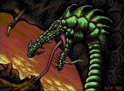
Dragonworld revisted
Credits :
Download :
Look for downloads on external sites:
Pokefinder.org
User Comment
Submitted by chatGPZ on 16 July 2011
| it always takes two for a discussion as far as i know. and it doesnt matter why it became one and who started it, it should still be moved into the forum. (wish that could actually be done with comments, that'd be an awesome mod feature, can you hear me perff? =P) |
User Comment
Submitted by STE'86 on 16 July 2011
| ah but it wasn't off topic. it was a comment on the release data. it became a discussion only when you trolled er sorry, "commented". |
User Comment
Submitted by chatGPZ on 16 July 2011
"comment by me on my release. always valid i think."
sorry, no. offtopic comments belong into the forum, no matter who started them. no special privilegues for the creator of an entry there.
|
User Comment
Submitted by STE'86 on 16 July 2011
er no, i think not. comment by me on my release. always valid i think.
moderator hat on by you when an argument hits the skids. |
User Comment
Submitted by chatGPZ on 16 July 2011
| the only thing that is obvious is that one got some more downloads and/or votes than the other. anything beyond that is your crystal ball interpretation and/or wishful thinking. (maybe if perff gives a damn, he can tell us the amount of external referrers). in any case, take these theories to the forum please. |
User Comment
Submitted by JCB on 16 July 2011
Don't think the point being made was proportion of votes to downloads, that was just an aside and what got Ste intrigued as to why. It's just that 200 downloads with 19-20 votes seemed rather high to Ste (comparative to HIS other uploads) especially when Ptoing's pic released around the same time has 37 downloads, until I pointed out to Ste that his pic had been linked on the c64.fans page on facebook :) Just shows that there must be an audience for this stuff who either rarely visit csdb or when they do, they miss stuff or just ignore it until it's put in front of their face.
Maybe thumbnails on the main page for releases (the one that lists new stuff, not the individual pages themselves) would interest people more.. oooo the pretty pictures!!
|
User Comment
Submitted by STE'86 on 16 July 2011
but it obviously is, isn't it?
2 pics released the same time one scoring 9.6 with 40 votes and 150 downloads with no outside publicity result just under 4:1 ratio. the "usual" result.
This one has 20 votes and just over 200 downloads making it 10:1, more than double the usual ratio. this one has had extra publicity from facebook. "the x factor". The people who, whether you like it or not, are not on here. |
User Comment
Submitted by chatGPZ on 16 July 2011
| the more downloads you get, the less votes you will get proportionally. no facebook involvement needed =) |
User Comment
Submitted by STE'86 on 16 July 2011
| well, i didnt say "extraordinary" i said "rather disproportionate" and looking at the usual ratio of votes vs downloads for my stuff then the ratio varies between 3:1 and 5:1. this one being 10:1 then yes, i surmise that it being the subject of a facebook article would actually be the reason for it. and I would also say bearing in mind that, as Vetos 9.6 scoring Room with a View has 158 downloads in the same time, that 200+ downloads for a picture in 2 weeks is actually quite unusual these days and obviously to do with extra publicity reaching people that aren't usually on here. |
User Comment
Submitted by chatGPZ on 16 July 2011
| or you could draw the conclusion that generally few people bother to vote =P (extraordinary high download numbers which originate from what you say would look more like they do in this entry. ~200 really isnt all that extraordinary :)) |
User Comment
Submitted by STE'86 on 15 July 2011
i see this one has a rather disproportionate ratio of downloads to votes. the result of it being "facebooked" by one of the c64 fan groups I imagine :)
i guess from this we can surmise that there is c64 life outside of the csdb 'verse. |
User Comment
Submitted by STE'86 on 5 July 2011
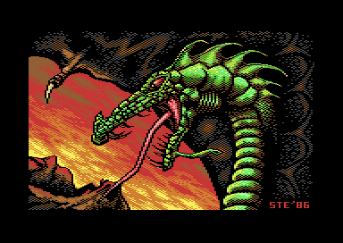
yes i know about the brown/dk grey thing. its down to the black bleeding more on the brown stipple than on the grey stipple and causing it to darken.
you can tell it's happening from Lemmings screencaps but i think its acceptable. it gives a weird "irridescent" effect so i can live with it. (leathery scaley wings being the cause and all the usual arty nonsense)
Veto told me about the effect when he tested it. but he didnt think it looked wrong. he just said it gives an "interesting effect" and followed it up with "looks like Wayne Schmidt" and i thought "that'll do for me" so i guess its horses for courses. |
User Comment
Submitted by Morpheus on 5 July 2011
User Comment
Submitted by DeeKay on 5 July 2011
Nice and much improved over the original version! ;-) The head does appear a bit too 2D in total if you ask me, and its right wing seems to be absolutely huge. Unfortunately the shading on the wing clashes with new VIC lumas, like with quite a few pictures (the shade orange-brown-dark grey should be avoided if you want to keep your pictures somewhat compatible, as it looks just wrong on the new VIC, where brown is darker than dark grey!)
Edit: Oh, and I think the sky is just perfect as it is, Steve! ;-) But I see where you're coming from standard multicolor and anything colorful diagonal causes a lot of headaches! 8) FLI ftw! |
User Comment
Submitted by STE'86 on 3 July 2011
| all i will say about the sky is that i found diagonal transitions are a bitch. they chew up your 3 colours quickly, and are far less flexible in their placement of pixels. if i was to do it again i "may" have opted for horizontal clouds which are far more "controllable" in their colour transition and pixel placement. their downside however is that they would look far less dramatic. |
User Comment
Submitted by chatGPZ on 3 July 2011
algorithm: releasing a proper library source is one of the many things on my todo list :) so far i can only offer a more or less working binary.
regarding the picture: i think the dithering works quite well. except one thing: the yellow stands out too much for my taste, i'd probably use a different color sheme for the "sky" part (maybe using violett or one of the greys on top of red/orange) |
User Comment
Submitted by Yogibear on 3 July 2011
User Comment
Submitted by algorithm on 3 July 2011
| Groepaz. Your pal emulation routine looks very promising. Would be great if you can release it. Just a open picture routine would be sufficient. |
User Comment
Submitted by josepzin on 3 July 2011
| I like it! Nice color contrast :) |
User Comment
Submitted by Rough on 3 July 2011
| Looks brill, would fit as title screen for the game Saint Dragon by Storm/Sales Curve. |
User Comment
Submitted by lemming on 3 July 2011
How does it look on real hardware? Brilliant! :-)
I have no idea about composite output, but here's direct chroma/luma-captures without any post-processing or hue/saturation/contrast/brightness adjustments:
C64A PAL 6569R1
C64B PAL 6569R3
C64II PAL rev.E 8565R2
C128D PAL (no idea about VIC didn't open it)
Remember that VIC-II:s are very much like SIDs so that there are differences among characteristics inside and outside of revisions, these include different amounts of bleeding, vertical shadowy lines, saturation and most things related to analog signal. :) For example a 6569R3xx84 (like used here) is guaranteed to look a somewhat different to a 6569R3xx85.
|
User Comment
Submitted by Motion on 3 July 2011
| Great re-work. Love the improvements - especially the wings. |
User Comment
Submitted by Wile Coyote on 3 July 2011
User Comment
Submitted by PAL on 2 July 2011
I remember on a lot of tellys this were the case, also that dark grey were dark as dark brown, but on my commodore monitor(stereo monitor or what it was, amiga monitor? a numper and the letter s behind) this were never the case. It were rock steady without any such stripes adding and the colors were great in my mind, that is why I always used dark gray as a lighter color than dark brown if you see what I meen.
On the real thing here in my flat on the tv screen(crt old sony good one) it gets stripes and sharpened in a way... if I connect the c64 to my 1080p HD home cinema it is more like on my old monitor.
The output that people had back in the days differed greatly from telly to telly or monitor to monitor... And also I have seen some c64 have more distortions than others and so on. |
User Comment
Submitted by STE'86 on 2 July 2011
| those of you viewing on a real c64/monitor, does the checker dither suffer from excessive vertical chroma striping? (alternate vertical character lines of chroma noise in the stipple). it was always a source of irritation on the real thing and something that doesnt show up the the same extent under any emulation. usually happened because of the "standard" artists monitor setting of hi contrast, low brightness and virtually full colour saturation :) |
User Comment
Submitted by Sixx on 2 July 2011
How does you make it look that good, Groe? Don't tell me is some sort of extra featue in MacVICE. =/
|
User Comment
Submitted by CreaMD on 2 July 2011
| It look great on my small Philips TV running C64 video through SCART. The purple/pink color that is on Groepaz's screenshot is red on the screen. Actually it looks pretty close to the screenshot. One of the browns used in lava as darkest color is darker (looks better than the screenshot) |
User Comment
Submitted by chatGPZ on 2 July 2011
| here is how it looks with the current version of my pal renderer (which is pretty close to how it looks on my c64 with 1701 monitor) |
User Comment
Submitted by Hoild on 2 July 2011
| Pretty GFX, but what we see on the screenshot is not a C64 GFX. I am also curious how it would look on a C64 -- I bet it will look quite different with proper PAL VIC-II output (or emulation). |
User Comment
Submitted by STE'86 on 2 July 2011
ok this uses some slightly unorthodox dithering and colour luma matchups. Any feedback on how this works out on a real c64 would be appreciated.
Thanks to PAL and Veto for running the initial tests on this for me. |
|
|
|
 | Search CSDb |
|
| Navigate | |
|
| Detailed Info | |
|
| Fun Stuff | |
· Goofs
· Hidden Parts
· Trivia
|
|
| Forum | |
|
| Support CSDb | |
|
 |  |
|