|
| |
 |
Released by :
Dane
Release Date :
27 August 2011
Type :
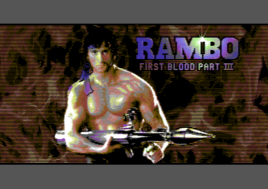
C64 Graphics
(MultiColor Interlace)
|
Released At :
Rambo Revisited - GFX Compo
Achievements :
C64 Graphics Competition at Rambo Revisited - GFX Compo : #1
Credits :
Download :
Look for downloads on external sites:
Pokefinder.org
User Comment
Submitted by Wile Coyote on 21 September 2011
Of all the entries into the Rambo Revisited compo Id say this is the most polished.
It reminds a little of what they do when they take something from the past, bring it to the present, and do what ever to bring it in line with what is perceived as current expectations, all the while limited by the quality of the original source material. Similar to what they do to films from the past when creating menu screens for DVD / Blu-ray |
User Comment
Submitted by aNdy on 27 August 2011
| Really captures the youthful appearance of Stallone from that era and the background is awesome! |
User Comment
Submitted by Hermit on 27 August 2011
| Amazing high contrast masterwork. Looks even better without the small flicker, and border speaks for itself, I don't understand the 2 points' vote... |
User Comment
Submitted by pievspie on 27 August 2011
User Comment
Submitted by Dane on 27 August 2011
Hahaha, this is what I get for finishing and uploading my entry in the middle of the night. I'll fix that pixel (and the two sprite color bugs in the right border) later today.
Edit: Taken care of! |
User Comment
Submitted by hedning on 27 August 2011
| What Monsieur Asseur said. |
User Comment
Submitted by JackAsser on 27 August 2011
| I think this picture is great but the only thing that annoys me is the extra pixel in the upper right corner of the roman digits III. :) |
User Comment
Submitted by CreaMD on 27 August 2011
| Ah finally someone paid a lot of attention to type too ;-) Very nice. This one really screams for checking on real things, so I'm going to do so. |
User Comment
Submitted by Wile Coyote on 27 August 2011
The fire in the background looks great. It looks more like fire, than an explosion.
It is good to see the colour white used as a highlight on Rambos skin, as thats was I was going to do during my original plans to enter a serious entry.
The static screen shot on display here works better than the interlaced .prg
When it comes to this Rambo reference, which I thought every one was supposed to stick to for the compo,
most seem to have opted for light grey, with a yellow background which is just wrong (as light grey is darker than yellow). |
User Comment
Submitted by Yogibear on 27 August 2011
|
|
|
 | Search CSDb |
|
 | Navigate |  |
|
 | Detailed Info |  |
|
 | Fun Stuff |  |
· Goofs
· Hidden Parts
· Trivia
|
|
 | Forum |  |
|
 | Support CSDb |  |
|
 |  |
|


