|
| |
AKA :
The human tile duplicate searcher strikes back
Released At :
3-Color-Logo Competition 2013
Credits :
Download :
Look for downloads on external sites:
Pokefinder.org
User Comment
Submitted by Bob on 8 March 2013
| cool. would like to se this in a demo as an FX.. gives you the feel of a snapshot in cool demo.. me like that! |
User Comment
Submitted by Smasher on 7 March 2013
| how is this possible to vote 1 or 2 for this fab artwork? shame on you! |
User Comment
Submitted by Slator on 3 March 2013
| the twister really kicks ass but the rest is a waste of pixels |
User Comment
Submitted by Raffox|HF on 1 March 2013
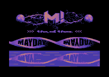
| Nice color shading! But this is not just a logo... it looks more like a screen capture of an intro, a good one too. |
User Comment
Submitted by Dr.j on 20 February 2013
I more than agree with Moloch post. myself looking for classic small logos
from the old cool intros like G*P , Ikari intros for example . its a matter of taste i know and this FullScreen pic is really awesome but.. |
User Comment
Submitted by Moloch on 20 February 2013
Yeah, its certainly not the first fullscreen graphic in the compo. The rules should have been a bit more strict maybe. But so far, I haven't found any of the fullscreen entries better than the traditional logo entries. Better quality out of a smaller screen area shows talent.
@The User - your example is a fullscreen graphic, the only part there that is a logo is the ESI letters. That intro is very typical of US intros of the time, most of them used a fullscreen graphic - plenty of examples from UCF also. |
User Comment
Submitted by TheRyk on 20 February 2013
Twister is excellent, and the rest of the screen is pretty neat, too, and it's not the first "fullscreen problem" entry. But I must admit that the "fullscreen critics" DO have a point imho. Less is more sometimes. I know that it's not your intention but filling the whole screen always arouses the suspicion that sb tries to get xtra attention for sth which doesn't really belong to the logo and, moreover, only distracts attention from it.
Great work, anyway, USER, lookin 4wd to see this one in a MYD! release animated by spider :) |
User Comment
Submitted by Cruzer on 20 February 2013
| Cool, lovely twistor, and incredible variation for 256 chars. Guess changing d800-colors is ok as long as there's still only 3+1 color. |
User Comment
Submitted by BHF on 20 February 2013
| The twister part of the Logo was cool, the rest was a bit messy and not my cup of tea. |
User Comment
Submitted by Dr.j on 20 February 2013
| A Killing one . Great Logo and impressive style. |
User Comment
Submitted by Tristan on 20 February 2013
| Delete the top two parts and the bottom part, leaving the main twist logo, and you got something. The reflection part is off alignment on X, on the right side. |
User Comment
Submitted by user on 20 February 2013
| @Moloch Every movie has an fullscreen logo from the Distributor, Studio and so on. Don't you call it logo because it is fullscreen? Another example would be THE famous intro logo from Eagle Soft Incorporated Intro (Eagle 1x1) . In my opinion it is not possible to be more oldschool than the eagle soft intro. |
User Comment
Submitted by Moloch on 20 February 2013
| More of a fullscreen graphic really |
User Comment
Submitted by Jok on 20 February 2013
Wow. This twister logo looks really great!
the rest is a bit messy imho |
User Comment
Submitted by spider-j on 20 February 2013
Very, very nice, mate!
P.S.: I want to make it move!!! :-) |
User Comment
Submitted by Urban Space Cowboy on 20 February 2013
| That's a pretty devious interpretation of the rules -- they don't actually say color RAM should all be the same, and so it isn't. More clever than all the Koala viewers submitted so far by a long shot. And exactly 256 unique chars, no more and no less! |
User Comment
Submitted by Oswald on 20 February 2013
| more like a demopart, cool, but rough around the edges |
User Comment
Submitted by Shine on 20 February 2013
| *respect* ... looks really nice! Good job user! :) |
User Comment
Submitted by Conjuror on 20 February 2013
| Looks great and its impressive that it fits in a charset. |
|
|
|
 | Search CSDb |
|
|
| Navigate | |
|
| Detailed Info | |
|
| Fun Stuff | |
· Goofs
· Hidden Parts
· Trivia
|
|
| Forum | |
|
| Support CSDb | |
|
 |  |
|