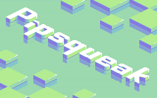
|
| |
Released At :
3-Color-Logo Competition 2013
Achievements :
C64 Graphics Competition at 3-Color-Logo Competition 2013 : #9
Credits :
Download :
Look for downloads on external sites:
Pokefinder.org
User Comment
Submitted by Shaun C on 25 March 2013
| Thanks for the comments + votes. This was a fun compo. Even though it's just a 3+1 colour logo, it feels good to finally release something instead of just thinking about it or starting but not finishing like i usually do. |
User Comment
Submitted by CRT on 23 March 2013
One of my fav 10/10. The old ant attack perspective talks to me.. and then it improved a lot more on that.
|
User Comment
Submitted by PAL on 23 March 2013
| i vote 9 but I must say that this palette is like some said something I have never like seen before and it is so exciting and so fresh... i vote 9 because I think there are one or two other logos in the compo that are even better but really, this is a 10! |
User Comment
Submitted by user on 6 March 2013
| This logo is awesome. The choosen palette is 'fresh'. I especially like the reflections. |
User Comment
Submitted by Raffox|HF on 2 March 2013
| Probably the choice of colors I like the most, so far. Well done! |
User Comment
Submitted by encore on 2 March 2013
| Love the colors and the isometric style, well done. :) |
User Comment
Submitted by E$G on 26 February 2013
| really nice, cool colors & 3d fx 9/10! |
User Comment
Submitted by Hammerfist on 25 February 2013
| Sweet! Does anyone else get an Amiga Hi-res Interlace vibe from this? Very tight, fresh colors and excellent execution of the idea! |
User Comment
Submitted by spider-j on 25 February 2013
first thought: yeah, looks good. second: what's a pipsqueak?
now:
hehe, after a quick look into dictionary I like it even more :-) |
User Comment
Submitted by Shaun C on 25 February 2013
| Thanks all for the comments :) |
User Comment
Submitted by Stone on 23 February 2013
| Sweet! This will be even nicer with some animation in it. |
User Comment
Submitted by DeeKay on 23 February 2013
| Very najs... I kinda expect the Spindizzy spinning top spinning through and bouncing off the blocks any second! ;-D |
User Comment
Submitted by Dr.j on 23 February 2013
| Very well designed . unique style and i like it |
User Comment
Submitted by Urban Space Cowboy on 23 February 2013
| Looks very Congo Bongo. :) |
User Comment
Submitted by Zierliches Püppchen on 22 February 2013
| I like the colors and Iso-Style ... roxx |
User Comment
Submitted by Isildur on 22 February 2013
User Comment
Submitted by BHF on 22 February 2013
| Wow, thats a different one. Love the colors /patterns. |
User Comment
Submitted by Tristan on 22 February 2013
| Beautiful and sharp! This really makes me wish this compo was a 3 color full screen pic compo. The logo itself is also stunning without the rest. |
User Comment
Submitted by Yogibear on 22 February 2013
User Comment
Submitted by tlr on 22 February 2013
| Sweet! Now just add the scroller... ;) |
User Comment
Submitted by Bob on 22 February 2013
| I really like this one ;) |
User Comment
Submitted by Deev on 22 February 2013
| haha like Veto and Yazoo, I was *also* working on an isometric logo, I was hoping I'd get in there first! Ah well, I have a couple more ideas :) Nice job, one of the best so far! |
User Comment
Submitted by psych on 22 February 2013
User Comment
Submitted by N3XU5 on 22 February 2013
| great work ... looks really awesome and i like the colors! =) |
User Comment
Submitted by apprentix on 22 February 2013
User Comment
Submitted by bepp on 22 February 2013
| Awesome! Great colors. Modern feel! |
User Comment
Submitted by Joe on 22 February 2013
User Comment
Submitted by Moloch on 22 February 2013
| I really like it, but another fullscreen graphic |
User Comment
Submitted by v3to on 22 February 2013
yep, good one. clean shapes and nice bright colors also.
started working on an iso-logo too.
yazoo: well... most logos are 2d here. guess this is a good reason for doing another one in 3d :) |
User Comment
Submitted by enthusi on 22 February 2013
User Comment
Submitted by Oswald on 22 February 2013
User Comment
Submitted by Yazoo on 22 February 2013
| looks very nice. but darn it, i was working on something more or less similar... :) |
User Comment
Submitted by joker_ on 22 February 2013
this amazing,nice colorset and design,good job bro.
|
|
|
|
 | Search CSDb |
|
 | Navigate |  |
|
 | Detailed Info |  |
|
 | Fun Stuff |  |
· Goofs
· Hidden Parts
· Trivia (1)
|
|
 | Forum |  |
|
 | Support CSDb |  |
|
 |  |
|


