|
| |
AKA :
Raahr!
Released At :
3-Color-Logo Competition 2013
Achievements :
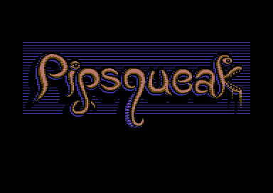
C64 Graphics Competition at 3-Color-Logo Competition 2013 : #26
Credits :
Download :
Look for downloads on external sites:
Pokefinder.org
User Comment
Submitted by Cruzer on 18 March 2013
| Cool, smooth, creative details. |
User Comment
Submitted by Shaun C on 15 March 2013
@The USER - Actually, it was your cool workstages anim for your Creepy logo that inspired me to upload what I had.
Unfortunately the only lesson to be learned from my workstages is: "Don't neglect to check your char count until you're 70% done." ;) |
User Comment
Submitted by user on 15 March 2013
| Thanks for adding the workstages. I try to learn from them ... |
User Comment
Submitted by Shaun C on 14 March 2013
@TheRyk - Oops, that was my fault. I tweaked a couple of things and reuploaded, which reset the dl count.
@Elko - I made some small adjustments. Still 255 chars. I do have a bad habit of wanting to keep prodding pixels past the point of it making much difference.
Intended bg was still going to be lines, but with some line based dithering to transition from brown down to blue, plus a little top and bottom border and maybe some bites taken out of the edges. |
User Comment
Submitted by Zierliches Püppchen on 14 March 2013
| @shawn: if u see pixel u like to change ... why u don't do it? I would like to see the original background idea ... |
User Comment
Submitted by TheRyk on 13 March 2013
Nice one.
PS: Again 27 votes but only 11 downloads, cmon guys at least watch it on VICE crt emulation |
User Comment
Submitted by Yogibear on 13 March 2013
User Comment
Submitted by Shaun C on 13 March 2013
Thanks for the comments. Much appreciated!
Actually I had a different idea for the background, but ran out of chars, and as The USER correctly surmised, I wanted to keep the shadow. :) Also correct that I wanted to keep the dithering to a minimum. Trouble is that now I keep seeing certain pixels that I want to change. |
User Comment
Submitted by Raffox|HF on 13 March 2013
| Ahah! Lovely organic and tentaclish font! |
User Comment
Submitted by user on 13 March 2013
| Without these Background lines you have to dither very hefty or can't create the shadow. I like how you used the black and blue to create the depth of the worms and all without really use much dithering. This one is so cool. |
User Comment
Submitted by spider-j on 13 March 2013
| Also a pretty good one. I like the idea. Not sure about the background... |
User Comment
Submitted by Shaun C on 13 March 2013
| 255 chars, according to PicChar. Was pushing 300 before I finally stopped wasting chars like crazy. :) |
|
|
|
 | Search CSDb |
 |
|
 | Navigate |  |
|
 | Detailed Info |  |
|
 | Fun Stuff |  |
· Goofs
· Hidden Parts
· Trivia
|
|
 | Forum |  |
|
 | Support CSDb |  |
|
 |  |
|


