|
| |
|
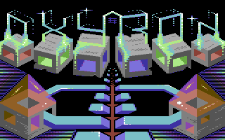
Oxyron Logo "A Touch of Glass II" [2015] |
Credits :
Download :
Look for downloads on external sites:
Pokefinder.org
User Comment
Submitted by Joe on 18 January 2015
| JSL: Ok, fair enough, then I understand. Drazpaint uses buffering for example. |
User Comment
Submitted by JSL on 18 January 2015
| Joe: I am pixeling in Amica Paint, when you copy the left half to the right, and it is set in the exact grid position as the left, then no errors occur, then when you switch the angle in X to mirror it, then it overwrite the first copy line and you get a scroll graphic over graphic, even then nothing anymore from the right image is in grid position gives colorclashes. Ofcourse I am thinking out a solution on this, would be to switch in X angle on the spare screen, and up it to the main screen on the right side, then it is thinking ahead, without any clashes. |
User Comment
Submitted by Joe on 18 January 2015
Symmetry is bad for your health!
The first one-point perspective in the art history describes only one thing: Death!
("The Holy Trinity" by Tommaso di Ser Giovanni di Mone, 1427-8).
If the perspective was not centered but offset, it will give way for more interesting work.
But since you have kept symmetrical challenges, Id suppose youll have to explore it further
and not simply from a simple mirrored screen.
Repetitions and reflections might contain more permutations than just a simple A:B idiom.
At least one could ask for something more demanding with more nodes and vertices?
Tiled graphics perhaps. Explore!
JSL: Clashes? A screen is 160 pixels wide in multicolor (320 hires pixels).
One half is 80 pixels (20 chars exact)!
How on earth could one get color clashes from mirroring a perfect half? |
User Comment
Submitted by Dr.j on 18 January 2015
| Great perspective Andy . love this logo very much as the rest of your pixel works . keep it up |
User Comment
Submitted by JSL on 18 January 2015
| Matt: You didn't read Symmetry or? That's Bad Church, I pixeled only left half, and copied it to the right, and switched it in X angle. This piece of Shine perhaps the same way, but, you get clashes with turning multicolor, so it is a bit of adjusting. Maybe Shine has other ways of turning without clashes, maybe pixeling on C64 and switching in Photoshop or other tool. Enough informations, on what Bad Church has to do with this? ;D |
User Comment
Submitted by PAL on 18 January 2015
| your usage of colors is very underestimated in my mind... very nice color combinations you use like no other use... love it! |
User Comment
Submitted by Matt on 17 January 2015
| what on earth has this picture got to do with Bad Church? |
User Comment
Submitted by TheRyk on 17 January 2015
| neat. but [nitpicking] why must all logos be fullscreen today. I think without all the other stuff in lower 75% of screen the logo itself would look good by itself without anything to distract from it.[/off] |
User Comment
Submitted by JSL on 17 January 2015
| Great Work Andy!! You did it again. Alltough I like more the round things, but clever work in pixeling, symetrically, and I understand the technics in pixeling this, because the only thing that got pixeled is the logo in full effect. Remememember, my Bad Church, It is Symetry, I pixeled only left half, and you do the same with this, no one who notices, but now.. Everyone knows, due this comment. Sorry for explaining the effect of 3 hours pixeling in just 30 minutes, but a fair vote of 9,5 from the Scene. I give you a 9. :) Btw. I saw the Oxyron logo in just 1 second, who is faster? :DD |
User Comment
Submitted by finchy on 17 January 2015
| Awesome! The perspective is perfect and I like the logo and the whole surrounding! |
User Comment
Submitted by DKT on 17 January 2015
| Yeah, cool. Just don't like the blocks under the OXYRON logo and wonder how it would look like without the blocks. I don't get the idea of the blocks, so maybe they just must be here ;). Nevertheless, cool. |
User Comment
Submitted by leonofsgr on 17 January 2015
User Comment
Submitted by slimeysmine on 17 January 2015
| Love it Shine, great work ;) |
User Comment
Submitted by Moloch on 17 January 2015
| Another nifty design, thumbs up! |
User Comment
Submitted by Joe on 17 January 2015
User Comment
Submitted by The Phantom on 17 January 2015
Took a minute to see the "oxyron" logo ;)
Nice work Andy... (as always) |
|
|
|
 | Search CSDb |
|
 | Navigate |  |
|
 | Detailed Info |  |
|
 | Fun Stuff |  |
· Goofs
· Hidden Parts
· Trivia
|
|
 | Forum |  |
|
 | Support CSDb |  |
|
 |  |
|


