|
| |
Credits :
SIDs used in this release :
Download :
Look for downloads on external sites:
Pokefinder.org
User Comment
Submitted by Jesder on 25 February 2015
Thanks for taking the time to post some feedback guys. I've noticed it says the external link above might be broken, but it's working fine for me. I'll take a look and see what that's an issue.
@eLK: Good comment on expanding the scroller in to the side borders. This was something that crossed my mind as I was working on it. I also wanted to move both the rasters and the dycp scroller up and down. But I was at the point where if I did that, I'd also make it a larger wave too. I'd then spend more time and add some variations to the colour cycling on the scroller and credits. If I did that I'd spend more time and perhaps have the greets text scroll (as there were more groups I wanted to include) and so on ;) So I decided to get it out and move onto something new. I love a good dycp scroller though, so do have plans to expand this and move it in to the borders (+make it bigger) for a future release :)
@Shine & @Zarky: Well spotted! The pattern was manually made and does look off compared with a natural set of sine values. I started with a clean table but wanted to make it's movement a bit different. I didn't achieve the result I was after, but never reverted back to the original values.
@Dr.J: I asked Johan specifically for an old skool style logo on this one. I love the retro style (as you can probably tell from my intros so far ;) |
User Comment
Submitted by Pad on 16 February 2015
| The style takes me way back and I get all fuzzy inside. :-) I do agree with Shine tho. I suspect the sine is manually made, and thus gets a bit constant in the middle. Of course this could be by design and the result intentional. Regardless it has a good feel to it, and that I like. :-) |
User Comment
Submitted by Dr.j on 16 February 2015
i would like to point that the logos of JSL sometimes remind me the good old
logos from '88-'89 , they are designed in old fashioned style |
User Comment
Submitted by Shine on 16 February 2015
| I like this intro, but what about this sine table for the logo. It's only me, who is seeing something wrong swinging? ;) |
User Comment
Submitted by ϵʟʞ on 16 February 2015
| It looks great! A pitty it is not up to borders scroller :( |
User Comment
Submitted by Jesder on 16 February 2015
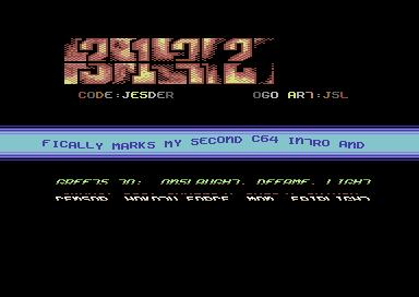
| My second C64 release, this time another old skool inspired intro - 3172. It started life as a cracktro, but ended up having more and more tweaks added until more closely resembled an old style intro. |
|
|
|
 | Search CSDb |
|
 | Navigate |  |
|
 | Detailed Info |  |
|
 | Fun Stuff |  |
· Goofs
· Hidden Parts
· Trivia
|
|
 | Forum |  |
|
 | Support CSDb |  |
|
 |  |
|


