|
| |
Released At :
X'2016
Achievements :
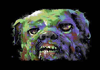
C64 Graphics Competition at X'2016 : #4
Credits :
Download :
Look for downloads on external sites:
Pokefinder.org
User Comment
Submitted by Electric on 21 December 2023
There are no workstages left besides this b/w version which was done first and then coloured. No memory if workstages were mandatory or not. Slight changes here and there made to meet the harsh hires requirements. The pic itself was drawn in PhotoShop with some googled ‘dog references’ in front. All those are lost.
 |
User Comment
Submitted by Digger on 8 October 2017
| Outstanding use of colours makes it look totally out of C64 palette. |
User Comment
Submitted by DeeKay on 6 November 2016
Ele: Don't let JB troll you, he's not serious! ;-) Nobody HAS so use a certain mode, no need to justify your choice... We just did NUFLI because I never liked IFLIs/Drazlace flickering, and certain pictures with lots of detail or detailed outlines simply don't work without either a spritelayer or $d016 style interlacing, e.g. Tiger or your & Duce's pics in Crest Slide Story!...
If you make the picture to embrace the chosen mode best, like done here, everything is perfect, no matter what the mode is! 8)
And I second Ptoing, it was REALLY nice finally meeting you! |
User Comment
Submitted by Jak T Rip on 5 November 2016
User Comment
Submitted by ilesj on 3 November 2016
| Your hires works are always amazing, but this one is on its own class. Words fail me, I'm in awe. |
User Comment
Submitted by redcrab on 2 November 2016
User Comment
Submitted by Bob on 1 November 2016
| This is a lovely cute little doggie ;) |
User Comment
Submitted by grasstust on 31 October 2016
| Fantastic picture! - My #1 at the compo. |
User Comment
Submitted by Electric on 31 October 2016
| Not really into NUFLI. I like the crispiness of hires and the limitations of it, Petscii's as well. There's more challenge and they present more 'the core' of C64 to me
of course they don't eat that much memory either optimizing is never too oldskool. If I like to do something realistic I rather do it on paper. |
User Comment
Submitted by jailbird on 31 October 2016
This is Electric still kicking asses!
I think it would look better in NUFLI, though. |
User Comment
Submitted by Morpheus on 31 October 2016
User Comment
Submitted by ptoing on 30 October 2016
| Really love this one as well, it looked fantastic on the big screen. It was also really nice meeting you, Tommi :) |
User Comment
Submitted by xpo on 30 October 2016
| There is only one word to describe this drawing: E L E C T R I C |
User Comment
Submitted by Monte Carlos on 30 October 2016
User Comment
Submitted by E$G on 30 October 2016
| Amazing, great use of colors & shadow! |
User Comment
Submitted by Twoflower on 30 October 2016
| *drool* *panting-with-tongue-out* *more drool* |
User Comment
Submitted by uctumi on 30 October 2016
| Astounding! I love the way it uses the limits of the c64 to its own favor, this image has a lot of impact and great styling |
User Comment
Submitted by Rock on 30 October 2016
|
|
|
 | Search CSDb |
|
 | Navigate |  |
|
 | Detailed Info |  |
|
 | Fun Stuff |  |
· Goofs
· Hidden Parts
· Trivia
|
|
 | Forum |  |
|
 | Support CSDb |  |
|
 |  |
|


