|
| |
Released At :
X'2016
Achievements :
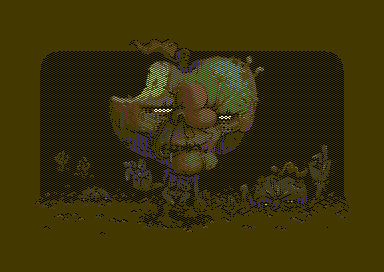
C64 Graphics Competition at X'2016 : #2
Credits :
Download :
Look for downloads on external sites:
Pokefinder.org
User Comment
Submitted by FATFrost on 10 November 2016
User Comment
Submitted by ZZAP69 on 6 November 2016
| Amazing. Don't think I've ever seen the colour brown look so good. |
User Comment
Submitted by Jak T Rip on 5 November 2016
User Comment
Submitted by TheRyk on 3 November 2016
ubergreat pic, ptoing!
"asslace" sexiest gfx mode name I've read so far :D |
User Comment
Submitted by ptoing on 3 November 2016
| Groepaz: Watch Don't meet Crest. |
User Comment
Submitted by algorithm on 3 November 2016
| With asslace, x expanded sprite overlay chequerboard is used to cover up half of the rectangular multicolor pixels and alternated each field. With correct pixel placement, this gives true hires pixels with no overlap (as in multicolor interlace) and has the plus side of reducing flicker significantly as well |
User Comment
Submitted by chatGPZ on 3 November 2016
User Comment
Submitted by ptoing on 3 November 2016
Thanks everyone :)
redcrab: Yeah, I am not a huge fan of flicker modes either, especially not the ones that move stuff sideways like IFLI, MCI or Drazlace. With Asslace you get interesting tints though and the flicker can be controlled quite well, plus no shaking. |
User Comment
Submitted by ilesj on 3 November 2016
| Fantastic picture! The muted color scheme looks awesome and works beautifully with the motif! Looks awesome on crt compared to emulator, and hardly flickers. I've been just staring at the picture for some time now :) |
User Comment
Submitted by Rock on 3 November 2016
User Comment
Submitted by redcrab on 2 November 2016
| Technically impessive stuff, and an ace picture on top of that! Flicker is not my cup of tea though |
User Comment
Submitted by algorithm on 2 November 2016
Great picture here and looks very good in this less used asslace format. btw just finished a converter for this asslace format with some quality enhancements (different d800 per field) quality of output here. (topleft = original picture. topright=converted asslace picture - minus the flicker :-)) bottom two = the seperate fields
 |
User Comment
Submitted by Burglar on 2 November 2016
great image, the asslace does wonders here.
only 1 complaint: "Them Apples", but where are the boobs?!? ;) |
User Comment
Submitted by chatGPZ on 2 November 2016
was interessiert mich mein geschwätz von gestern :o)
yes, its pretty hard - there was so much good stuff =) |
User Comment
Submitted by ptoing on 2 November 2016
Thanks everyone again :)
Groepaz: You wrote more or less the same about the Mermaid/red crab pic :D I guess it's hard to choose a favourite in this compo. |
User Comment
Submitted by chatGPZ on 2 November 2016
| my favourite in the compo by far - awesome |
User Comment
Submitted by Archmage on 2 November 2016
| Ptoiiing! :) Great pixels from a great guy! |
User Comment
Submitted by Bob on 1 November 2016
| Bad Apple ;) yes they though they could take over the world.. so did a window.. now what will happen... everything goes evil and bad! except the c64! still going strong! totally ass kicking so it hurts! |
User Comment
Submitted by Hoild on 31 October 2016
| A rose is a rose is an apple... |
User Comment
Submitted by Radiant on 31 October 2016
Really good, both composition and execution.
I think there's an inherent aesthetic in interlaced visuals that gets lost in static pictures. An enticing tremor, a sense of flux - if you will, or if you're less into pretentious artsyness, it looks different and so is perceived differently.
On a similar note, there's a difference in emotional response between looking at a picture on a CRT monitor and on a modern flatscreen display as well. |
User Comment
Submitted by ptoing on 31 October 2016
Thanks everyone.
Oswald: Because I do not like NUFLI. It is a pain in the ass to work in, you will always have areas where you will have weird artefacts because of how the sprites and the char pixels are interleaved, as well as the sprite pixels being widepixels and you can not always cover them how you want. Frankly, I do not like NUFLI, I like how it can look, but I will never make a picture in it. Also, what Jailbird said, esp about the tinting that the brown sprites add in this case. It makes everything look more rotten, not easily (if at all) possible with other modes. |
User Comment
Submitted by Jammer on 31 October 2016
| Imho the finest entry of whole compo and what Jailbabe said ;) |
User Comment
Submitted by jailbird on 31 October 2016
My personal #1 as well.
Besides, once and for all, you should stop questioning the artistic choices of brilliant graphicians who obviously know what are they doing. It hardly even flickers, and the interlace blurring ads quite a lot to the picture which would be taken away by the crispy characteristic of pure hi-res (that often looks like shit on a TV set anyway). |
User Comment
Submitted by Mace on 31 October 2016
| Awesome. My personal favourite. |
User Comment
Submitted by Oswald on 31 October 2016
| superb in all ways, except why not nufli ? :P |
User Comment
Submitted by Slator on 31 October 2016
| wtf is this? how amazing, it is just a bunch of pixels, but they are so superbly aligned that it just looks awesome deluxe, fabulous work, ptoing |
User Comment
Submitted by Ksubi on 31 October 2016
| Amazing creativity. Love the colour scheme 10/10 easy. |
User Comment
Submitted by booker on 31 October 2016
User Comment
Submitted by rail slave on 30 October 2016
| The perfect pic, system seller (34 years too late :P). Brilliant. |
|
|
|
 | Search CSDb |
|
 | Navigate |  |
|
 | Detailed Info |  |
|
 | Fun Stuff |  |
· Goofs
· Hidden Parts
· Trivia (2)
|
|
 | Forum |  |
|
 | Support CSDb |  |
|
 |  |
|


