|
| |
|
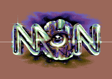
Maniacs of Noise Logo (2022) [2022] |
AKA :
MON
Released At :
Logo Graphics Compo 2022
Achievements :
C64 Graphics Competition at Logo Graphics Compo 2022 : #2
Credits :
SIDs used in this release :
Download :
Look for downloads on external sites:
Pokefinder.org
User Comment
Submitted by psych on 14 July 2022
User Comment
Submitted by goerp on 4 July 2022
| If there's a group called 'Now' you can always turn it upside down and have another entry :) |
User Comment
Submitted by Zierliches Püppchen on 30 June 2022
| The ORION Logo works great. This one lacks a little bit. |
User Comment
Submitted by TheRyk on 27 June 2022
quite some killer pic
however, flex has a point, though compo rules did not set such limits |
User Comment
Submitted by Flex on 25 June 2022
Wow. On the other hand, in my book this goes beyond the logo category.. It's a damn fine whole screen pic.
All you should need is 3 colours and 256 chars.. ;-) |
User Comment
Submitted by SMC on 25 June 2022
User Comment
Submitted by DeMOSic on 25 June 2022
User Comment
Submitted by Yogibear on 25 June 2022
User Comment
Submitted by psych on 25 June 2022
User Comment
Submitted by MCM on 25 June 2022
| Wtf… amazing !!! straight 10/10 ! |
User Comment
Submitted by zscs on 25 June 2022
| Wow! :O 10/10 from me! ;-) |
User Comment
Submitted by Nordischsound on 25 June 2022
User Comment
Submitted by soci on 25 June 2022
Thanks!
The background colour choice was not constrained in the rules and may be anything as the transitions are prepared for that. Especially in PETSCII that can be an advantage.
I think that must be a typo below as black background is used here already but if it'd be pink that wouldn't be a problem either.
Only the border colour must be static black. |
User Comment
Submitted by Mr. Spock on 25 June 2022
User Comment
Submitted by Dymo on 25 June 2022
User Comment
Submitted by Honcho on 25 June 2022
| Can only echo what others have said, stellar work and always an inspiration to us all! |
User Comment
Submitted by Facet on 25 June 2022
@Drax: wowsers... never though you would have made a tune especially for this logo. I would have been honoured!! Maybe next time.. but fortunately we'll be in a production soon with both our work ;D
@Soci: I will make a new version with black blackground separately, so you can integrate it perfectly in the collection.
@all: thanks for the great comments and votes of course. I'm really happy with the many compliments on this one. Thanks so much! |
User Comment
Submitted by Genius on 25 June 2022
| Choose 6581 SID for the music to prevent the silent drops. |
User Comment
Submitted by Raistlin on 25 June 2022
| Amazing work, Facet! Truly awesome :-) |
User Comment
Submitted by soci on 25 June 2022
Really cool indeed!
Unfortunately the border is not black at the moment however I have to make it black anyway when I do the results collection.
This requirement exists specifically so that releases can be shown in the same way as they were entered. So in the end it'll miss the rasters and the pink border. I hope you don't mind. Could have been worse if it's a more integral part of the composition.
So please everyone keep the border black and no trick with rasters! And vote like it'd have a black border (if that makes a big difference). |
User Comment
Submitted by Genius on 25 June 2022
| Superb logo but what happens to the music? Are those silent drops intentionally in the mix? BTW you forgot to mention Charles Deenen. Without him MON did not happen, I guess... And ofcourse it is Reyn Ouwehand and not Ouderhand ;) |
User Comment
Submitted by DRAX on 25 June 2022
| Now that is pure awesomeness 👍 Next time let us know in advance so we can make new sid for such delicious graphics 😉❤️ |
User Comment
Submitted by katon on 25 June 2022
| Well Master, a great logo, a beautiful logo, a wonderful logo, a damn amazing logo, I would say 100 compliments to this work. Okay because I'm not gonna finish 10/10! |
User Comment
Submitted by Shine on 25 June 2022
Wonderful!!! <3
But:
Graphics mode of choice are plain multicolour, hires or petscii with black border. |
User Comment
Submitted by DjS on 25 June 2022
User Comment
Submitted by Jammer on 25 June 2022
|
|
|
 | Search CSDb |
|
 | Navigate |  |
|
 | Detailed Info |  |
|
 | Fun Stuff |  |
· Goofs
· Hidden Parts
· Trivia
|
|
 | Forum |  |
|
 | Support CSDb |  |
|
 |  |
|


