|
| |
Credits :
Download :
Look for downloads on external sites:
Pokefinder.org
User Comment
Submitted by Hoild on 5 January 2008
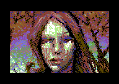
Vanja made the foliage perfect this time. :]
The background is truly great, nothing is lacking or overdone about it.
The figure could be better, though, to catch up with the remarkable background for a totally balanced and great picture.
I gave it an 8, partly to compensate a bit for the currently dismal net vote result.
|
User Comment
Submitted by Radiant on 4 January 2008
Reminds me a little of this:
 |
User Comment
Submitted by Darkus on 4 January 2008
| This is the first c64 picture that has this look and feel to it.. (at least that I have seen!) |
User Comment
Submitted by Mirage on 3 January 2008
| i like it for the experimental approach taken... fresh in an akward way |
User Comment
Submitted by Jon on 3 January 2008
| Hm. Same hairstyle from "Self Portrait with Unicorns". Perhaps another self portrait, sans unicorn(s)? :) |
User Comment
Submitted by Mermaid on 3 January 2008
Lack of eyeballs? Hmm, I wonder what those white things are then. 8) As for the pattern, you are probably right :)
Quote:It DOES have a feel of oil painting though! At least I succeeded with something! Hehe <3 |
User Comment
Submitted by DeeKay on 3 January 2008
Interesting, but somehow it doesn't appeal to me as much as other experiments! (by other painters and mermaid herself! <:-) Something in the face is off, I don't quite know what it is - the lack of eyeballs or the IMHO unfitting pattern on the forehead, cheek and chin (cheers saehn, so I'm not the only one noticing this! 8)? I don't know. But I do know that Mermaid is known for perfect pixel arrangement, so maybe that's like me trying to do something without antialiasing or Ptoing having huge colored 8x8 blocks in a beautifully pixelled "Alte Schule"? ;-)
I have to say I do love the background though, the style works out beautifully for that!
And no: It neither looks like a bad conversion nor are there many visible colorclashes! colorclashes cause blocks, and there are hardly any in the picture if you look at it more closely (okay, maybe a few on the lower left backgriound)! It DOES have a feel of oil painting though! 8)
Quote:
..and then someone invented FLI :).
LOL! ;-) |
User Comment
Submitted by Burglar on 3 January 2008
| must add, love it when ppl try out new styles and experiment, especially when it's done so well. |
User Comment
Submitted by Inge on 2 January 2008
| Fiin kunst. I really love this picture. Just say when and where the exhibition is. |
User Comment
Submitted by jailbird on 2 January 2008
Vanja: I never used Koala Paint but I guess there is a "tiny" difference in handling brushes compared to Timanthes :)
Pixelling on PC provides a less "fragmented", more continuous way of painting. The pressure is minimal. Especially when you don't deal/care about the clashes, at least that's what radiates from this work: the accommodating, light strokes. |
User Comment
Submitted by Mermaid on 2 January 2008
| Jailbird: Koala Painter had brushes too, I think? :) |
User Comment
Submitted by jailbird on 2 January 2008
Vanja: Sorry, my bad. I have the habit to think about color clashes as something evil. You managed to utilize it.
Now I'm wondering if the same effect could be achieved on a vanilla C64, the old-school way: pixel-by-pixel? :) |
User Comment
Submitted by Stainless Steel on 2 January 2008
Holy shit, say what you want but the picture sure did provoke a reaction.
|
User Comment
Submitted by null on 2 January 2008
| I likes it <3 reminds me of crayon drawings <3 |
User Comment
Submitted by Mermaid on 2 January 2008
"Emulating" colour clashes? I'm not quite sure what you mean by that?
I decided not to care about colour clashes and just paint, like I'd do in Koala Painter back in the 80's. And yes, it was drawn in Timanthes :) |
User Comment
Submitted by jailbird on 2 January 2008
In this case, kudos for emulating color clashes so accurately! ;)
Is this Timanthes btw? |
User Comment
Submitted by Mermaid on 2 January 2008
| "Bad conversion"? O ye of little faith.. :) See Production Notes for some workstages. |
User Comment
Submitted by Mindcooler on 2 January 2008
| I also see an oil painting on canvas. |
User Comment
Submitted by Crimson on 2 January 2008
| Very original and expressive image, Dear Vanja! I can see a regular shape coated with very fat dithering sauce where its layers, trickling down, have been accumulating themselves here and there uncompromisingly and then crystallize in the final (yeah, the blocks are visible). Prickly mosaic, full of expression and some LSD colors! /Marcin |
User Comment
Submitted by Burglar on 2 January 2008
| very cool, looks like real paint ;) |
User Comment
Submitted by Scout on 2 January 2008
Quote:it rather looks like an fli pic using only 1 out of its 8 screens. :)
That makes it plain multicolor, right ;-) |
User Comment
Submitted by Oswald on 2 January 2008
| not my cup of tea either, and to brag a little: p1 could never convert so bad, doesnt matter how many color/chars... ;) it rather looks like an fli pic using only 1 out of its 8 screens. :) |
User Comment
Submitted by saehn on 2 January 2008
| Cool, meaty. Looks like thick acrylics built up on canvas. The lines/swirls on the forehead are a little distracting for me, they seem so linear compared to the rest of composition. I like the overall color sense. Good work! ;) |
User Comment
Submitted by anix on 2 January 2008
| if vincent had a c64 perhaps... |
User Comment
Submitted by TDJ on 2 January 2008
User Comment
Submitted by Jammer on 2 January 2008
| i bet it's intentional and handmade. vanja reads all this fuss and LHAO :D |
User Comment
Submitted by Yazoo on 2 January 2008
User Comment
Submitted by enthusi on 2 January 2008
Seems TO ME like someone is trying how far you can go and still be cheered at and labeled "art".
To me, this too looks/feels like some bad conversion (and Im not even anti-conversion in general).. |
User Comment
Submitted by Ed on 2 January 2008
Beautiful!
Multicolor is the format! This picture looks very good from a far distance, and gets interesting on a closer look.
Is there some Leon in there, btw? ;) |
User Comment
Submitted by jailbird on 2 January 2008
Um, seems to me as a quick smudged-brush doodle done on PC and converted to C64 as-is. Sorries :(
As a C64 picture - very nice and fresh, although I'm quite bothered by the malformations which look too much like color-clashes rather than intentional features. |
User Comment
Submitted by Motion on 2 January 2008
| When I look at this, I see oils and canvas. The shading style almost lifts it off the screen. Quite interesting - I am all for experimentation. |
User Comment
Submitted by Twoflower on 2 January 2008
| @Groepaz: It might look as a whole lot of different things, but I don't believe it looks like a conversion. More like someone made it with brush-tools in Koala or Advanced Art Studio or some other C-64 equivalent to Painter. |
User Comment
Submitted by Steppe on 2 January 2008
| I don't quite dig this as much as some of your other pics. The colour clashes give the whole pic an interesting "background noise" and the consistent use of checkerboard fills give the whole thing a very raw paint-brush look. Still a very nice piece overall! |
User Comment
Submitted by chatGPZ on 2 January 2008
| mmmmh, not my cup of tea. looks too much like a straight (and sorry, bad) conversion to me. |
User Comment
Submitted by Mace on 2 January 2008
Interesting piece of work.
If I look through the hairs of my eyes, this piece really comes to live.
Except for the eyes of the lady... |
User Comment
Submitted by Joe on 2 January 2008
User Comment
Submitted by Stainless Steel on 2 January 2008
| creepy. is that a mood picture ? |
User Comment
Submitted by HCL on 2 January 2008
| ..and then someone invented FLI :). |
|
|
|
 | Search CSDb |
|
 | Navigate |  |
|
 | Detailed Info |  |
|
 | Fun Stuff |  |
· Goofs
· Hidden Parts
· Trivia
|
|
 | Forum |  |
|
 | Support CSDb |  |
|
 |  |
|


