AKA :
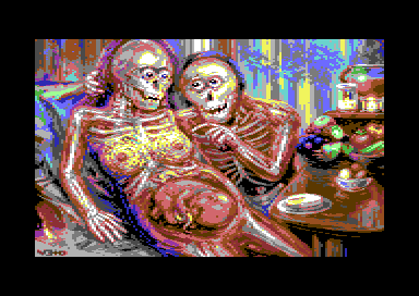
X-rayed Family Pic
Released At :
Breakpoint 2009
Achievements :
C64 Graphics Competition at Breakpoint 2009 : #3
Credits :
Download :
Look for downloads on external sites:
Pokefinder.org
User Comment
Submitted by TheRyk on 21 January 2023
| so yuck and yet sooo good! :D |
User Comment
Submitted by The Overkiller on 14 March 2012
User Comment
Submitted by v3to on 6 January 2011
| "the pic was an experiment a with bodyworlds-style shapes"... |
User Comment
Submitted by Heavy Stylus on 6 January 2011
Shouldn't the baby be an x-ray too (skeleton)?
And what is with the solid bone boobs & eyes? ;) |
User Comment
Submitted by The Shadow on 8 July 2009
| A most unique idea manifested into an incredible work of art! |
User Comment
Submitted by Oswald on 3 July 2009
| I agree. The pic is not horrific for me neither, instead shows the relationship from a unique perspective. awesome piece. |
User Comment
Submitted by v3to on 3 July 2009
most interesting for me reading your comments is that many of you mention the impression of horror atmosphere. interesting because the initial plan was to create a more or less scientific picture. very down to earth and in an early stage i worried that this might become a boring piece. so the concept changed to an emotional setting. in my eyes the human body - even x-rayed - is a fascinating archetype with unique aesthetics. thats also the reason why i wanted a positive aura, but maybe i am only a weirdo in these things.
ok, the result for sure is grotesque and i understand that most people find it horrific or even repulsive.
this is what i see in the picture: love and confidence not depended on physical attractions. the guy surprises her with breakfast and enjoys that she is really pleased. in a sense the baby should be the star for a growing family, but this time it's the relationship between the parents. |
User Comment
Submitted by tempest on 21 May 2009
User Comment
Submitted by saehn on 5 May 2009
| Argh! Disgusting! Awesome! I'm only now seeing it for the first time. :-) Very cool, Veto. |
User Comment
Submitted by v3to on 20 April 2009
| thank you all for your comments. the pic was an experiment a with bodyworlds-style shapes and the composition more like an evolutionary thing. and finally ... i agree that the fruit on the table is the best part ;-) |
User Comment
Submitted by oys on 16 April 2009
| masterpiece! AMAZINGLY NICE! you rule :) should have won ofcourse. |
User Comment
Submitted by Thunder.Bird on 16 April 2009
User Comment
Submitted by Edhellon on 15 April 2009
| @Jammer: yes, Cezanne come to my mind immediately during the compo aswell. I guess it's a pretty obvious reference since even I got it :) |
User Comment
Submitted by Motion on 15 April 2009
Aren't we a bunch of ugly cunts without skin? It's the skin that makes us! Very bizarre - Veto wins me over again with his wild, canvas like work. ...the beauty *is* the child.
@Fatfrost: Noorks? I thought those were Meringues with cherries on top! ;)
|
User Comment
Submitted by yago on 14 April 2009
My favorite, this image stuck long after the compo in my head.
|
User Comment
Submitted by nada on 14 April 2009
| subtle and powerful, mysterious and transparent ( hehe) , intimately acquainted and strange...all in one!! to it extra, extra fine colours! ConGratuLationSS...veTO! :) |
User Comment
Submitted by Ninja on 14 April 2009
| Disturbing. Fresh. My favourite from the compo! |
User Comment
Submitted by Jammer on 14 April 2009
| i like fruits the most. instant associations with paul cezanne ;) |
User Comment
Submitted by Malmix on 14 April 2009
| Funny stuff.. The fruits look awesome! Overall very detailed for beeing multicolor. |
User Comment
Submitted by leonofsgr on 13 April 2009
| veto roolz! "horror" feeling but cool mc picture! and is this REAL mc?! i don't belive... :_) 10/10 |
User Comment
Submitted by Jucke on 13 April 2009
| Hahaha! I totally love this picture. Just made my day. The c64 is a kickass computer for graphics! Thanks for the reminder Veto. |
User Comment
Submitted by Paul Bearer on 13 April 2009
| Great work. Very disturbing. Maybe it could be the next Cannibal Corpse album cover? :) |
User Comment
Submitted by Fzool on 13 April 2009
User Comment
Submitted by JSL on 13 April 2009
Very good job Veto! I like your style, FLI? :)
|
User Comment
Submitted by Hoild on 13 April 2009
User Comment
Submitted by Edhellon on 13 April 2009
| This should have won IMHO. |
User Comment
Submitted by HCL on 13 April 2009
| Outstanding! ..and where goes the bitmap color-limits? |
User Comment
Submitted by FATFrost on 13 April 2009
| Artist/Technically amazing, but i'm not sure about the theme being my cup of tea and it induces a deathly theme a little. hmmm.... nice noorks though! |
User Comment
Submitted by daison on 13 April 2009
Interesting picture to say the least! ;)
Graphically I like the shiney table & fruit the best. |
User Comment
Submitted by The Phantom on 13 April 2009
What an incredible piece of artwork! I simply love this!!
Were the breast's left intact on purpose?
Fantastic work VETO! Keep them coming!!!! |
User Comment
Submitted by grennouille on 13 April 2009
User Comment
Submitted by Linus on 13 April 2009
User Comment
Submitted by iAN CooG on 13 April 2009
|
|
 | Search CSDb |
|
 | Navigate |  |
|
 | Detailed Info |  |
|
 | Fun Stuff |  |
· Goofs
· Hidden Parts
· Trivia
|
|
 | Forum |  |
|
 | Support CSDb |  |
|
 |  |
|


