|
| |
Credits :
| Code | .... | Dflame of Blazon, Crypt, The Stock |
| Music | .... | 6R6 of Blues Muz', Nostalgia, SHAPE |
| | | Drax of Bonzai, Crest, Maniacs of Noise, Vibrants |
| | | Richard of Blazon, Civitas, People of Liberty, Psytronik Software, Scene World Magazine, The New Dimension |
| | | Rob Hubbard |
| | | Wuiti of Austrian Phantom Crackers, Pulsar, The Ancient Temple |
| Graphics | .... | Dflame of Blazon, Crypt, The Stock |
| | | Troublemaker of Crypt |
| Idea | .... | Dflame of Blazon, Crypt, The Stock |
| | | Troublemaker of Crypt |
| Text | .... | Gehtjanx of Crypt, The Stock |
| | | Jamais of Crypt |
| | | Mr.Silver of Crypt |
| | | Nukem of Crypt |
| | | theStack of Crypt |
| | | Troublemaker of Crypt |
SIDs used in this release :
Download :
Look for downloads on external sites:
Pokefinder.org
User Comment
Submitted by Linus on 13 November 2009
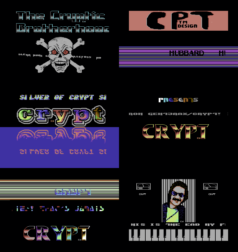
| Wow, that CPT thingie is one ugly logo. |
User Comment
Submitted by The Ignorance on 13 November 2009
| Yeah, the improvement over the years is clearly visible. roflmao. |
User Comment
Submitted by TWW on 11 November 2009
Cool stuff. Strangely enough I like it :) However two things cought my attention;
1. Intro: Spritescroller the letters get tossed onto the 1st (or last^^) sprite. On the other end it is ok tho'
2. 3rd part (And I know coz i did this myself hehe). the character "I" in the 2x2 scroller is messed up coz you don't check for exceptions for "I", "." etc.
Other then that: Stay Cool! and do more! |
User Comment
Submitted by plagueis on 10 November 2009
| Yeah, I thought that mirrored scroller part had the best color arrangement, and it's nice to see some other people actually releasing a "space-it" demo for a change, so I can watch with leasure, or skip it as I please, without having to follow along to the flow of a trackmo, no matter how good or bad it is. A trackmo is nice, but we need more variety. |
User Comment
Submitted by Rough on 9 November 2009
| What about an 711/WOD Intro Designers, X-Ample Architect etc. compo! |
User Comment
Submitted by chatGPZ on 9 November 2009
"no matter how oldschool this demo is meant to be I think it could have been a lot more polished. take that CPT logo in the second part for example, seriously."
indeed. "oldschool" doesnt mean "looks like made with an intromaker from 1988". really. |
User Comment
Submitted by daison on 9 November 2009
| Nice tribute! (if I may call it that :) |
User Comment
Submitted by The Phantom on 8 November 2009
The logo on the 3rd intro (or part) rocks!
der Rest der Demo ist ein Witz :) |
User Comment
Submitted by Matt on 8 November 2009
the music in the first and last part are pretty impressive covers.
no matter how oldschool this demo is meant to be I think it could have been a lot more polished. take that CPT logo in the second part for example, seriously.
hope to see better stuff from crypt in the future.
|
User Comment
Submitted by NecroPolo on 8 November 2009
| I guess, the musicians paid their tribute, too :) |
User Comment
Submitted by Count Zero on 8 November 2009
How come this ain't pure Hubbard?
|
User Comment
Submitted by NecroPolo on 8 November 2009
| Very nice stuff! Feels like driving an old (but really good) car. Thanks for the experience! |
User Comment
Submitted by pmc on 8 November 2009
| I really liked this release - it had that real old skool feel and some really nice logos too - I especially liked the one in the mirrored scroller part. :-) |
|
|
|
 | Search CSDb |
|
 | Navigate |  |
|
 | Detailed Info |  |
|
 | Fun Stuff |  |
· Goofs
· Hidden Parts
· Trivia
|
|
 | Forum |  |
|
 | Support CSDb |  |
|
 |  |
|


