|
| |
|
Mommy...they're baaaack [2010] |
Credits :
Download :
Look for downloads on external sites:
Pokefinder.org
User Comment
Submitted by Conrad on 23 August 2010
| Well, you lot can debate as much as you want. I'm just glad that people are re-living these graphics styles, no matter how many times they appeared in the 80s. Great logo, STE! Would love to see a Mean Team graphics collection. :) |
User Comment
Submitted by Kristian on 23 August 2010
| Can't say I'm a big fan of the typographic choices on this one, but still nice to see some new stuff. |
User Comment
Submitted by STE'86 on 23 August 2010
The logo style stays so live with it :). it might get painted differently at some point (as it always has been), but its fundamental shape and style are so linked to us historically that its not going to be changed now. This logo evolved as a design that could be reproduced in 8 sprites, a dozen characters or a bitmap. it serves its purpose admirably (how many other logos would get recognised in the "scene" after 25 years, except maybe Triad :) ).
"It does what it says on the tin" (but i will look at the A's) |
User Comment
Submitted by Radiant on 23 August 2010
| Yes, I agree about the A's. Nice stuff apart from that. Would be cool to see you experiment with different logo styles. |
User Comment
Submitted by Devia on 23 August 2010
| Classic.. luv it.. but somehow I read this as MERNTERM... those A's are a bit confusing to me. |
User Comment
Submitted by Deev on 23 August 2010
| My first thought when I saw this was exactly what Tempest said, however, I can see your point, Ste, about how it's evolved over time and style-wise that it fits what could almost be described as an established brand. The one thing I would disagree with is the last line. I'm not sure if it was meant tongue in cheek, but suggesting the that the sky effect is there to play to the C64s strengths is a poor excuse for a lack of originality. Lots of logos have been made in recent times that work just as well as this does on a C64 screen, yet show far more creativity. Same goes for the comment about the C64 being an 80s machine. Paint, pencils etc have been around an awful, awful long time, yet it doesn't stop people using them in new and exciting ways. Similarly, the C64 is just the tool for making art, it has loads more potential left in it yet! |
User Comment
Submitted by Moloch on 22 August 2010
Comments are like assholes, everyone has one. \o/
|
User Comment
Submitted by STE'86 on 22 August 2010
information:
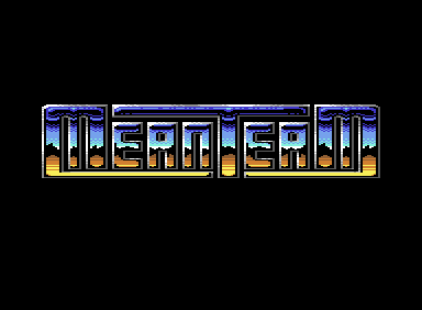
the logo shape is based on the "type 5" which was the last logo type i did on Sid & Vics II (if you look at our stuff in chronological order u will see the logo slowly evolving or adapting to the needs of the demo). now while sloping side versions look more visually interesting they are also technically more restricting because of the ensuing "jaggies" and the colour availability in an 8x8. hence to do the desert sky a straight one is necessary. All our logos have certain similarities such as the strong MT letters, and as they would teach you at art college, when you have a logo that your client base can recognise at a glance "don't fuck with it". And lastly, yes it is 80's because so am i and whether u like it or not so is the c64 and with its limited palatte you play to its strengths, which in this case means "desert sky" |
User Comment
Submitted by JCB on 22 August 2010
| @tempest, not a problem. Like I say, I'm not sure why Ste uploaded it apart from to show that he's trying to get back into C64 pixeling again. It wasn't meant to be a finished logo, just something to edit on. He's done more to it since and come up with an idea for the requested demo with a scroller which although oldschool looks nice imo and I'm coding it now :) |
User Comment
Submitted by tempest on 22 August 2010
JCB: I wasn't trying to dimish the merit of the original '87 logo. It has its place in the C64 and demoscene history as an inspiring logo - like we just saw from the copycat versions - mostly because of the flashy use of color and the background gradient.
That all aside, my comment was about this 2010 release. I feel that the "update" could've been more ambitious in so many ways. It is better than the original though, as STE got rid of the unnecessary space around the letter T. |
User Comment
Submitted by JCB on 22 August 2010
ROFL Ste stole his own logo!! what a lamer!!
|
User Comment
Submitted by fade on 22 August 2010
| Is this what we do on here? Copy other people's logos in Photoshop? weeee it's fun!!! ;) |
User Comment
Submitted by JCB on 22 August 2010
7.1/10 (19 votes)
Is this what we do on here? Copy/paste the vote stats? weeee it's fun!!! ;) |
User Comment
Submitted by fade on 22 August 2010
7.3/10 (18 Votes)
NO COPY |
User Comment
Submitted by JCB on 22 August 2010
@tempest, fair enough you're entitled to an opinion but for 87 when that was originally drawn it was quite unusual. I'm not sure why Ste uploaded this edit of it here as it was something he did with some spare time at work and not a new creation.
That Powerrun is amazing :) how the hell did they manage to do that to it? lol |
User Comment
Submitted by tempest on 22 August 2010
JCB: old school or not, it's still a pretty feeble and uninspired logo.
Now this is funny: Powerrun Demo
|
User Comment
Submitted by JCB on 22 August 2010
| @Wile, it was the "chrome" effect we saw a lot at the time. Anything like drawings of cars/motorbikes etc that had chrome/shiny metal parts generally had that effect on them as if somehow chrome was only chrome if it was reflecting a desert scene :) |
User Comment
Submitted by Count Zero on 22 August 2010
So innovative! Awesome color choice!
<delete>...
|
User Comment
Submitted by Wile Coyote on 22 August 2010
| @JCB I always viewed the colour combo as a take on the elite logo, which in itself was a take on various other sources, which were based on reality. |
User Comment
Submitted by Jazzcat on 22 August 2010
| Cool logo. Love the old-style vibe. More please Ste! |
User Comment
Submitted by JCB on 22 August 2010
| ROFL I love it, point to a demo that stole Ste's original Meanteam logo design from our Bouncy Thingz demo.. And if you read Ste's post it says it's from there. It IS old school because it IS "OLD SCHOOL" ;) |
User Comment
Submitted by tempest on 22 August 2010
Boring old style blocky logo.
Di-Art |
User Comment
Submitted by leonofsgr on 22 August 2010
User Comment
Submitted by JCB on 21 August 2010
| @Wile, thx, I prefer the Snipping tool in Win7 (and Vista), after Ste reminded me it was there :) and doing it that way saves the dreaded gamma too. zomg!! :) |
User Comment
Submitted by Wile Coyote on 21 August 2010
@JCB
While VICE is running, and displaying your image, press Prt Sc (Print Screen) on your keyboard.
This should copy a snapshot to your PC clip board.
Using something like Photoshop, select the paste from clipborad option. |
User Comment
Submitted by JCB on 21 August 2010
Yes, I know gamma is a mess, a lot of people have never heard of it or when they have don't know what it means. BUT as I pointed out, I don't see the problem with saving an image WITH the internally chosen gamma as for all anyone knows (with it being a file format that doesn't support gamma info) only I am going to view it. I'd quite like it to look right in that case.
It's the same with the palette, nobody is going to see the same as me anyway (due to things like badly calibrated kit) but they expect RGB values to be the same between apps/pictures on their machine.
Shame about no PAL emulation picture saving either, seems like quite an important thing to be missing ;)
I think I'll have to deal with CCS screwing foobar2000 every time I run it as someone forgot to tell him NOT to save gamma changes in his screenshots ;)
|
User Comment
Submitted by chatGPZ on 21 August 2010
@jcb: as you may have noticed, the whole gamma topic is a big mess, you can basically assume that everyone is doing it wrong - and there is not much that can be done about it. and thats why gamma correction options exist in various apps such as vice. in an ideal world, every setup would use proper gamma correction tuned to that respective setup, and all digital images would be saved using no gamma correction at all, possibly including hints on which gamma curve applied to the system used to create the image (eg also digital cameras, scanners etc all have different gamma properties). at this point vice should hint that it uses PAL gamma, which is ~2.5 (standard says 2.8) for creation, and save a picture which is gamma corrected by the PAL gamma (NOT by the effectively used factor, which is 2.8/2.2).
the problem that arises when saving a picture with a gamma correction which is correct for your setup is, that it wont be correct for another setup. eg windows/VGA uses 2.2 (this is also the default for current vice builds). OSX for example traditionally uses 1.8. so the picture saved with gamma correction which looks correct for you on your windows pc will look significantly different (and wrong) on OSX.
so to make it short, the only way to get this kinda details transported correctly to everyone viewing a digital image, you must use an image format that allows to save this info with the image, and you must make sure the "other guy" is using a calibrated system which also uses said information from the picture. this however doesnt work in most practical situations, because everyone is doing it wrong =)
and there is no option (yet) to save the pal emulated image from vice, you have to make a screenshot from the app using whatever tools. its on the todo list however :) |
User Comment
Submitted by JCB on 21 August 2010
| Just out of interest, how do you make VICE save the PAL emulated image? |
User Comment
Submitted by Marauder/GSS on 21 August 2010
| well, I'm fine with Steve's screenshot if it's the way how he see it on his TV... I don't really care about the screenshot as I watch the stuff on the real thing anyway, if it catches my attention... (c; |
User Comment
Submitted by JCB on 21 August 2010
So, a) what's the point of it being there, if your setup gamma is incorrect then your whole setup needs sorting b) why do image apps such as Gimp have gamma sliders for altering the image which can then be saved, which is what I expected from VICE?
*edit*
Basically I don't see the problem with expecting an app that's applying my chosen gamma to it's image to save out that same image, else (as happens) it won't look correct on my system when I view the saved file.
|
User Comment
Submitted by chatGPZ on 21 August 2010
"if, INSIDE an app I change the gamma, brightness, contrast etc I'd presume that was for THAT app and therefore have some effect on the image it saved."
gamma is *always* only for what is *displayed*. no exceptions. the whole point of gamma correction is to compensate for the respective gamma of the display. saving a gamma corrected image is completely pointless for the same reason. and individual apps have gamma correction features (remember DOOM ?) because not every combination of operating system and graphics driver allows to adjust gamma globally in a useful way, and because few actually bother to set it up correctly. |
User Comment
Submitted by Graham on 21 August 2010
Gamma is not only different on different display devices, on TFT screens it even changes with the angle you watch at the screen.
|
User Comment
Submitted by STE'86 on 21 August 2010
| and "something tells me" that the base vice palette looks nothing like any display i ever saw because we used colour/brightness and contrast to adjust it. so when an option is put into vice of capping my stuff with the adjusted sliders active then i will use it. until that glorious day, it will be a cold day in hell when i use the unadjusted base palette to display my stuff |
User Comment
Submitted by JCB on 21 August 2010
| Be serious, how the fuck are we supposed to know how coders have done things? If I change the gamma for my video card, fair enough, if, INSIDE an app I change the gamma, brightness, contrast etc I'd presume that was for THAT app and therefore have some effect on the image it saved. |
User Comment
Submitted by chatGPZ on 21 August 2010
"VICE ignores all that and saves without any gamma etc"
ehrm. gamma depends on the display used to show the picture. it should never be saved to a picture, because when viewed on a different display a different gamma correction is needed. (something tells me gfx people should know this =P) |
User Comment
Submitted by JCB on 21 August 2010
| Ste's shot is using his "this is how my TV was set up" palette. It's still not right, we were messing about with all the settings in VICE the other night and got it a lot closer but then VICE ignores all that and saves without any gamma etc |
User Comment
Submitted by Marauder/GSS on 21 August 2010
Magervalp's screenshots looks both better than Steve's uploaded one, which somehow looks "unreal" to me... have to watch it on the real thing!
nice logo anway! (: |
User Comment
Submitted by chatGPZ on 21 August 2010
| its only oversaturated =) |
User Comment
Submitted by MagerValp on 21 August 2010
New luma left, old luma right.
 
|
User Comment
Submitted by Digger on 20 August 2010
| Nice one! A blast from the past! I'm luvin' it, geeza mehr! |
User Comment
Submitted by Fredrik on 20 August 2010
User Comment
Submitted by Oswald on 20 August 2010
| nice oldschool logo. so this is old luma? looks as bad to me as new lumas to you :) btw I have just watched poltergeist 1-2 a day ago :)) |
User Comment
Submitted by TheRyk on 20 August 2010
| Melikes! But why not release such a nice logo with a scroll text and some music? Next time, I guess. :) |
User Comment
Submitted by Perplex on 20 August 2010
| Nice! But it's missing PAL emulation in the screenshot!!1! |
User Comment
Submitted by PAL on 20 August 2010
| Welcome back... it is oldschool and it is beautiful... hard and shiny! |
User Comment
Submitted by SIDWAVE on 20 August 2010
| Classic design, takes me back!! |
User Comment
Submitted by Moloch on 20 August 2010
Interesting idea, I wonder if a Koala Pad (or the other similar devices) would work with Stelladaptor/WinVICE. Maybe give it a try myself ... need to draw some stick figures. \o/
|
User Comment
Submitted by Joe on 20 August 2010
User Comment
Submitted by Stainless Steel on 20 August 2010
| Lovely logo. Couldn't the Koalapad somehow be connected via some joystick <> usb connector to the pc and then used in Vice with Koalapainter ? |
User Comment
Submitted by Ed on 20 August 2010
| Ah, classic indeed. "Welcome back" and hope you'll find a editor you are comfortable with. |
User Comment
Submitted by STE'86 on 20 August 2010
| yes, well in order to do that i would need an app i felt happy with and which drew the way koala used to. we live in hope |
User Comment
Submitted by JCB on 20 August 2010
| I think he's just waiting for Oswald to fix P1, or for me to code a PC based Koala ;) |
User Comment
Submitted by Sander on 20 August 2010
| Nice - as expected :) I wonder where it would lead to if you'd really challenge yourself. Hope to see that someday soon! |
User Comment
Submitted by daison on 20 August 2010
Why release a test case?
I like the logo though ;) |
User Comment
Submitted by Motion on 19 August 2010
User Comment
Submitted by STE'86 on 19 August 2010
| not really :P just a test to see if i can get photoshop to play nicely with p1. obviously based on bouncy thingz but in classic Meanteam logo style. |
|
|
|
 | Search CSDb |
|
| Navigate | |
|
| Detailed Info | |
|
| Fun Stuff | |
· Goofs
· Hidden Parts
· Trivia (1)
|
|
| Forum | |
|
| Support CSDb | |
|
 |  |
|