|
| |
AKA :
X'2010 Compopic
Released At :
X'2010
Achievements :
C64 Graphics Competition at X'2010 : #6
Credits :
Download :
Look for downloads on external sites:
Pokefinder.org
User Comment
Submitted by celticdesign on 11 March 2015
User Comment
Submitted by FATFrost on 14 March 2011
One of the freshest pics ever. Nice work Carrion.
Ps: Are they waiting for 'Meet Crest'??? ;/ |
User Comment
Submitted by Oswald on 10 October 2010
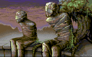
| so, its the same status from two different angles, one of them X flipped :) |
User Comment
Submitted by booker on 10 October 2010
Supplied photos (taken by me) for this one.
And yes - I'm very glad of what Tomek did with them! |
User Comment
Submitted by hedning on 8 October 2010
| Master of Multicolor! I bow before you. :D A very, very nice pic. Keep up the good work! |
User Comment
Submitted by JackAsser on 6 October 2010
| Wow, wow and WOW! Carrion! :D I need mummies for the Eye of the Beholder project which has similar limitations as plain koala. Wanna join the project and slave-pixel some game graphics? Pretty please with sugar on top? |
User Comment
Submitted by Oswald on 6 October 2010
| seen this one before the compos and I could only repeat the word "wow" :) |
User Comment
Submitted by GT on 6 October 2010
| Great picture! Love it very much. I'm a big fan of images like this. |
User Comment
Submitted by Valsary on 6 October 2010
| Masterpiece! It's magical and in my eyes there is a second, more philosophical meaning. One of the few scene pictures i could compare to works by artist like Beksinski, etc. |
User Comment
Submitted by Nightlord on 5 October 2010
This is my personal favorite #2 after Veto's. Really nice. It is amazing to me how you used the same color palette in the foreground and background and still managed to create this much depth and separation between the two characters and the rest of the scene
|
User Comment
Submitted by irwin on 5 October 2010
| For me deserves a place in top3, by far the best your image this year. |
User Comment
Submitted by Akira on 4 October 2010
| Brilliant stuff, the use of colors is astonishing. One of my faves in this compo. |
User Comment
Submitted by saehn on 4 October 2010
| This is one of my favorites from the compo. The deliberate use of checkerboard dithering is interesting to me, reminds me of some of Joe's work. I'm curious though, as to why there's random dither in some places (like the fade to the mountains) but not in others (the bands under tree roots). It's a great pic, both in terms of skill and subject matter. Awesome! |
User Comment
Submitted by psych on 4 October 2010
| Outstanding! Wymiatasz Tomek! |
User Comment
Submitted by Yazoo on 4 October 2010
| very great picture - i love it, and its my personal #3 in the compo. and extra (man)-hugs for using multicolor and resisting the nufli-hype :-) |
User Comment
Submitted by Norvax on 4 October 2010
| Carrion, it is impressive... Huge effort, a true piece of art..Congratz. |
User Comment
Submitted by Archmage on 4 October 2010
| A great picture that should have placed much higher I think. Interesting theme, good colour scheme and just the right amount of detail. My favourite from Carrion so far. |
User Comment
Submitted by Moloch on 4 October 2010
| Very nice graphic, has a very mysterious story hidden in the pixels. One of my favorite releases from X2010. |
User Comment
Submitted by Hoild on 3 October 2010
| This is one more of those C64 graphics that don't look like a C64 release, but more like gfx from another retro computer with a better video chip. And that by itself is an achievement for a multicolour pic. However, if I evaluate it with no regard for the platform, I don't really fancy it as a picture, sorry. |
User Comment
Submitted by Morpheus on 3 October 2010
| Love the style! Who put them there and why? |
User Comment
Submitted by Digger on 3 October 2010
| I am speechless! Great pic Tomek! |
User Comment
Submitted by Sander on 3 October 2010
User Comment
Submitted by Tristan on 3 October 2010
| I feel like this sometimes. |
User Comment
Submitted by Mix256 on 3 October 2010
User Comment
Submitted by Motion on 3 October 2010
This is an amazing piece!
|
User Comment
Submitted by Deev on 3 October 2010
| Excellent! Since your comeback, you've got better and better and are now definitely among the best. |
User Comment
Submitted by Ed on 3 October 2010
User Comment
Submitted by dalezy on 3 October 2010
| the only thing that has arms is the tree :) nice one! |
User Comment
Submitted by Malmix on 3 October 2010
| Wow! Great colors and nice motif! |
User Comment
Submitted by Joe on 3 October 2010
Beautiful, what a great surprise.
The tree on the right looks like a midget or an oversized bonzai. |
|
|
|
 | Search CSDb |
 |
|
 | Navigate |  |
|
 | Detailed Info |  |
|
 | Fun Stuff |  |
· Goofs
· Hidden Parts
· Trivia
|
|
 | Forum |  |
|
 | Support CSDb |  |
|
 |  |
|


