|
| |
Released At :
Forever C | The Dirty Dozen
Achievements :
C64 Graphics Competition at Forever C | The Dirty Dozen : #6
Credits :
Download :
Look for downloads on external sites:
Pokefinder.org
User Comment
Submitted by STE'86 on 13 April 2011
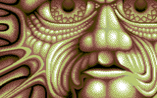
whenever i look at this my mind expects to see credits fading in and out on the left side under the eye.
it would make a great titles backdrop for an "Indy" style adventure. |
User Comment
Submitted by Motion on 13 April 2011
| Warm, rich and plain excellent! |
User Comment
Submitted by Mermaid on 24 March 2011
User Comment
Submitted by booker on 23 March 2011
| Looked cool on big screen! |
User Comment
Submitted by Ksubi on 23 March 2011
| Wow! Impressive use of light and colours in a typical saehn stylized pic. Awesome work! |
User Comment
Submitted by SplAtterpunk on 23 March 2011
| There's something about this pic... |
User Comment
Submitted by uka on 23 March 2011
| This is face! IMHO Should be in the top three. |
User Comment
Submitted by Jak T Rip on 23 March 2011
| This is really outstanding. I can't believe it didn't score higher, as it was a straight 9/9 for me on the party. This picture looks like it should be bigger. Every time I look at it I wait if it moves and shows me the next part of the pic. Very interesting effect! Anyway saehn, what would you think about a scrolling 2x2 version of this pic? |
User Comment
Submitted by psych on 22 March 2011
User Comment
Submitted by The Shadow on 22 March 2011
| Oh wow. This is amazing :) |
User Comment
Submitted by Hoild on 21 March 2011
I was occupied during the compo, and could only check the projector on an irregular basis, and I really thought this was an entry for the Atari GFX compo, due to the extremely unorthodox palette and dithering effect. Such pictures like this are normally made on Atari, due to the extended palette of that video chip. ;]
Nice work, Saehn! |
User Comment
Submitted by Twoflower on 21 March 2011
| Really nice choice of palette, very nice pixeled. Gives me a good feeling in my stomach. Almost an Odblesk II. |
User Comment
Submitted by CreaMD on 21 March 2011
I love this too. Your stuff always stands out on the screen. I think what sometimes prevents it from kicking ass of other prods is a big ammount of weirdness, and ability of putting people to state of insecurity (uneasiness).. they don't know how to react so they react cautiously ;-) Anyway, it's your trademark, and I love you for doing this ;-)
|
User Comment
Submitted by Moloch on 21 March 2011
User Comment
Submitted by Jazzcat on 21 March 2011
| Menacing. Me likes muchly! |
|
|
|
 | Search CSDb |
 |
|
 | Navigate |  |
|
 | Detailed Info |  |
|
 | Fun Stuff |  |
· Goofs
· Hidden Parts
· Trivia
|
|
 | Forum |  |
|
 | Support CSDb |  |
|
 |  |
|


