|
| |
Released At :
Intro Creation Competition 2018
Achievements :
C64 Demo Competition at Intro Creation Competition 2018 : #22
Credits :
SIDs used in this release :
Download :
Look for downloads on external sites:
Pokefinder.org
User Comment
Submitted by 4gentE on 14 July 2021
User Comment
Submitted by Jak T Rip on 25 January 2019
| just great style. Would not have guessed from the screenshot. |
User Comment
Submitted by PAL on 14 January 2019
| That is ace! almost cycleburner worthy |
User Comment
Submitted by Mixer on 12 January 2019
| Very nice. A lot of style. |
User Comment
Submitted by Jammer on 11 January 2019
User Comment
Submitted by 0xDB on 10 January 2019
| Cool drums and some nicely screechy parts in the tune. |
User Comment
Submitted by Frantic on 7 January 2019
User Comment
Submitted by Tetsuo on 7 January 2019
Thank you all for your kind comments.
Regarding visibility of stuff displayed on borders, it was checked on real hardware and everything was visible, but i will try better next time :)
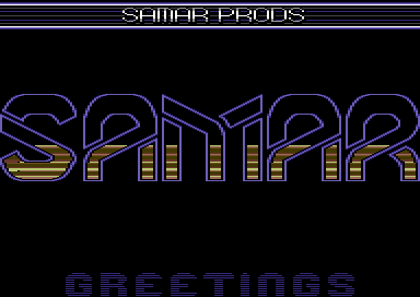
@Knight Rider Actually, raster is stable, but with 4 sprites in line and with open sideborders, change of background color at badlines happens in that place where black dots are. Those black dots masks white dots, which are result of changing background color and are visible on VICE with C64C PAL model (not visible at C64 PAL model). So it is some kind of trade off.
When i think of that now, I could just change bg color on next line, outside border, leaving not 2, but 3 lines in same color. |
User Comment
Submitted by encore on 7 January 2019
| Feels very robotic. Goes well with the music, which is fantastic. |
User Comment
Submitted by Compyx on 6 January 2019
| That's one butt-ugly logo. |
User Comment
Submitted by Mibri on 6 January 2019
User Comment
Submitted by G-Force on 6 January 2019
User Comment
Submitted by Joe on 6 January 2019
User Comment
Submitted by DKT on 6 January 2019
| Great intro Tetsuo! I know you cook more stuff for future releases, so I'm really happy :-) |
User Comment
Submitted by Golara on 6 January 2019
| I can see it all in my crt |
User Comment
Submitted by TheRyk on 6 January 2019
very likable as it's different though based on well-known classic effects
yeah there's some dot issue and top/bottom content should be more central, but there's CRT monitors with overscan button (e.g. Sony Trinitron) so it's not true you can't watch it on _any_ real hw |
User Comment
Submitted by Mr.Ammo on 6 January 2019
Tetsuo, great intro! But... your fellow team members should have told you about overscan on CRT monitors and TV sets. The reason why we have borders on the C64 ;-)
The overscan prevents me from seeing the lower half of the lower border scroller en some information is lost in the upper border (compared to running it using vice). |
User Comment
Submitted by aNdy on 6 January 2019
| Love the top block dumping rasters into the logo. Great! |
User Comment
Submitted by Knight Rider on 6 January 2019
| Very original. I like it. Not sure if the black dots and unstable raster lines can be avoided on the left of the S. |
User Comment
Submitted by Wayne Kerr on 6 January 2019
| Cool design/effect with the top writer + the logo rasters, well synced too. |
User Comment
Submitted by Magic on 6 January 2019
Love the idea and the synch!
Spox intro! :D |
User Comment
Submitted by psych on 6 January 2019
User Comment
Submitted by Golara on 6 January 2019
| Very nice style. I like it :) |
User Comment
Submitted by Hawk on 6 January 2019
|
|
|
 | Search CSDb |
 |
|
 | Navigate |  |
|
 | Detailed Info |  |
|
 | Fun Stuff |  |
· Goofs
· Hidden Parts
· Trivia
|
|
 | Forum |  |
|
 | Support CSDb |  |
|
 |  |
|


