|
| |
Website :
https://sanderfocus.nl/demoscene-logos/
Credits :
SIDs used in this release :
Download :
Look for downloads on external sites:
Pokefinder.org
User Comment
Submitted by Scrap on 27 June 2021
User Comment
Submitted by Sander on 21 May 2021
This is for you Toggle :)
 |
User Comment
Submitted by Toggle on 21 May 2021
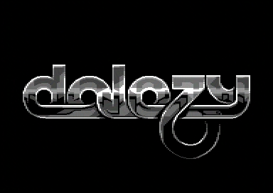
| Pure class! Thanks for the workstages, too. As much as I would have loved to see this in colour, I think it was the perfect choice to do it in greyscale. Fantastic <3 |
User Comment
Submitted by Zierliches Püppchen on 21 May 2021
| Stunning! I love that shading and the texture. A real kick-ass logo! <3 |
User Comment
Submitted by Paladin on 18 May 2021
| Beautiful logo and I absolutely love the track! Catchy as F&^%! |
User Comment
Submitted by K-reator on 18 May 2021
This is why we like immortal machine. Good to see that you are back in buisness with full power.
True masterpiece!
We ask for more. |
User Comment
Submitted by Oxbow on 18 May 2021
User Comment
Submitted by goerp on 18 May 2021
Very very nice!
Nice workstages.
I like that you chose to keep it in black/white/grey. |
User Comment
Submitted by El Jefe on 18 May 2021
| looks incredibly classy, noble! Great! |
User Comment
Submitted by Sander on 18 May 2021
Thanks all <3
@Copyfault, the C64 version is new, based on my logo from 2012:
 |
User Comment
Submitted by Copyfault on 18 May 2021
The greatness of this logo is out of question, but did I get that right that his logo was done in 2012 already?
This is what I call "ahead of time" - and I'm not even suprised due to the genius behind it :) |
User Comment
Submitted by Isildur on 17 May 2021
User Comment
Submitted by anonym on 17 May 2021
User Comment
Submitted by HCL on 17 May 2021
User Comment
Submitted by dalezy on 17 May 2021
User Comment
Submitted by Burglar on 17 May 2021
| The #1 logo graphician shows why he's #1 :) |
User Comment
Submitted by Street Tuff on 17 May 2021
User Comment
Submitted by FABS on 17 May 2021
User Comment
Submitted by MCM on 17 May 2021
| Stunning as always ! Great art !! |
User Comment
Submitted by Deev on 17 May 2021
| Beautiful! Love those curves! |
User Comment
Submitted by Cupid on 17 May 2021
| God damn, that is gorgeous. |
User Comment
Submitted by Oswald on 17 May 2021
| wow sander, this is a new never seen height in c64 logos.fantastic. |
User Comment
Submitted by bepp on 17 May 2021
User Comment
Submitted by Jammer on 17 May 2021
| Pure essence of class and style <3 |
User Comment
Submitted by Frantic on 17 May 2021
| My first thought was: "sander". One second later, the text on the screen confirmed this initial thought. Good work there mister! |
User Comment
Submitted by G-Force on 17 May 2021
| Classy logo sprung to mind straight away. |
User Comment
Submitted by psych on 17 May 2021
User Comment
Submitted by Genius on 17 May 2021
User Comment
Submitted by Monte Carlos on 17 May 2021
| Nice with those multiple layers and the semi transparency. However, the intermediate color versions also looked very cool. |
User Comment
Submitted by ccr on 17 May 2021
User Comment
Submitted by Shine on 17 May 2021
W O N D E R F U L !!! <3
It's always fascinating, how you manage to create art (here this logo)! :D |
User Comment
Submitted by Sander on 17 May 2021
Based on a logo I did in 2012. Here are some workstages:
 |
|
|
|
 | Search CSDb |
|
 | Navigate |  |
|
 | Detailed Info |  |
|
 | Fun Stuff |  |
· Goofs
· Hidden Parts
· Trivia
|
|
 | Forum |  |
|
 | Support CSDb |  |
|
 |  |
|


