|
| |
Released At :
Only Sprites Compo
Achievements :
C64 Demo Competition at Only Sprites Compo : #7
Credits :
SIDs used in this release :
Scrolltext and other text in this release : ()
Download :
Look for downloads on external sites:
Pokefinder.org
User Comment
Submitted by Cruzer on 26 October 2023
| Seriously mind-boggling! This is the kind of stuff Crossbow would come up with. |
User Comment
Submitted by Raistlin on 22 January 2021
| Stylish, original - and with just the right amount of “how in the heck did they manage this?”. Great stuff! |
User Comment
Submitted by Nightlord on 21 January 2021
| triad will always be a special group for me. I love hove "true to brand" every triad prod is. so very consistent, in quality and in style |
User Comment
Submitted by Strepto on 15 January 2021
Grey! I like the grey.
Thanks for sharing the info on how it was made.
I haven't noticed the ghostbytes, even though I claim to be a coder... |
User Comment
Submitted by Powerslave on 12 January 2021
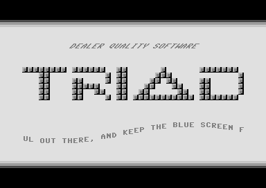
It's time to tell you some secrets around how this demo is made.
As you know expanded multicolor sprites will have 4 pixels wide segments and that the c64 have what we call a "ghost byte" that will be visible when the normal screen is turned off.
The secret is to use unexpanded multicolor sprites were possible and to fix the "impossible" rows by using expanded sprites together with overlay ghost byte.
All squares with a "space" on its left side are always using unexpanded mc sprites and were it's possible there will be used expanded sprites moved 2 pixels to the left and covered by the 2 pixel wide ghost byte to half the 4 pixel mc grey part.
The screenshot will maybe explain more. Black is the ghost byte and the different colors will show you the different sprites and their positions.
Timing is very critical and to build another logo than the original 40x6 TRIAD version is maybe not possible.
There must be time to reposition all the sprites X position, change the $D010 value, change the Y position and update the ghost byte at a cycle exact position.
It was not clear if this was possible or not before the final pixels was fixed and there were a risk that the complete project should be canceled.
The scroll is the easiest part of the demo but still complex as the position for the "chars" is sensitive inside the sprites to allow a multiplexing without glitches.
Totally 2 x 8 sprites are used for the scroll.
These routines are not so time consuming and it should have been possible to add more things to the screen but the estetic look was more important than filling the screen with a lot of things like back in the 80's.
This is a pointless demo as it could easy be fully made by chars instead of sprites but we like the challenge... :-) |
User Comment
Submitted by DeeKay on 3 January 2021
| Nice one. Though the trick of using x-expanded sprites and covering them with $3fff magic/ghostbyte looked nicer in Crossbow's "Brick in the Wall" in Avantgarde! ;-P |
User Comment
Submitted by shazz on 16 December 2020
| I still don't get how the logo is done. The text scroller is also very well done. Just impressed. |
User Comment
Submitted by Nova on 16 December 2020
| You could have it through any border since badlines would be turned off since nothing but sprites is used. |
User Comment
Submitted by DKT on 11 December 2020
Hehe, probably nobody expected to see classic Triad intro made in this technique :D
Great job! |
User Comment
Submitted by Powerslave on 8 December 2020
| @tlr Yes, it would be possible. |
User Comment
Submitted by tlr on 8 December 2020
| Super nice, does this mean we can have the logo coming in through the upper border area then? |
User Comment
Submitted by Shine on 7 December 2020
| Dealer Quality Spriteware!!! <3 |
User Comment
Submitted by Jammer on 7 December 2020
| @HCL: I'd suspect so but that mid gray bevel seems too narrow for x-expanded multicolor sprites :) I still cannot wrap my head entirely :( |
User Comment
Submitted by HCL on 7 December 2020
| @Jammer: Seems to be a combination of ghost byte and low-prio sprites. Very nice execution. Love it!! |
User Comment
Submitted by Jammer on 7 December 2020
| Ok, somebody please explain to me - how the fuck TRIAD logo is done? :O Are black shades ghostbyte or sth? |
User Comment
Submitted by JackAsser on 6 December 2020
| Haha... 10/10 for the idea alone! <3 |
User Comment
Submitted by Raistlin on 6 December 2020
| Sweet! Really nice first entry - and, yeah, reading about the history of sprites was fascinating! Cool stuff! We have our current winner :-) |
User Comment
Submitted by Mibri on 6 December 2020
| Classic Triad style and a really neat little history lesson in the scroller! |
User Comment
Submitted by Compyx on 6 December 2020
| Nice one. I had kinda the same idea, so now have to put the dycp in the sideborder :( |
User Comment
Submitted by Joe on 6 December 2020
User Comment
Submitted by Jammer on 6 December 2020
User Comment
Submitted by Smasher on 6 December 2020
| oh yes! wow, great entry!! the dev kit is all yours (for the moment...) :) |
|
|
|
 | Search CSDb |
|
 | Navigate |  |
|
 | Detailed Info |  |
|
 | Fun Stuff |  |
· Goofs
· Hidden Parts
· Trivia
|
|
 | Forum |  |
|
 | Info on other sites |  |
|
 | Support CSDb |  |
|
 |  |
|


