|
| |
 |
Released by :
JSL
Release Date :
4 April 2013
Type :
C64 Graphics
(MultiColor)
|
Credits :
SIDs used in this release :
Download :
Look for downloads on external sites:
Pokefinder.org
User Comment
Submitted by Oswald on 10 April 2013
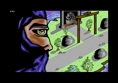
| Picasso deliberitaly mixed up viewpoints of face parts, while here it's a case of inability. I like JSL's determination, and constant flow of gfx, and often he pumps out stuff which I like. but when something is butchered so badly it has to be said instead of nice lies and circle back patting. |
User Comment
Submitted by Rough on 9 April 2013
| I like it, especially the green background area. |
User Comment
Submitted by TheRyk on 8 April 2013
Don't see why the perspective's necessarily "wrong". I take this one for expressionism, kinda Picasso-esk or maybe sth like an early Salvador Dali sketch or collection. Even if realism was intended - which might be the case: If the ninja has superpowers and can fly or just jumped from a rooftop to commit suicide and has very large and flexible eyeballs, why shouldn't he look at us?
However, it is rather the claimed "haters" witchhunt by the fans which is a little over the top imho than the criticism. Don't be angry about critics, JSL, the vast majority of them mean you no harm, but try to help you improve, because they still think you want to work on your style and skills. Others are not so sure anymore if you really wanna make any progress due to your reaction/ignoring their former criticism and stopped commenting altogether and instead just vote without comment - is that really what you prefer? IIRC it drives you even more crazy :) |
User Comment
Submitted by E$G on 5 April 2013
User Comment
Submitted by Cruzer on 5 April 2013
| I don't think it's rude or hateful at all to criticize something. JSL: Don't take it personal, no one are saying anything bad about you, just about this particular arrangement of pixels. |
User Comment
Submitted by redcrab on 5 April 2013
Why do you all freak out on this particular piece? It's an average JSL picture. No need to be rude. (Silence would be statement enough)
And what Kitty said. If the picture was called "beware of the flying nun" I bet this shitstorm never would have come :) |
User Comment
Submitted by Tristan on 5 April 2013
User Comment
Submitted by JSL [PM] on 5 April 2013
"...Everytime this happens I have the urge to smash my C64 and throw it out of the window..."
You're gonna be hearing a whole lot more from me from now on.
|
User Comment
Submitted by celticdesign on 5 April 2013
well, me likes. and to be true, don't take it to serious :-)
straight 5 from me +1 for the effort, +1 for your static output,
-1 for the perspective.
|
User Comment
Submitted by CONS on 5 April 2013
| The eye is strange, yes. For the rest, I just imagine him looking out of a window of a plane that takes a right turn. CaChing, some issues solved ;) |
User Comment
Submitted by Cobra/Samar on 5 April 2013
| If sombody draws over a dozen graphics per year, we can require the better techniques. |
User Comment
Submitted by enthusi on 5 April 2013
Ive seen much much worse + this one features Jabba the Hut.
Seriously, there are dozens of 'technical flaws' but it still has some vigor in it. I'd chose it over a few gazillion of half-hearted converts any time. |
User Comment
Submitted by Matt on 5 April 2013
If you can't live with the criticism maybe you should give up drawing, or try better next time. Or do you expect a pat on the shoulder when you come up with something like this? Seriously.
To me this is just your worst picture ever and that's it really.
And on another note I find upvoting as retarded as downvoting. |
User Comment
Submitted by Dr.j on 5 April 2013
User Comment
Submitted by Danzig on 5 April 2013
/me likes. Good work, Johan. Keep 'em coming!
|
User Comment
Submitted by slimeysmine on 5 April 2013
| The problem is that you are all comparing this to the original artwork of Last Ninja/II. This is JSL's image, a different perspective so appreciate it for what it is. I think you are overreacting and not giving him his full credit for what is a very good picture. |
User Comment
Submitted by Stone on 5 April 2013
| Don't let the haters get you down JSL, this is a cool picture. The isometric view is obviously a homage to the Last Ninja game even though the gate and the Angry Penis Shrine kind of breaks it a little. |
User Comment
Submitted by lemming on 5 April 2013
At least it's the last ninja.
|
User Comment
Submitted by Peacemaker on 5 April 2013
poor ninja :/ i feel his pain...
what oswald wrote |
User Comment
Submitted by Oswald on 5 April 2013
| this is broken on so many ways, you should read up on & learn on perspective, drawing, sketching in general, it looks like being built up from 3 flat layers: ninja, the ground, and object on grounds. Perspective is broken too. Nose should be inside the hood, eye should look like an ellipsoid from this angle, etc. |
User Comment
Submitted by JSL on 5 April 2013
Everytime this happens I have the urge to smash my C64 and throw it out of the window, some sceners replied to me "not taking these comments too seriously" And surely there will be more of my pictures, which get a negative impact. Just because JSL ain't the greatest. We will see whats next as upload..
|
User Comment
Submitted by The Phantom on 5 April 2013
| THIS is why I stopped commenting. |
User Comment
Submitted by JSL on 5 April 2013
| I release "every unfinished" picture aswell, now what is unfinished on this Ninja, what could have been better. When it's finished to me it is finished, and if you could do it better than please go ahead, or else shut the fuck up. I made other Ninja pictures in the past, and they even score heaps better than this 1.6, the background to this ninja somehow reminds me of the levels of Last Ninja 1, and how you would do it, grey paths, lightgreen surrounding grass. I just copied the levels. And what possible could be better on the Ninja.. Wrong eye? |
User Comment
Submitted by Yazoo on 5 April 2013
lets have a last ninja gfx competition comes to my mind (afer we had that rambo compo already) :)
|
User Comment
Submitted by Tristan on 5 April 2013
| seriously, do you even try? |
User Comment
Submitted by PAL on 4 April 2013
| the eye of the beholder... i "hate" this but also see quality in there but i really can not understand what you did with this... the eye is so wrong it is like a frontal image mirrored in som strange way... but then again... my daughter vilde at 10 think this is really cool. |
User Comment
Submitted by The Phantom on 4 April 2013
I want to like this JSL, Last ninja was probably one of my greatest addictions ;)
What throws the whole image off for me is that eye. It's looking at me, instead of somewhere else.
Everything else is pretty sweet though.
It really looks like you drew the entire head, then sliced it in half to fit the background scene. Probably just me. |
User Comment
Submitted by Cobra/Samar on 4 April 2013
Maybe perspective is good, but the rest?
JSL: You are better. |
User Comment
Submitted by Burglar on 4 April 2013
that's the thing. it's not that jsl cant pixel (the butterflies he did were nice, and there was this pirate boat he did years ago which was excellent), but he releases every unfinished/broken pic too.
spend time on a pic until you think "wow, I've just done the best I've ever did", and you'll get all the praise you deserve from everybody. |
User Comment
Submitted by Cruzer on 4 April 2013
| JSL makes nice things from time to time, but this is utterly bad. |
User Comment
Submitted by Yogibear on 4 April 2013
| Come on! It's not that bad! I even like some things! |
User Comment
Submitted by Matt on 4 April 2013
LOL!
Anyway, 2/10 for the effort only.
The picture is probably the worst you ever made, sorry to say so. |
User Comment
Submitted by iAN CooG on 4 April 2013
User Comment
Submitted by dink on 4 April 2013
| I like how you managed to fit Jabba the Hut in that shrine :) |
User Comment
Submitted by Burglar on 4 April 2013
| I'm sorry jsl, but this is just completely awful. how can you release something when the perspective is so fucked up? |
User Comment
Submitted by JSL on 4 April 2013
Feedback which I got from several sceners, say that his nose
should be covered by his cap, but I left it like this, so one
mistake I made with this Ninja. Ninja-Music by Richard Bayliss. |
|
|
|
 | Search CSDb |
|
 | Navigate |  |
|
 | Detailed Info |  |
|
 | Fun Stuff |  |
· Goofs
· Hidden Parts
· Trivia
|
|
 | Forum |  |
|
 | Support CSDb |  |
|
 |  |
|


