|
| |
|
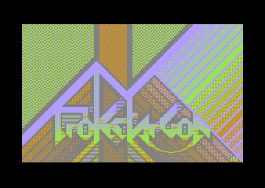
ProjectArgon 3-Color-Logo [2013] |
Released At :
3-Color-Logo Competition 2013
Achievements :
C64 Graphics Competition at 3-Color-Logo Competition 2013 : #4
Credits :
Download :
Look for downloads on external sites:
Pokefinder.org
User Comment
Submitted by Shine on 1 July 2013
| I can still NOT believe, that you used only one charset (max 256 chars) :) Really AWESOME gfx dude :) |
User Comment
Submitted by prowler on 23 March 2013
| Some serious dithering-porn here! The winner imho, excellent use of colours, composition, balance as hacked ut letters. And dtill more readable than the average tag on the street :-) |
User Comment
Submitted by CONS on 15 March 2013
| Very unique approach. This palette indeed creates the illusion of far more colors than three. And its a welcome challenge to read! |
User Comment
Submitted by Morpheus on 14 March 2013
User Comment
Submitted by Shaun C on 13 March 2013
Wow, the colour bands over on the right look especially amazing on old VIC-II palette. Still impressive on new VIC-II too.
|
User Comment
Submitted by rexbeng on 12 March 2013
| @Monte Carlos, the colors used to pixel this are 11, 14, 8 and 5. |
User Comment
Submitted by WVL on 12 March 2013
This is great! Also really like that picture from X2012 (glad that I took the time to convert that for you).
Nice to have you on c64!
I do wonder about the colorpalette that you are using though, it's not really like any c64+monitor combination that I've seen.. (then, there are many..) |
User Comment
Submitted by Monte Carlos on 12 March 2013
| Was this meant to use color combination 11, 14, 10 and 5 instead of 11, 14, 8 and 5? You can watch the effect when you freeze the part and change $d022 to $fa. |
User Comment
Submitted by Burglar on 11 March 2013
#1 in the dither-pattern compo for sure.
this design screams to be made into a real demopart.
but as a (Pokemon!) logo, still great, but there are a couple better ones. |
User Comment
Submitted by Frantic on 11 March 2013
| At least 144 colors here. :) |
User Comment
Submitted by Joe on 11 March 2013
User Comment
Submitted by Dane on 11 March 2013
User Comment
Submitted by Zierliches Püppchen on 11 March 2013
| Very Interesting, what u have done with 3 Colors ... its a noticeable Logo, no doubt. People who argue with Typeface ... yes its not Helvetica or Times New Roman ... ;-) I would rate it 9 up to 10. |
User Comment
Submitted by Shine on 11 March 2013
User Comment
Submitted by spider-j on 11 March 2013
| Very nice style! But even after your explanation I have to say: letters are too much "hidden" for my taste. |
User Comment
Submitted by rexbeng on 11 March 2013
Hello all. Thanks for your comments/remarks. As for the debate on how this is readable or not, well, in my book it is not (pretentious redundancy coming up) absolutely mandatory for a logo to serve as a text-title. There are plenty of logos made this way; graffiti artists and heavy metal fans from Norway can surely attest that :P
Anyway I have made a slipshod image (http://tinyurl.com/d4xllok) with the letters cleared and separated just for the record. I see how the "P" might have confused some people but, really, was it so hard in the end? |
User Comment
Submitted by Radiant on 11 March 2013
| Love the typeface, reminds me of oldschool ASCII. Very skillful use of dithering, and a nice composition. A little too much art and too little logo for me, though - wish the logo had been a more prominent part of the picture. Still excellent. |
User Comment
Submitted by Deev on 11 March 2013
| Excellent work! This stands out above virtually every other entry for me. Far too many of the entries in this competition just look to the past, where as this is taking the restrictions and doing something that looks very different, yet still extremely good technically. Whilst I like the style of the type, it is virtually impossible to read, but that doesn't bother me too much here. It's not like you're advertising a product on a supermarket shelf! |
User Comment
Submitted by Oswald on 11 March 2013
| technically the most pushing, ammazing joeish layering qualities, the typeface is not so nice tho. |
User Comment
Submitted by Tristan on 11 March 2013
| WOW... this makes everything else look like shit. Serious envelope pushing right here. This is what staying on the C64 is all about. Old school is for memories, new school is for expanding minds. Great job sir! |
User Comment
Submitted by Ksubi on 10 March 2013
| Wonderful! Love the bold colour use. How long will it take before this dude is snapped up by a group ?! |
User Comment
Submitted by Dr.j on 10 March 2013
| Impressive , unique with outstanding style. this is what i call Art |
User Comment
Submitted by leonofsgr on 10 March 2013
User Comment
Submitted by Kristian on 10 March 2013
| Gotta agree with PAL here. Love the choice of colors, the illusion of a lot of colors, the dithering and the style. As a piece of art it is great, among the best I've seen in here for a while. As a logo not so much. Even when I know what it is supposed to say I can't read it. |
User Comment
Submitted by PAL on 10 March 2013
| I must say it is masterful as a color experiment, but as a logo I must admit that I can not read it, if filename were not on this in here it would for me be absolutely impossible to read. But man I love the colors in all the cool dithering and patterns. I could give a 10 for the colors, but since this is also a logo compo I must give it a 7. |
User Comment
Submitted by Sledge on 10 March 2013
| Don't know what to say. This is true skills! You got ten points from me! |
User Comment
Submitted by Digger on 10 March 2013
| Great use of limitations! I gave 10 too, well deserved. Now wait for Joe ;-) |
User Comment
Submitted by Flea on 10 March 2013
| Not so much of a LOGO itself, but for a clever and brave attempt I voted 10. |
User Comment
Submitted by Titus on 10 March 2013
User Comment
Submitted by Raffox|HF on 10 March 2013
| One of the best releases, clever usage of colors. Not my cup of tea in terms of shapes. Non the less I've enjoyed watching it on the real thing. 10/10 |
User Comment
Submitted by Smasher on 10 March 2013
| This could win the 30-color-logo compo as well :) |
User Comment
Submitted by Cargo on 10 March 2013
User Comment
Submitted by Cruzer on 10 March 2013
| Cool and creative! Wonder if the red/green dithering will look good on a real c64 though. |
User Comment
Submitted by The Gothicman on 10 March 2013
User Comment
Submitted by Xenox on 10 March 2013
| Wouw, this is fucking good... One of the bests for me, 10 from 10 points... |
User Comment
Submitted by chatGPZ on 10 March 2013
| very nice, extra points for brave color usage. |
User Comment
Submitted by Mace on 10 March 2013
Once in a while someone new tries something on the C64 and it's amazing.
This is an outstanding example of that.
|
User Comment
Submitted by BHF on 10 March 2013
| Amazing use of pixels, different sizes and clever combos. Great illusion of many colors, love it ! |
User Comment
Submitted by Sixx on 10 March 2013
| Simple amazing.. Ladies and gentlemen, we have a winner! :) 10/10. |
User Comment
Submitted by iAN CooG on 10 March 2013
converted to chars and uploaded a proper prg
|
User Comment
Submitted by Hammerfist on 10 March 2013
| Well, this is the amazing logo I was kind of hoping for. Magnificent! I thought it had way more colors and couldn't believe the effects you created just with dithering. I doubt this can be topped. 10/10. |
User Comment
Submitted by bepp on 10 March 2013
User Comment
Submitted by rexbeng on 10 March 2013
| @tlr: I used Multicolor2Char (as suggested by The User) to do the count and according to that, it does fit. I appreciate if someone could verify it using a real C64 though. I'm still making my baby-steps on the machine :) |
User Comment
Submitted by Hoild on 10 March 2013
| Awesome design -- this is beyond the usual logo release, and could compete in a generic/multiplatform GFX compo. |
User Comment
Submitted by Akira on 10 March 2013
| What the shit... this is amazing... |
User Comment
Submitted by tlr on 10 March 2013
| Unusual and nice color choise! Does it fit in a charset? |
User Comment
Submitted by Almighty God on 10 March 2013
| 3 colours logo? very nice used of colours... |
|
|
|
 | Search CSDb |
|
|
| Navigate | |
|
| Detailed Info | |
|
| Fun Stuff | |
· Goofs
· Hidden Parts
· Trivia (2)
|
|
| Forum | |
|
| Support CSDb | |
|
 |  |
|